Modern Style
BOSSA | KERA | MADERO
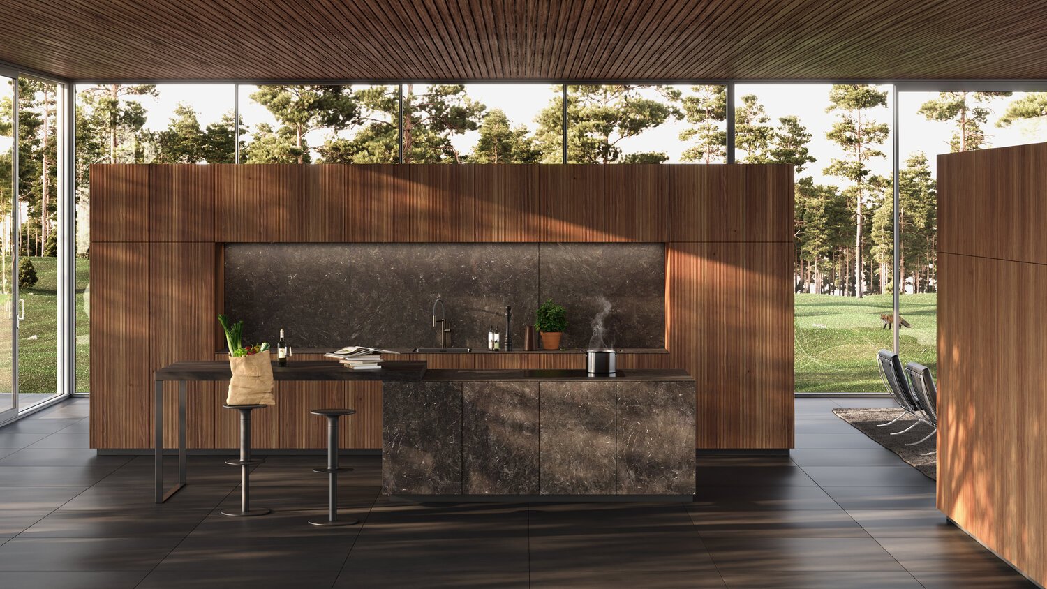
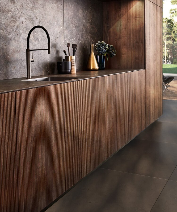
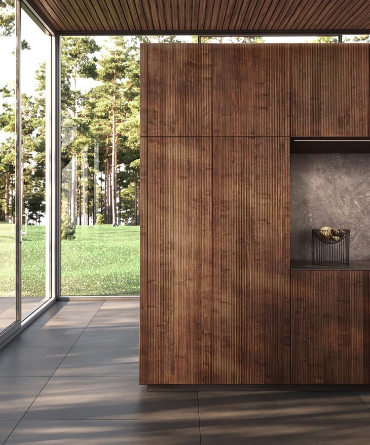
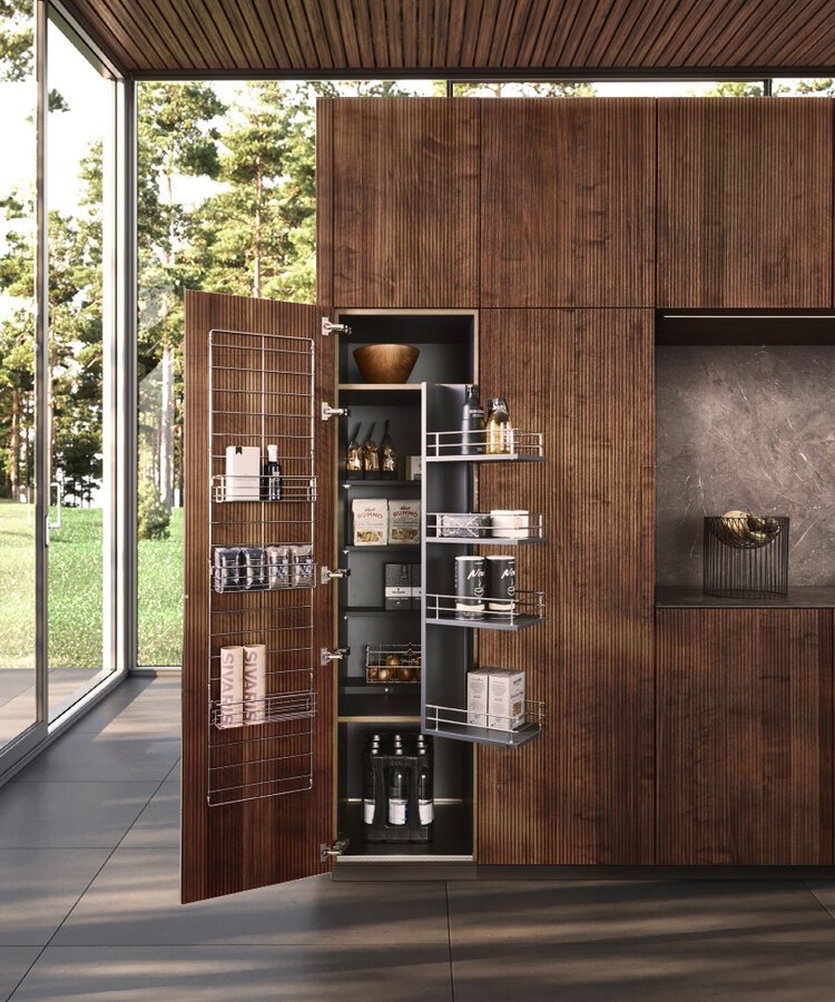
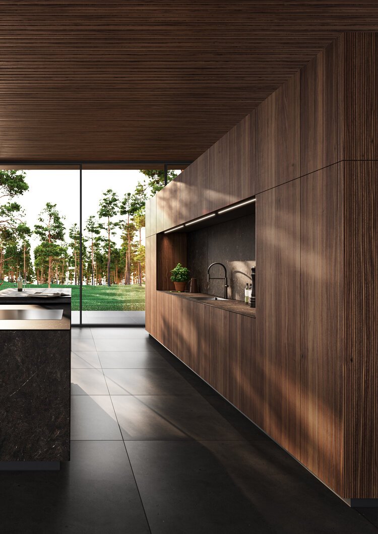
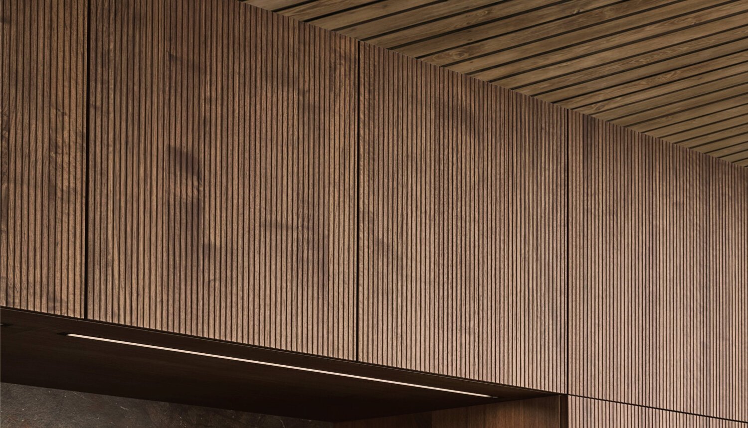
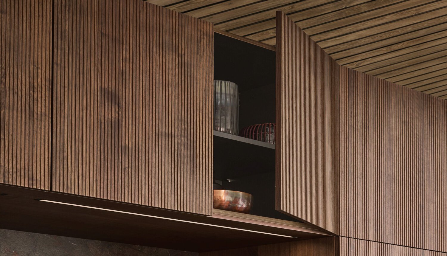
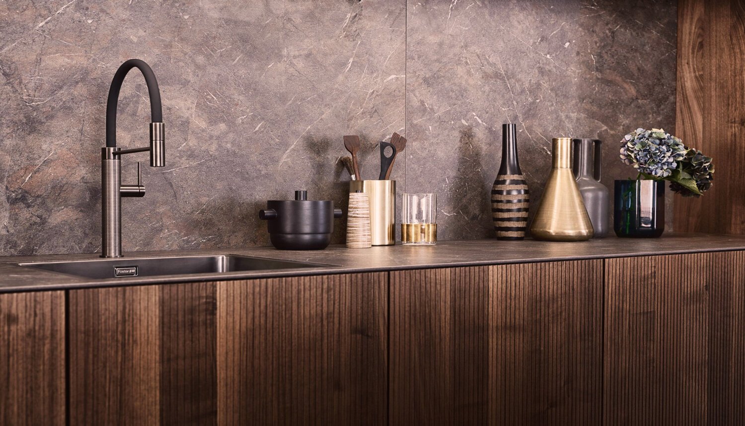
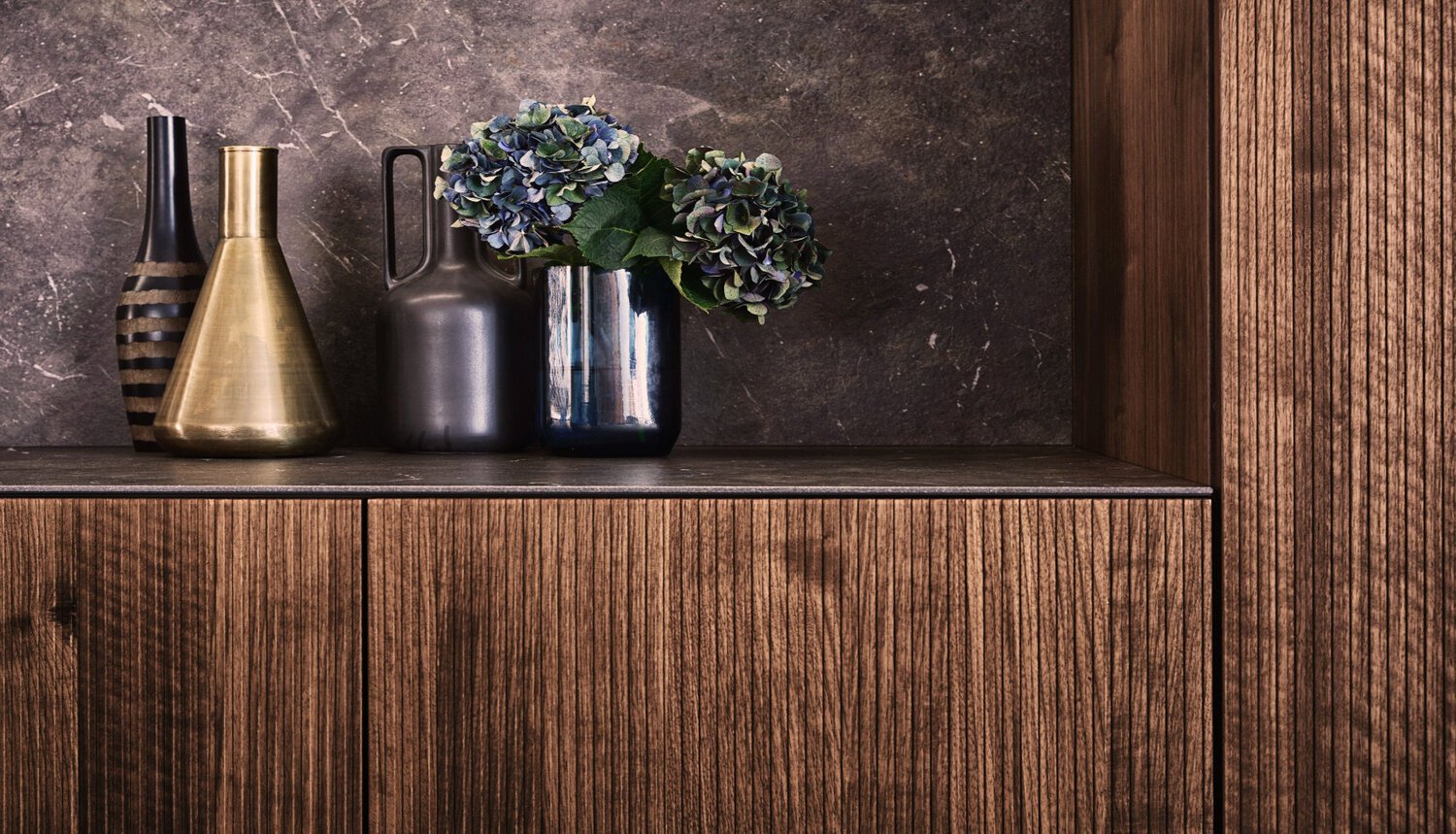
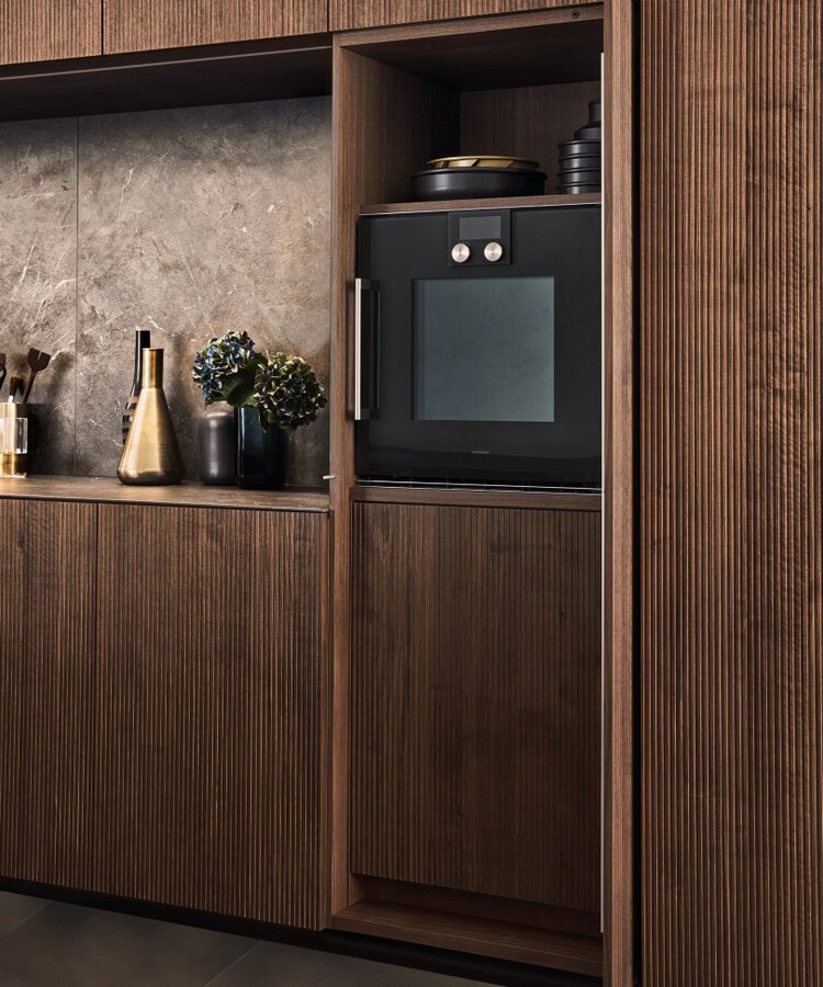
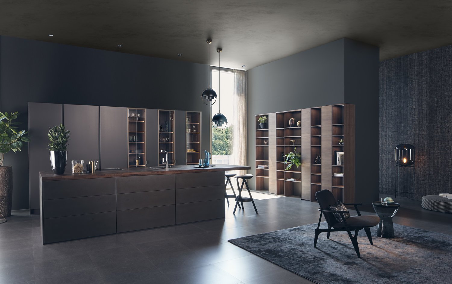
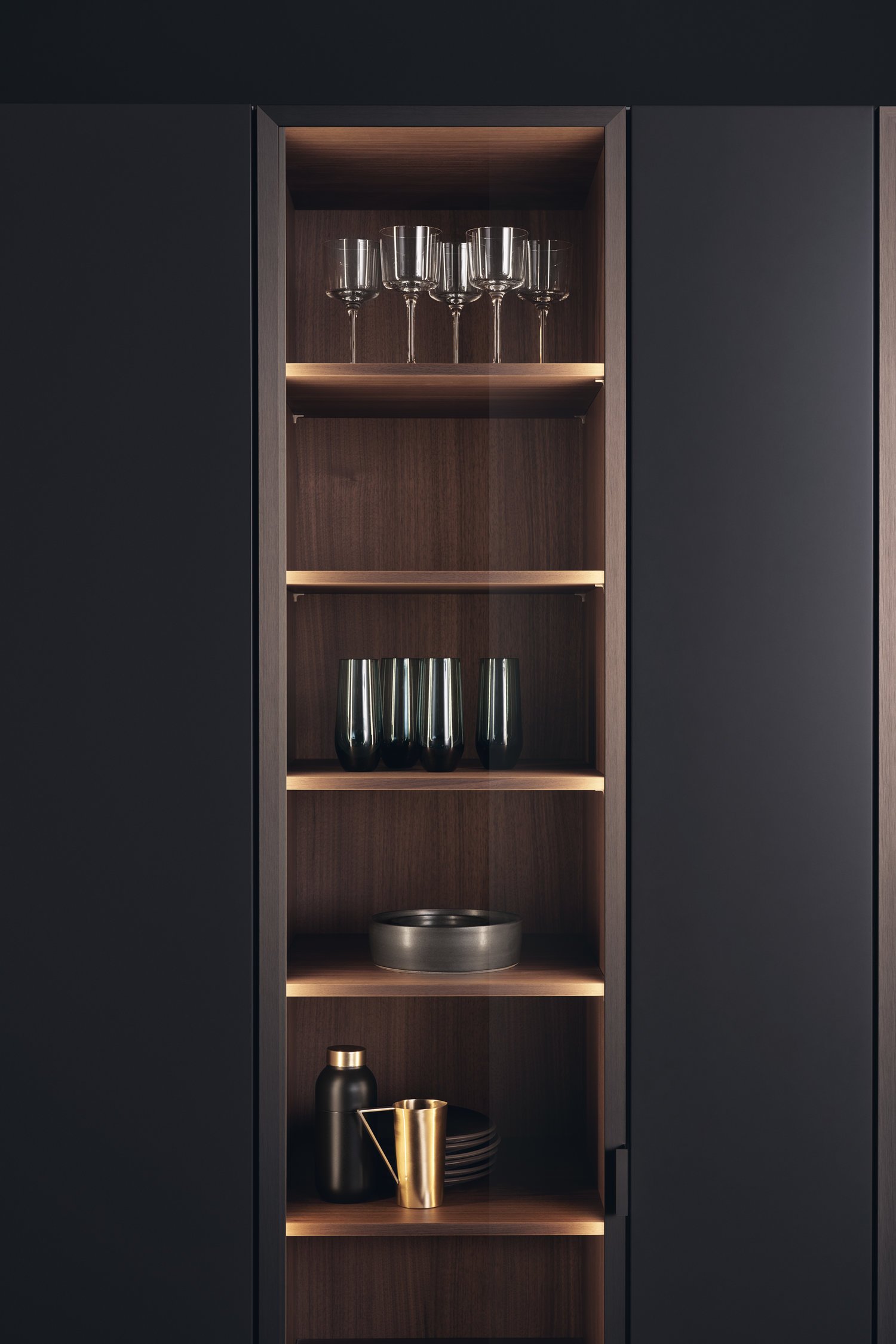
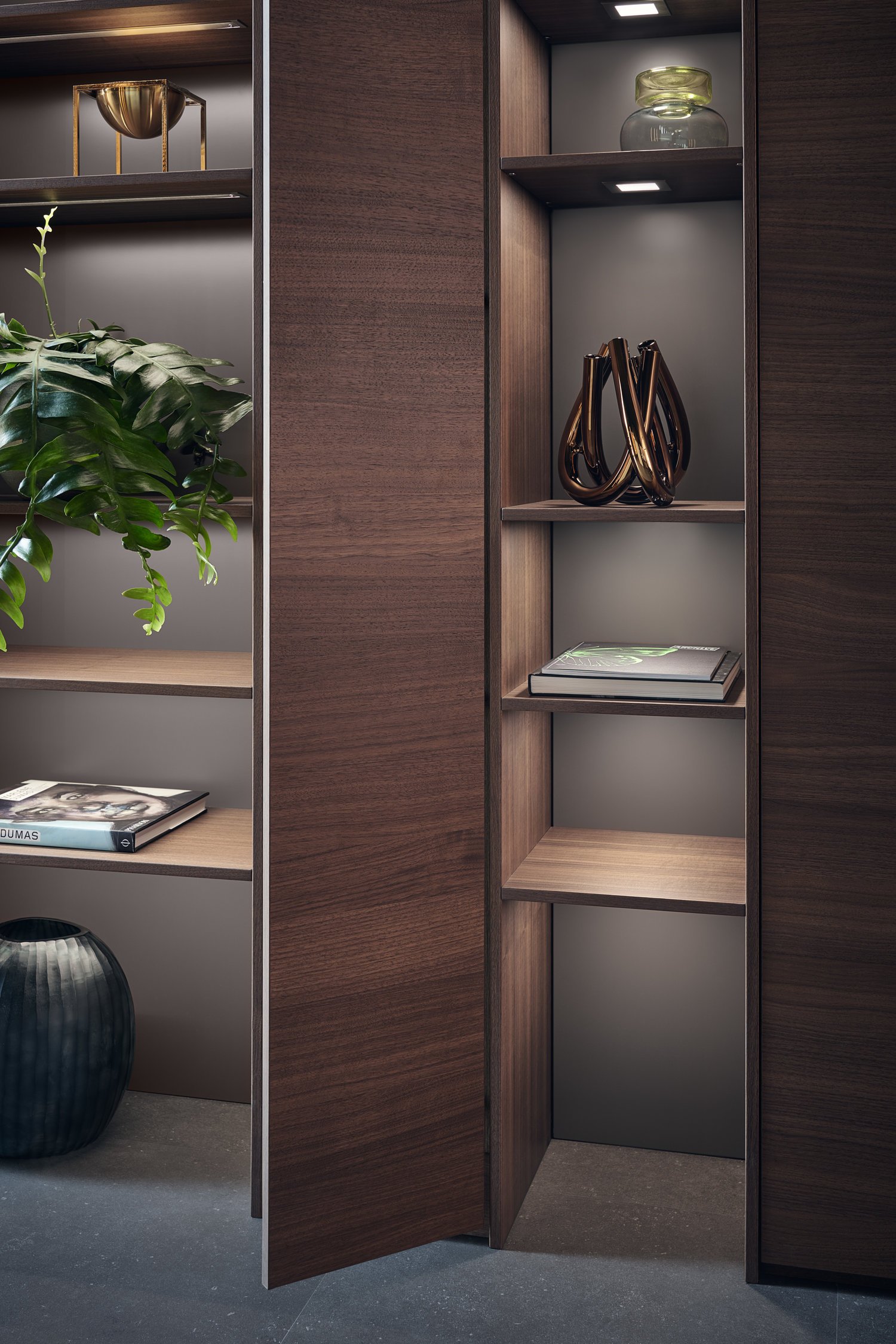
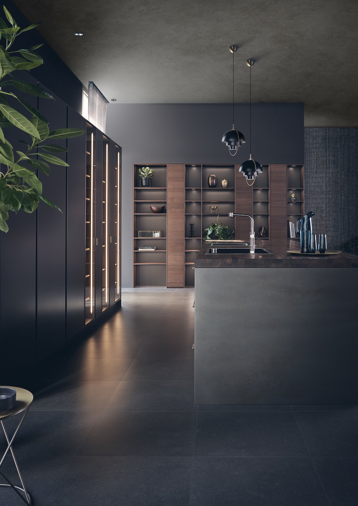
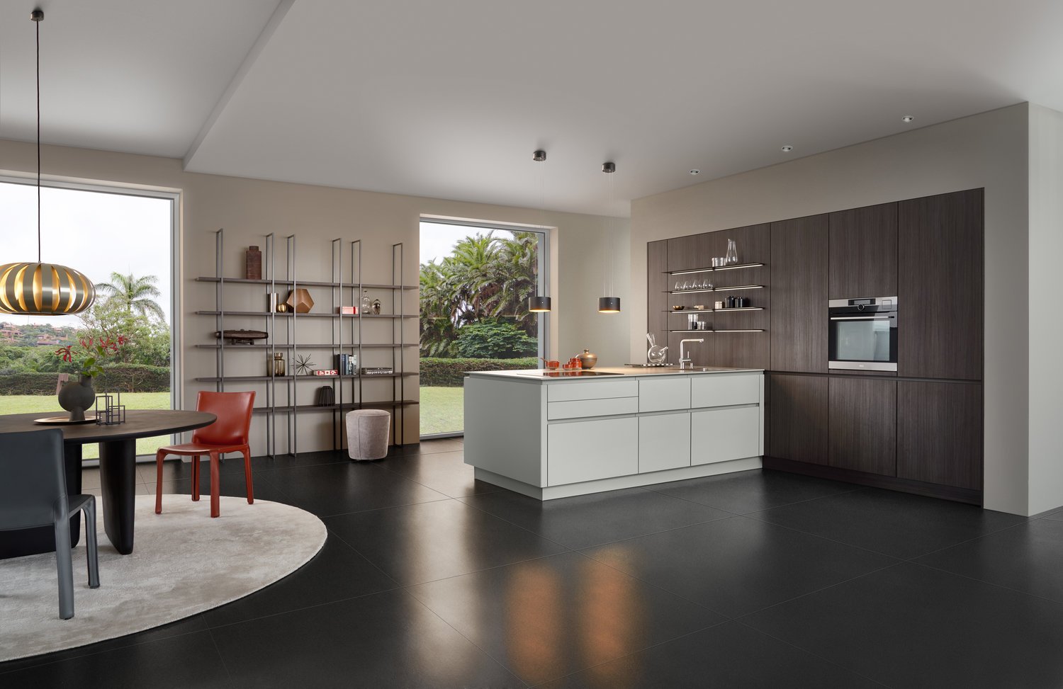
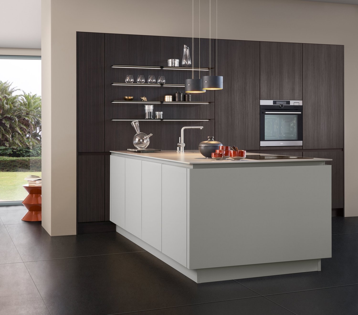
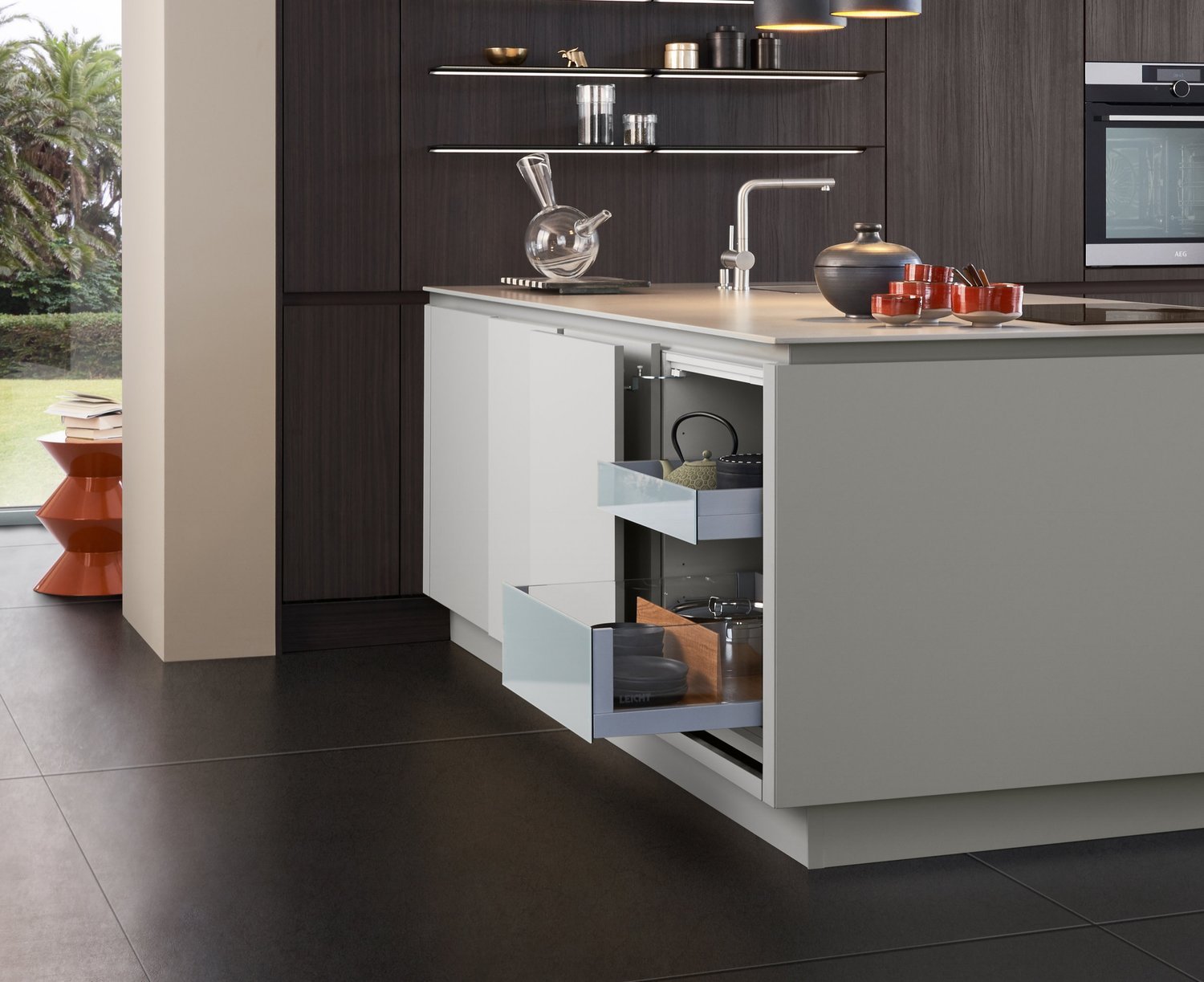
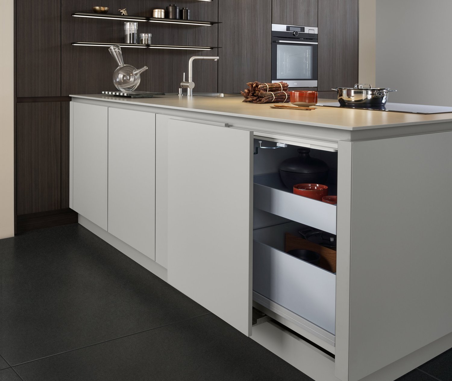
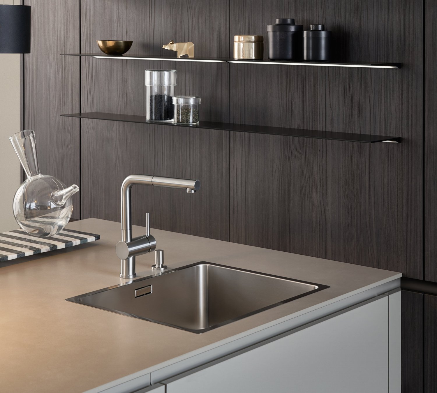
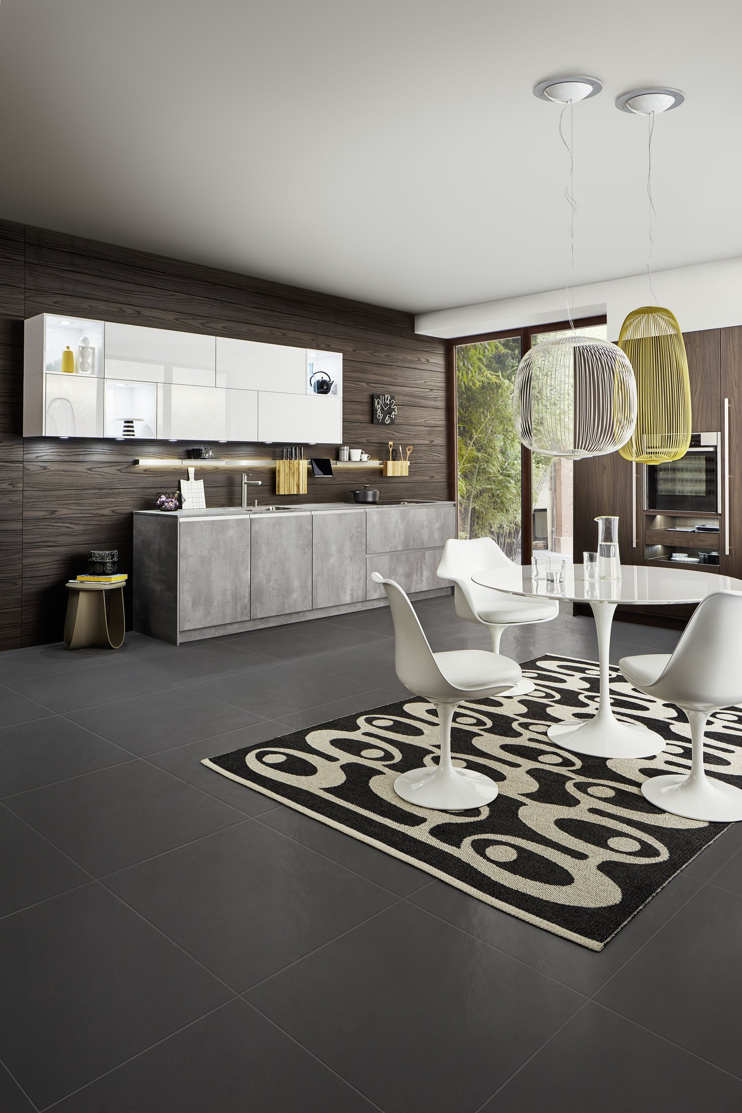
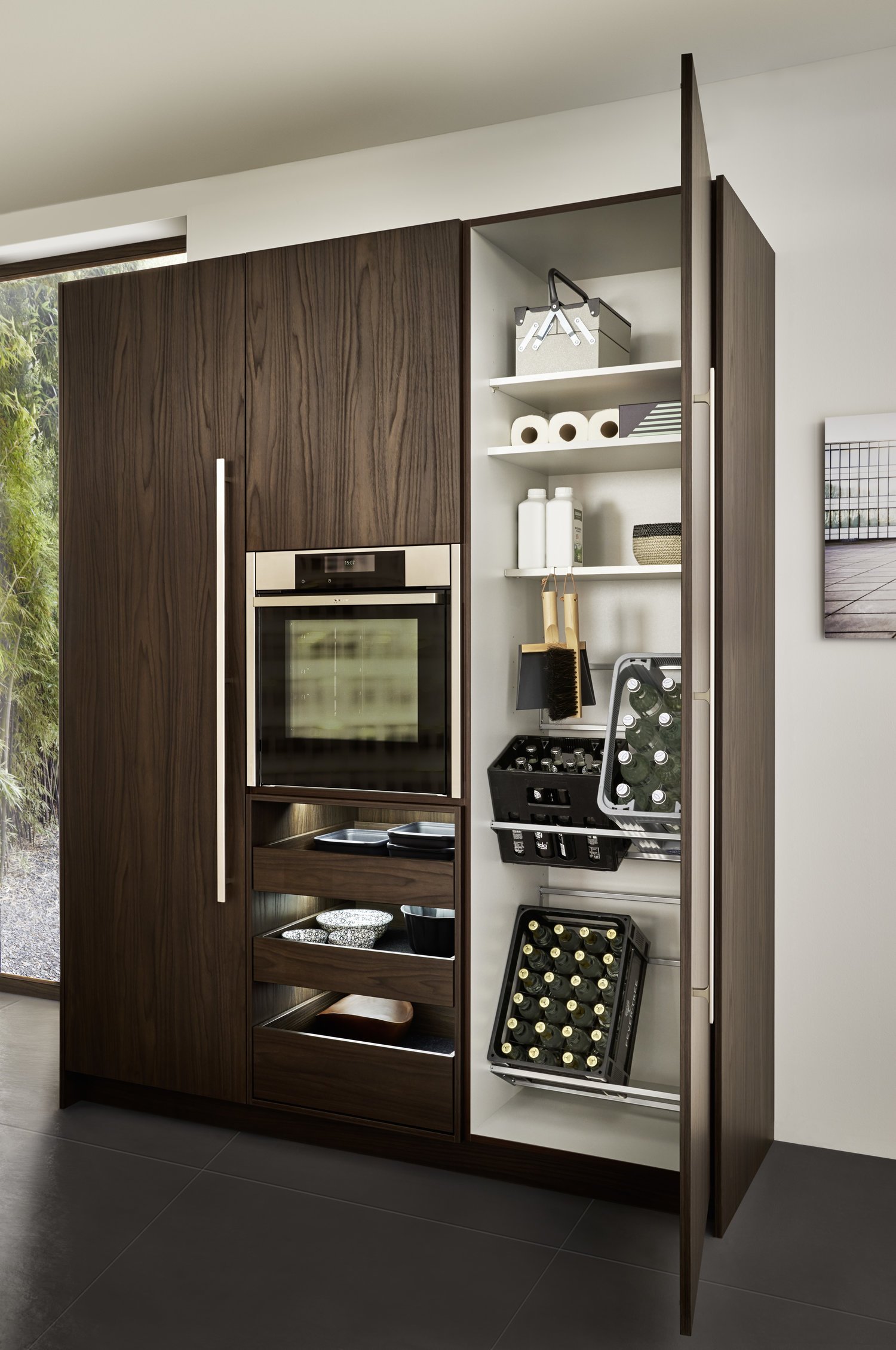
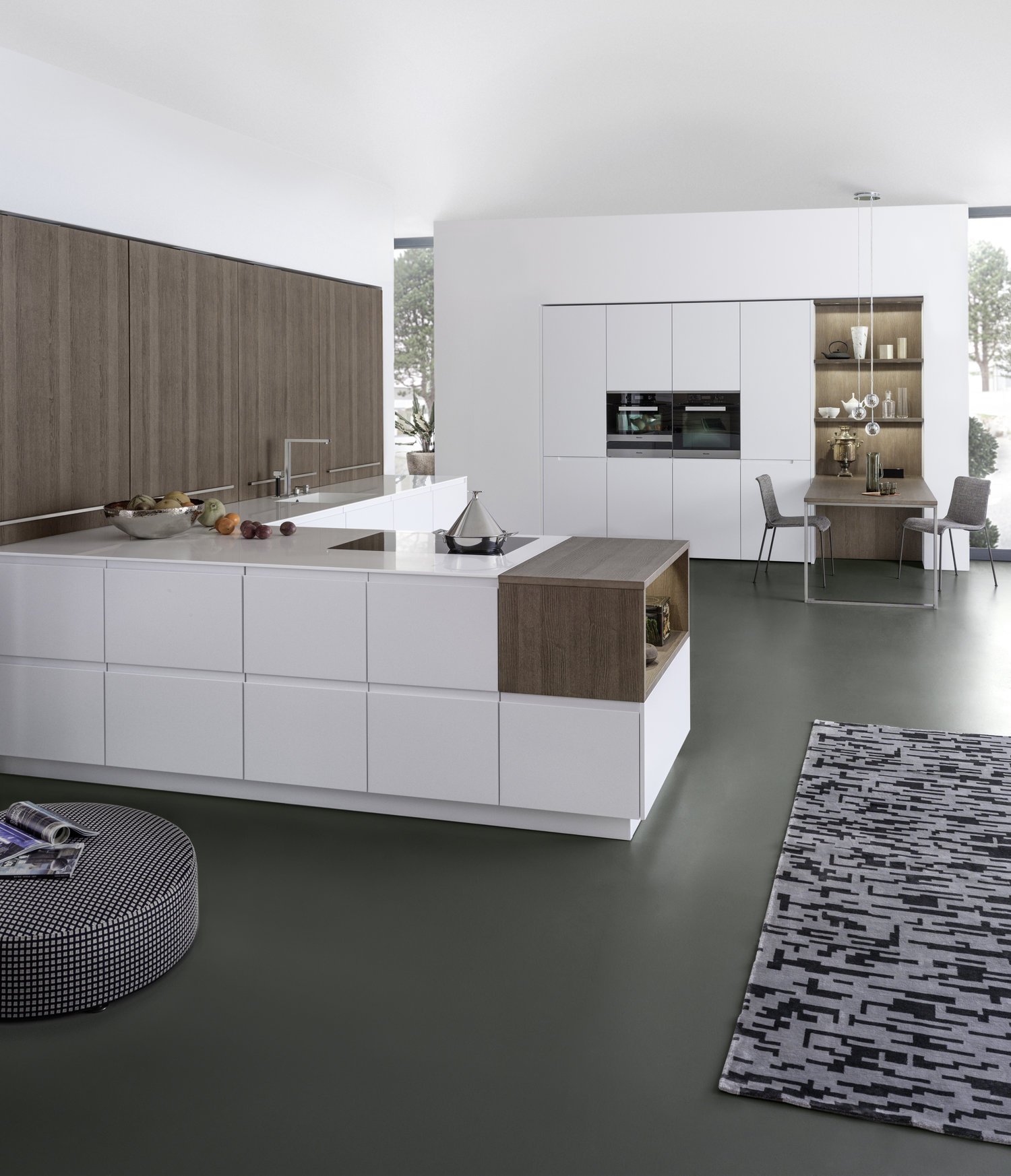
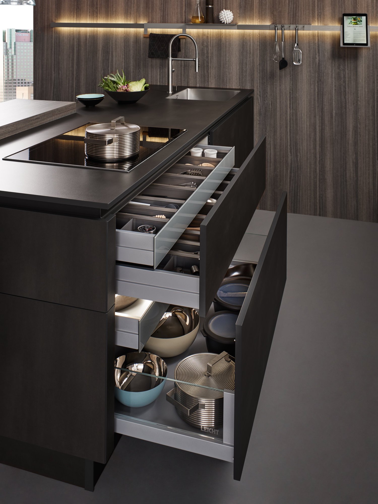
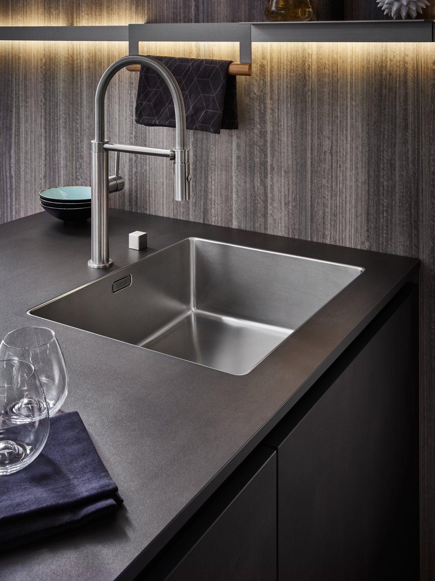
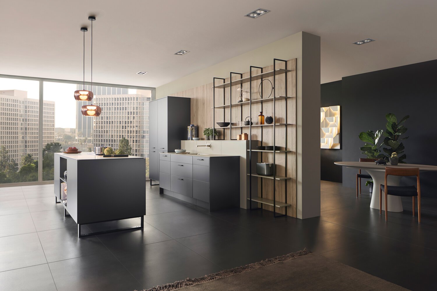
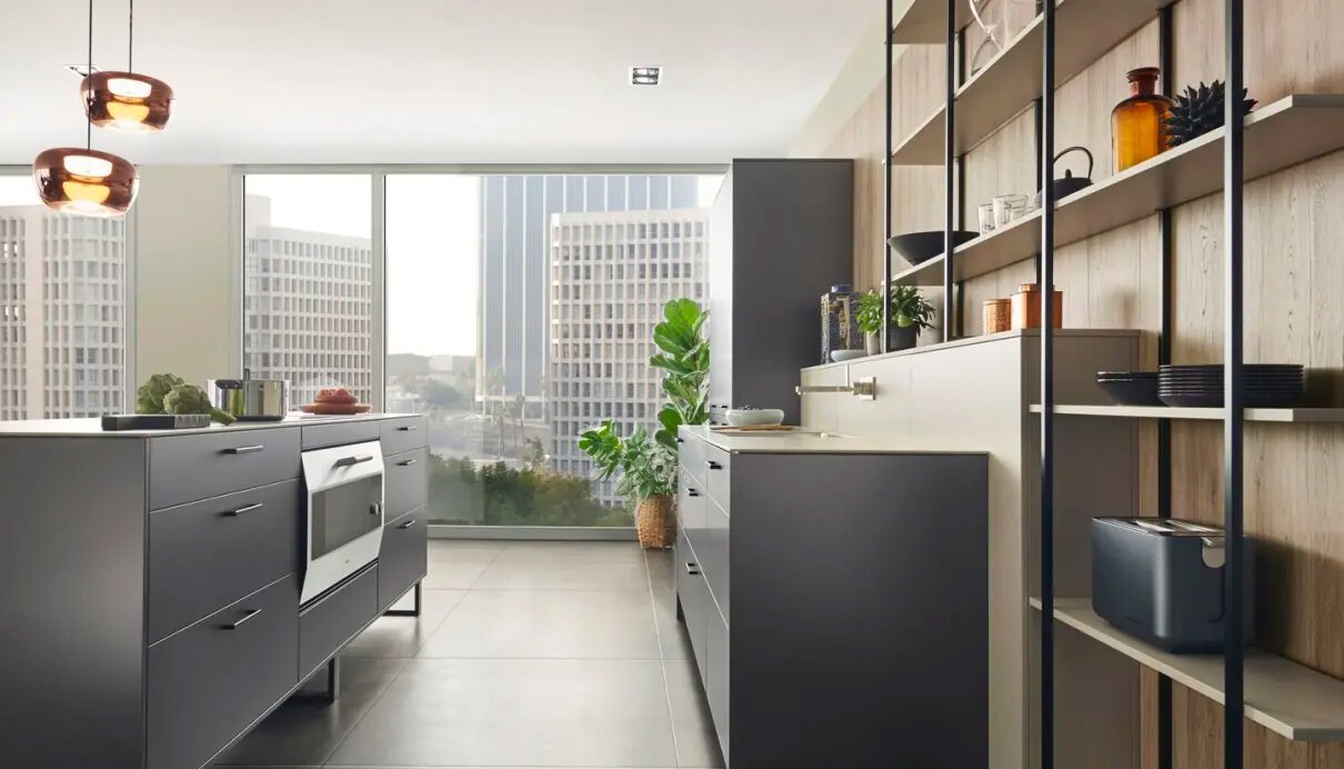
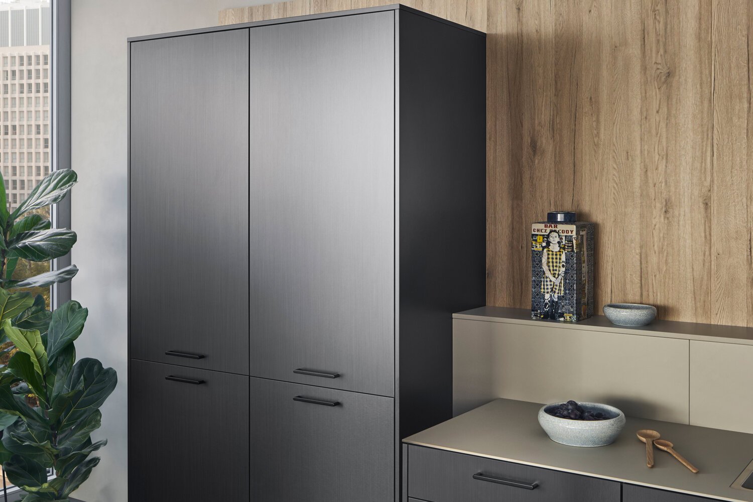
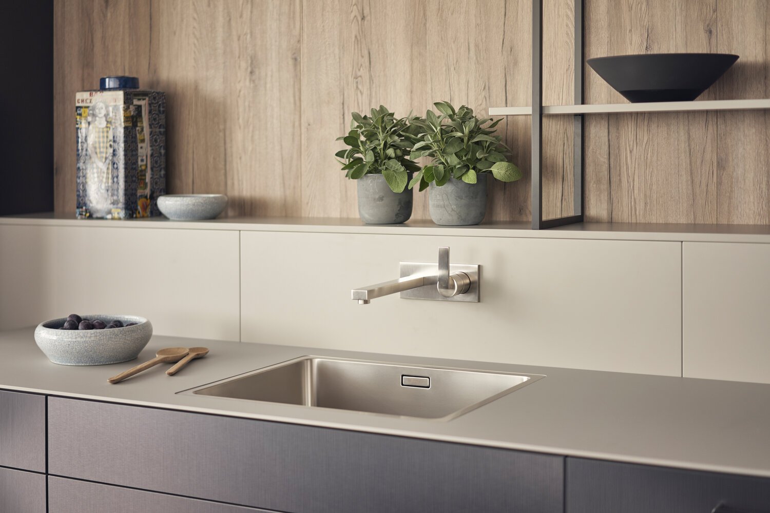
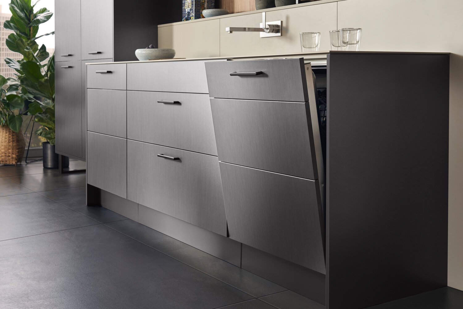
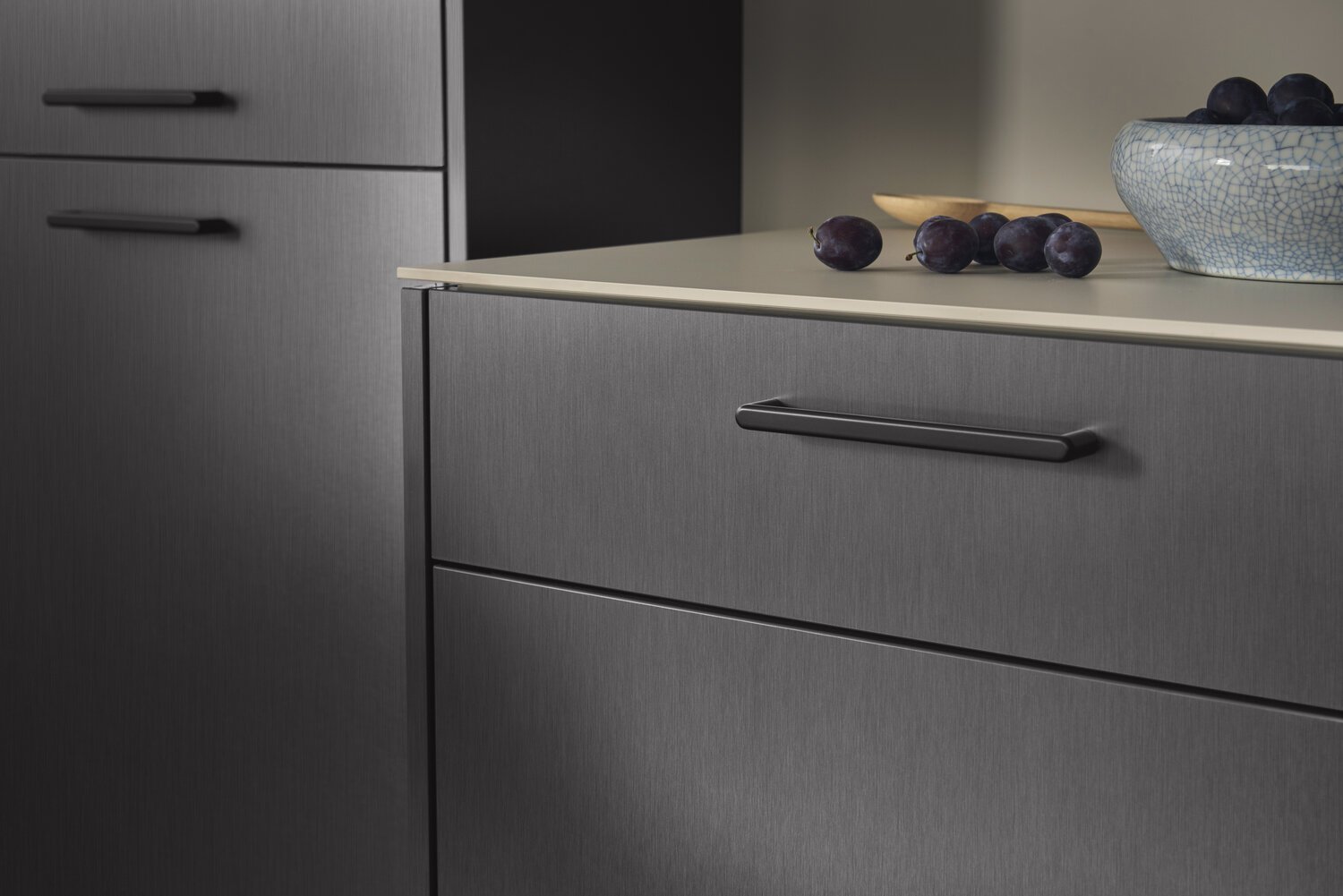
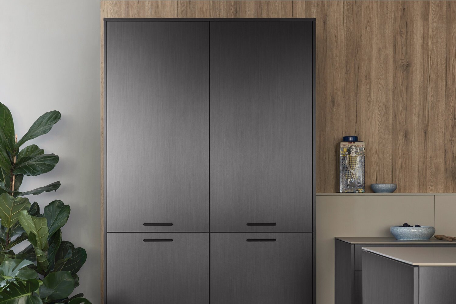
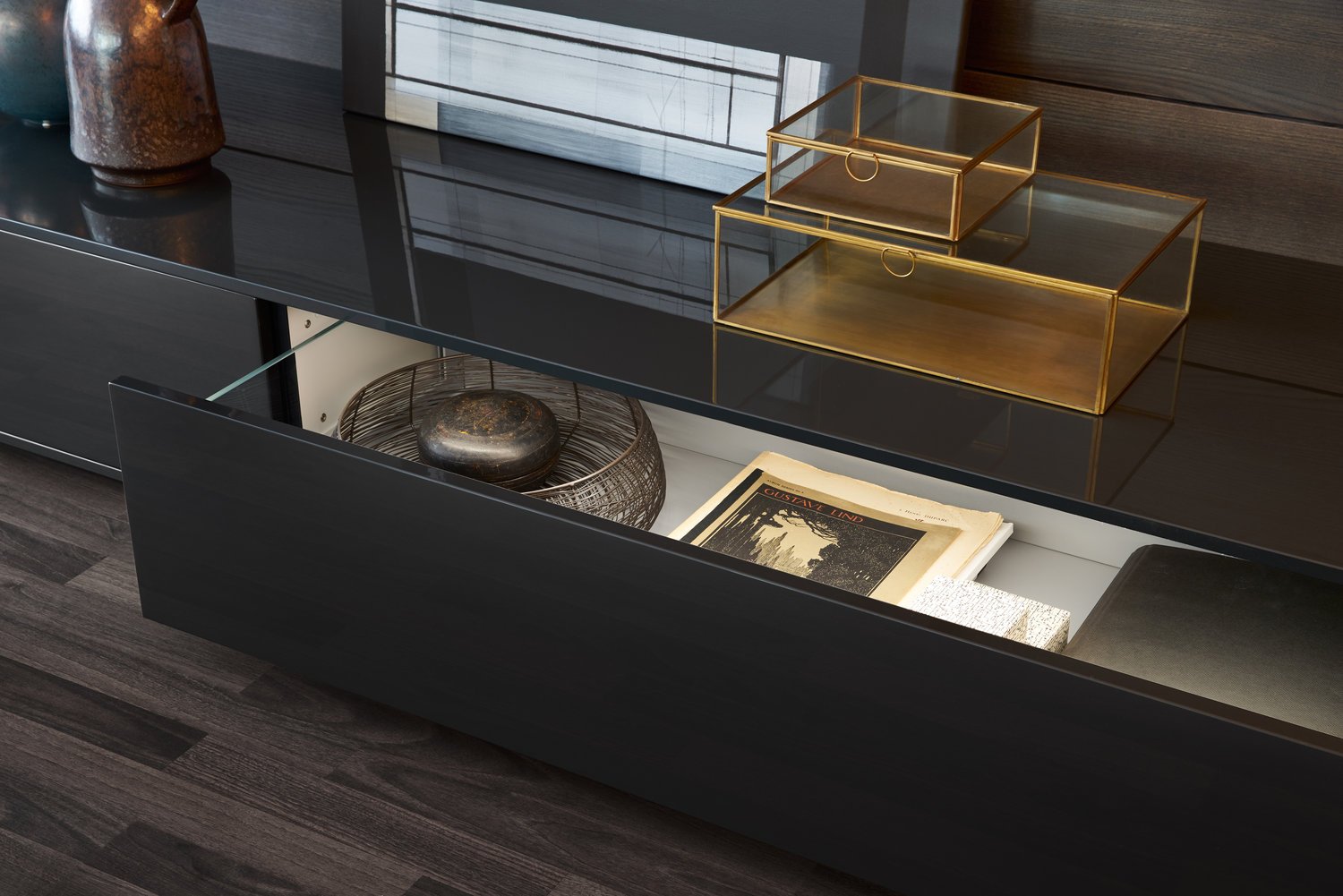
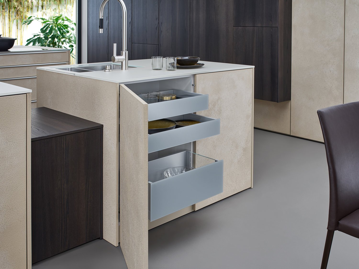
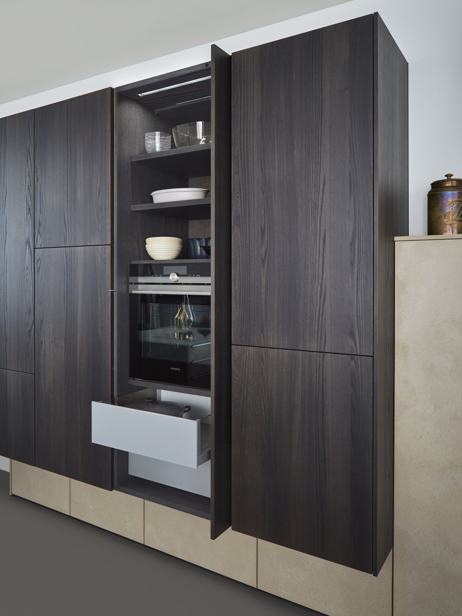
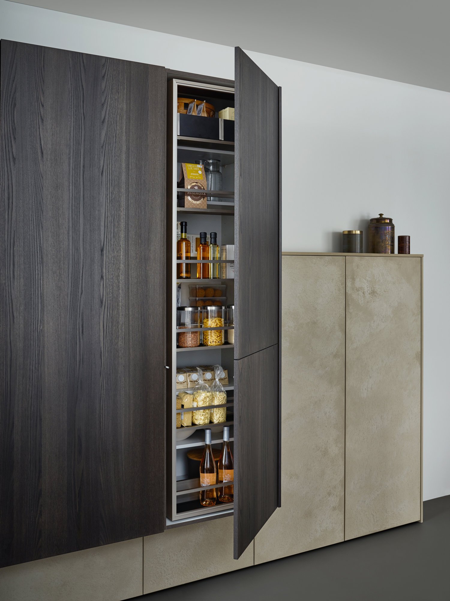
BOSSA, a surface with thick veneer application and vertical embossing. The complete cladding of the handle-less kitchen run and the adjoining units with the new BOSSA programme in walnut is an architectural statement that makes no compromises in terms of function or aesthetics.
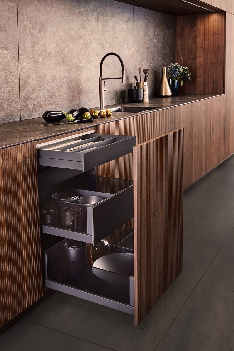
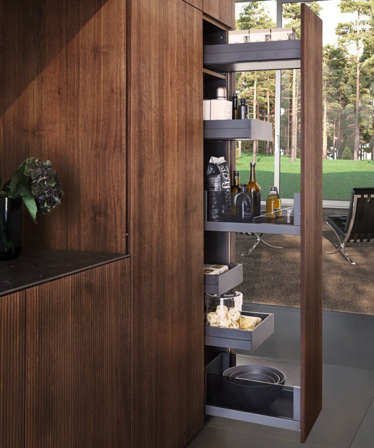
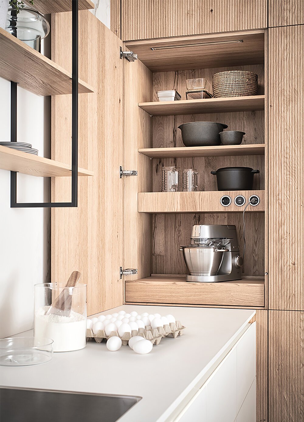
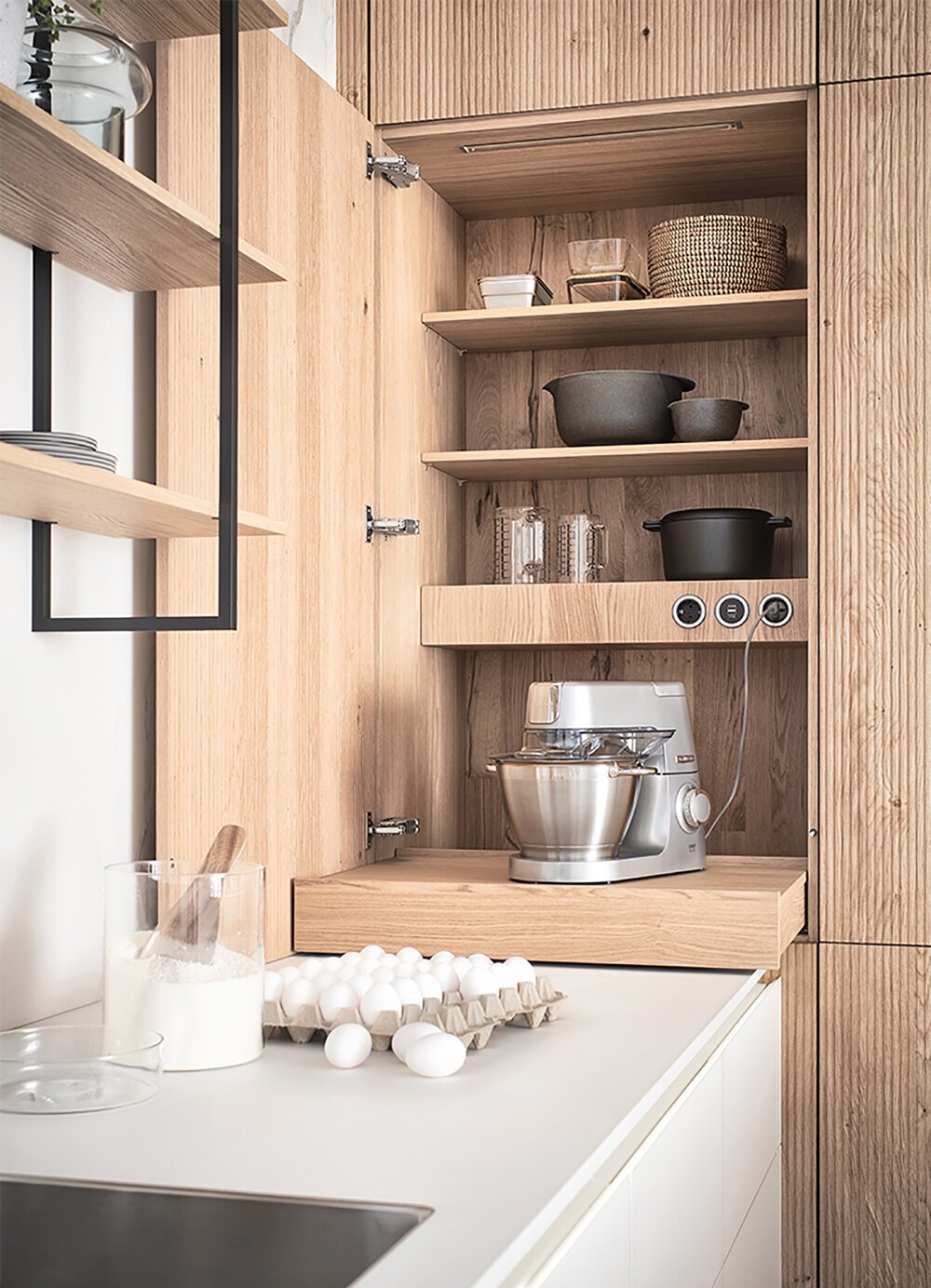
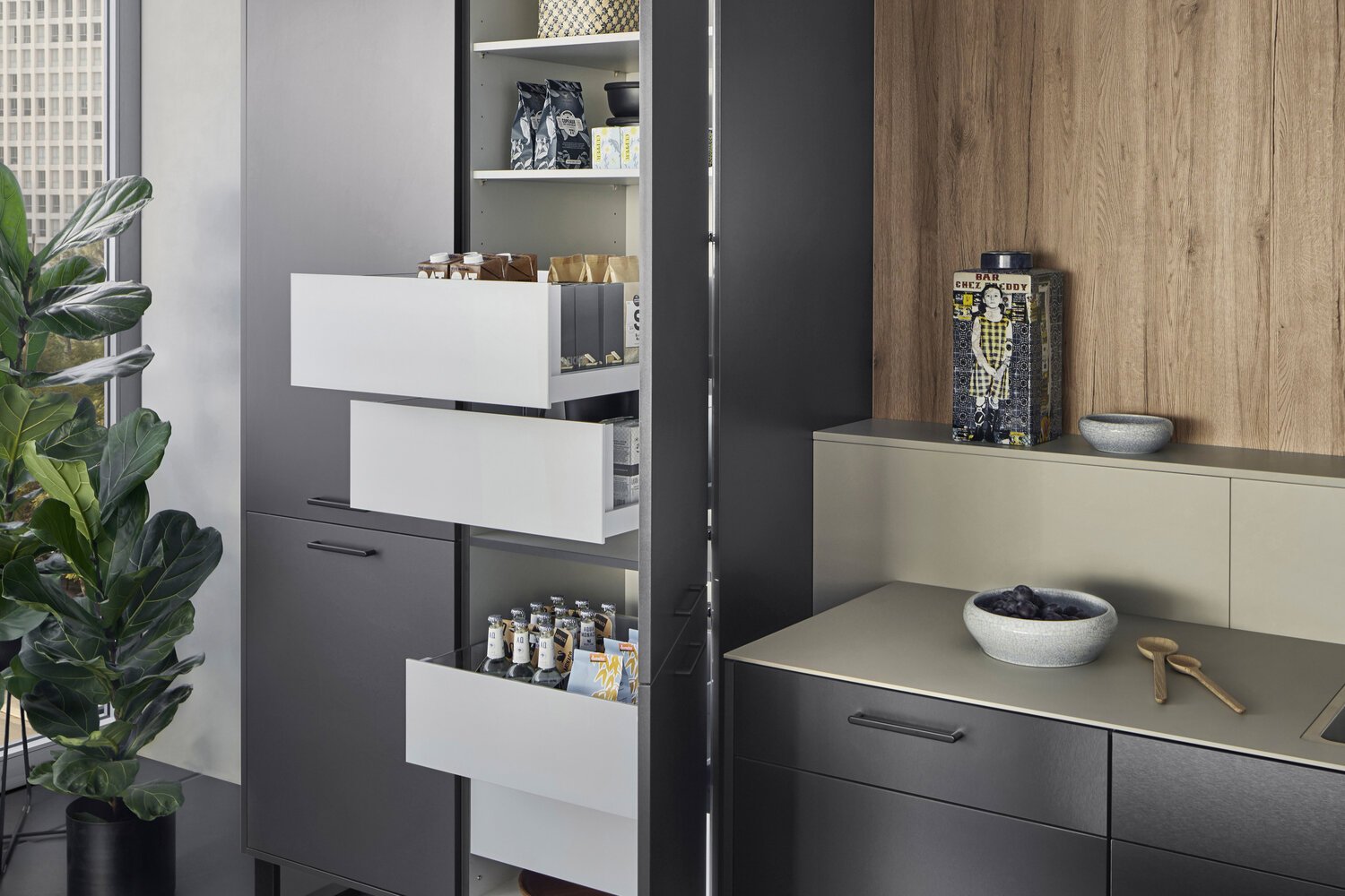
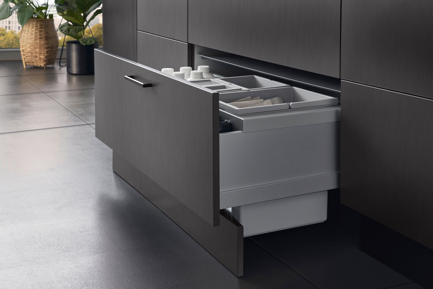
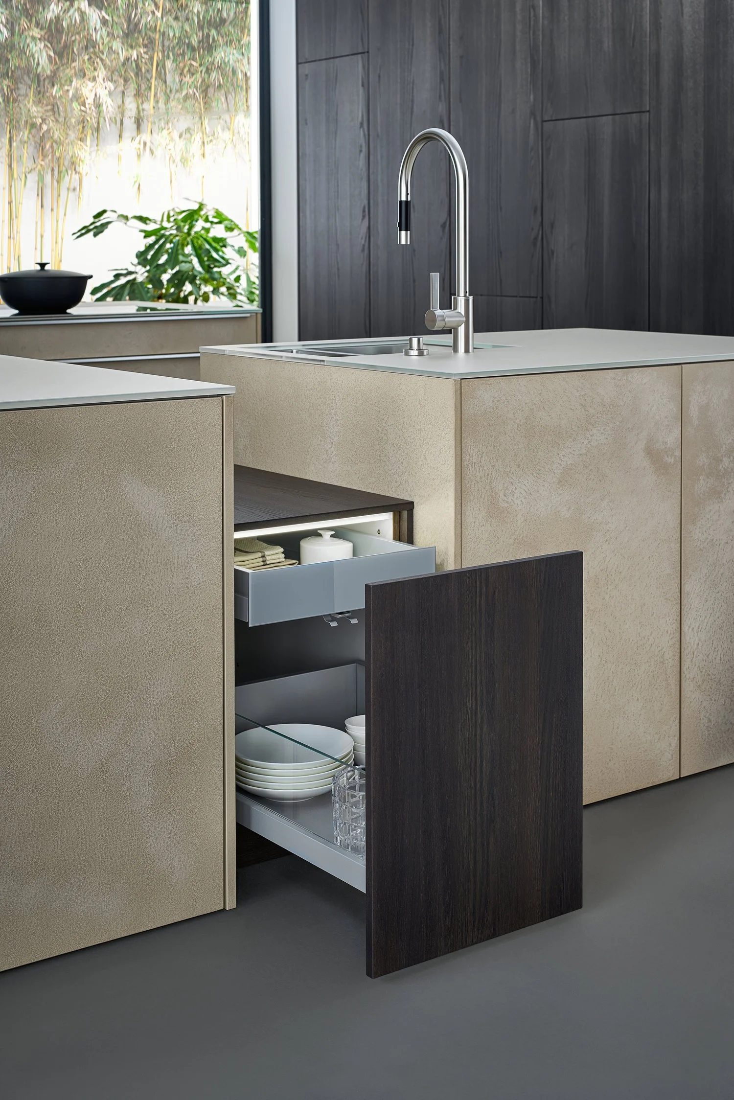
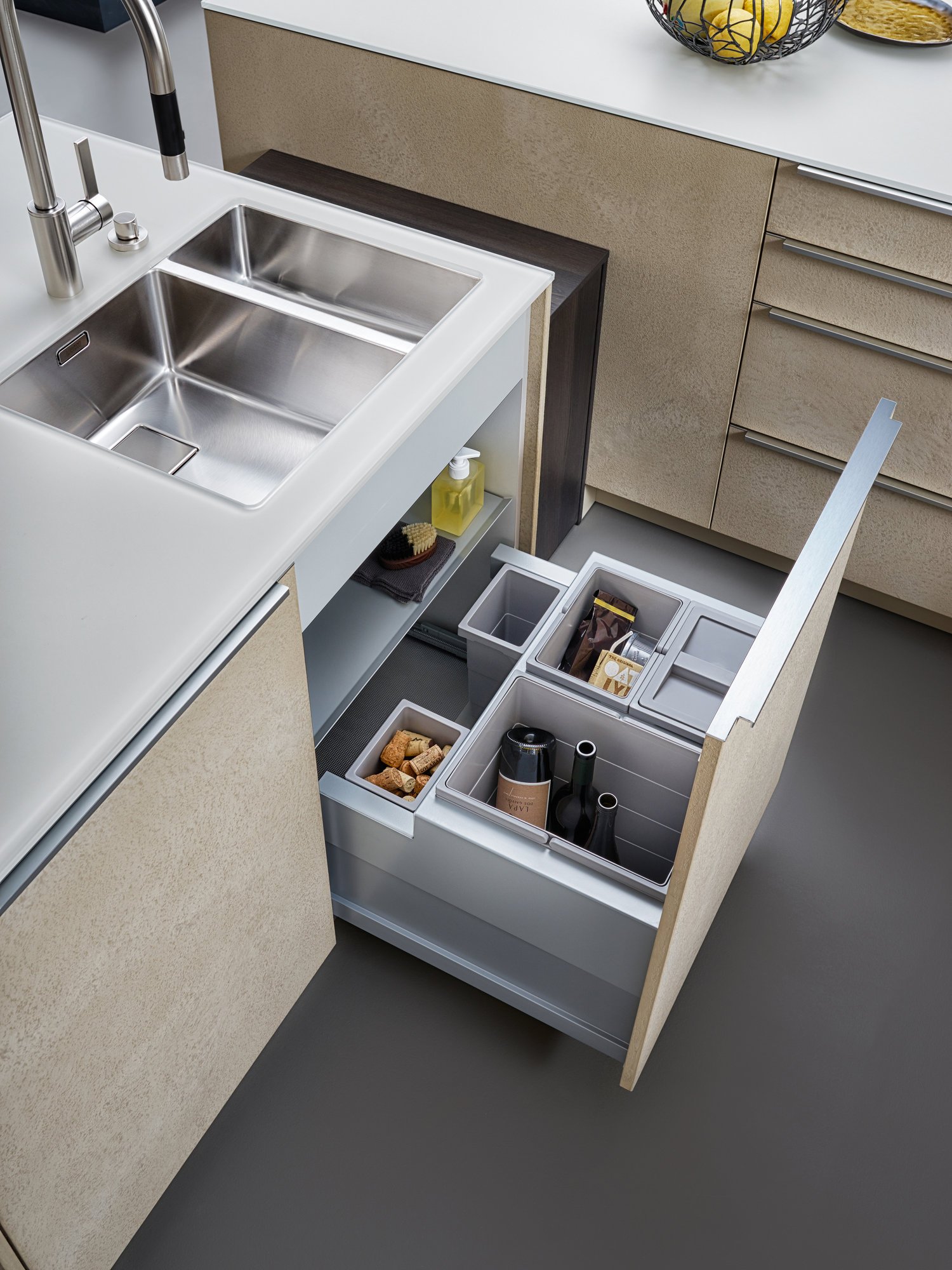
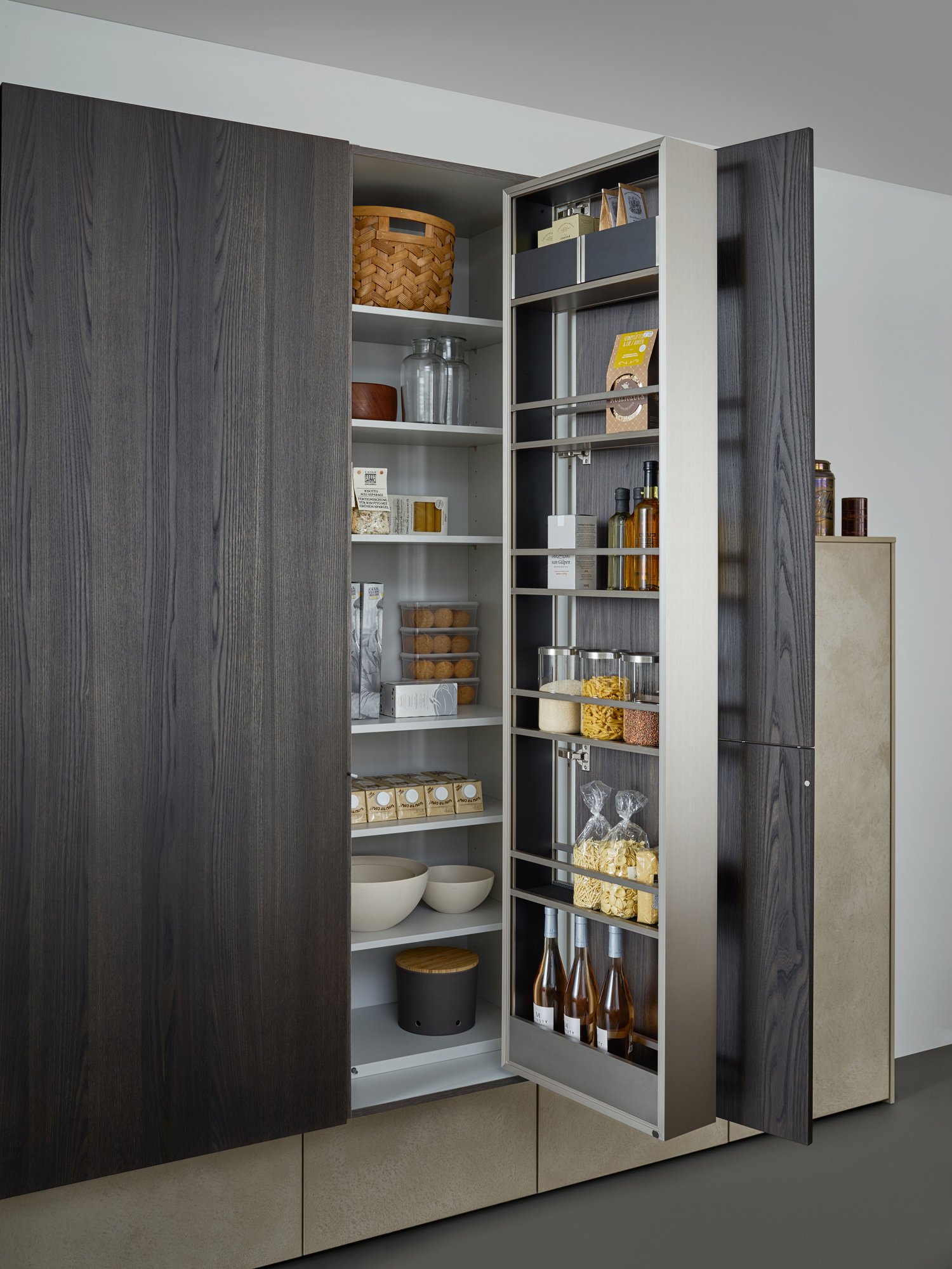
All equipment as well as storage space solutions are concealed behind the BOSSA front clad with fine walnut, which makes it possible for LEICHT to style large areas in a completely homogeneous manner. Together with the BOSSA surface, the carcase, available for the first time at a height of 86 cm and featuring the new colour carbon grey, creates a uniform, perfect look throughout the entire living space.
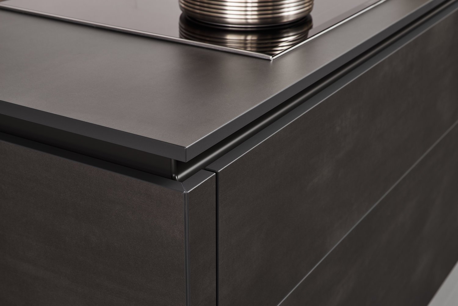
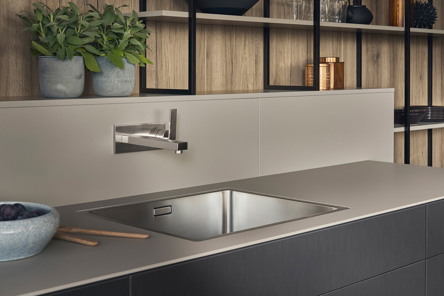
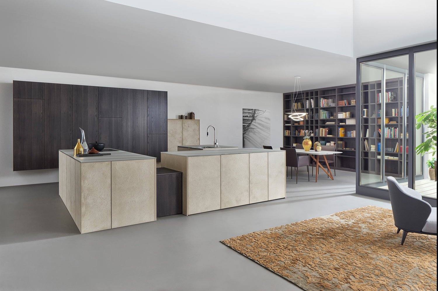
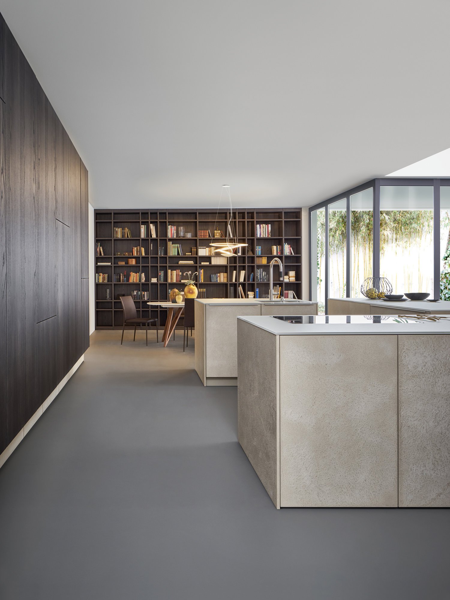
The second material in this kitchen scenario, mitred ceramic, is shown to its best advantage in combination with the dark walnut. The free-standing island block in front of the kitchen run as well as the worktops are also made of this high-quality ceramic – they underline the sophisticated, luxurious look of this exceptional kitchen.
CLASSIC-FS | TOPOS
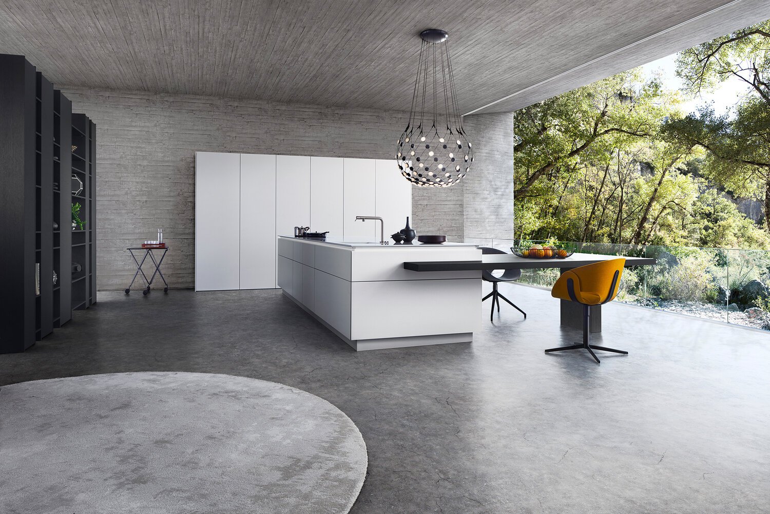
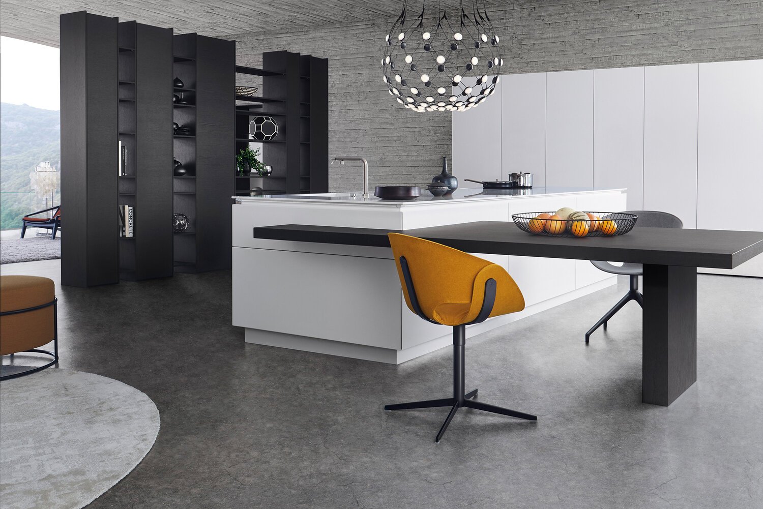
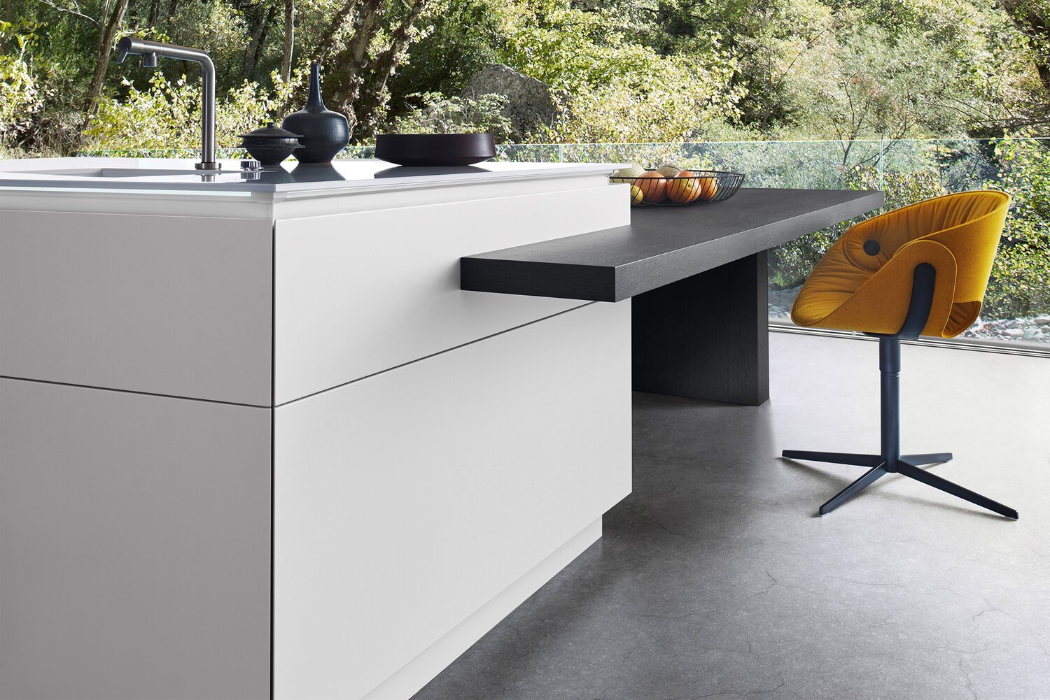
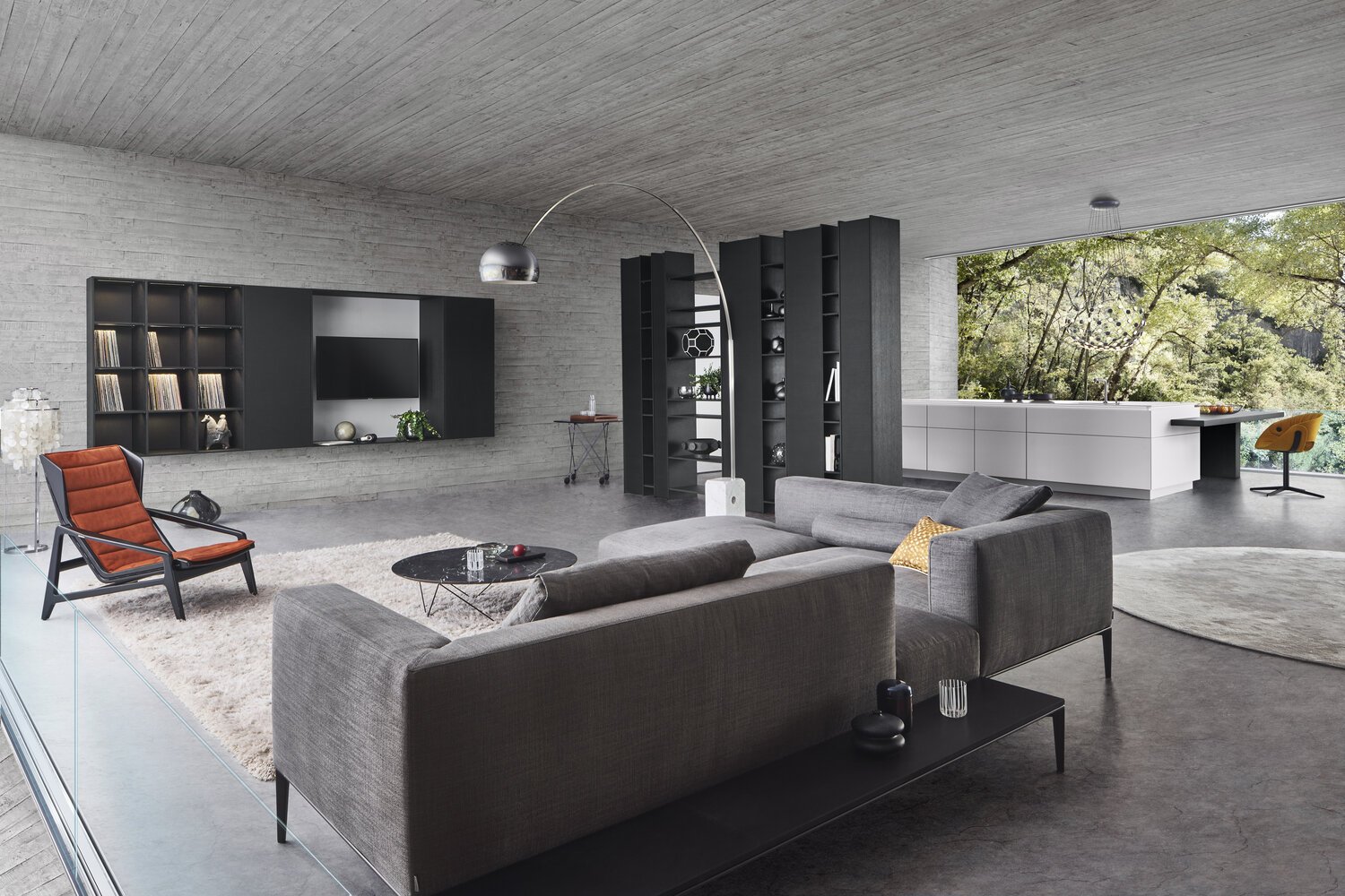
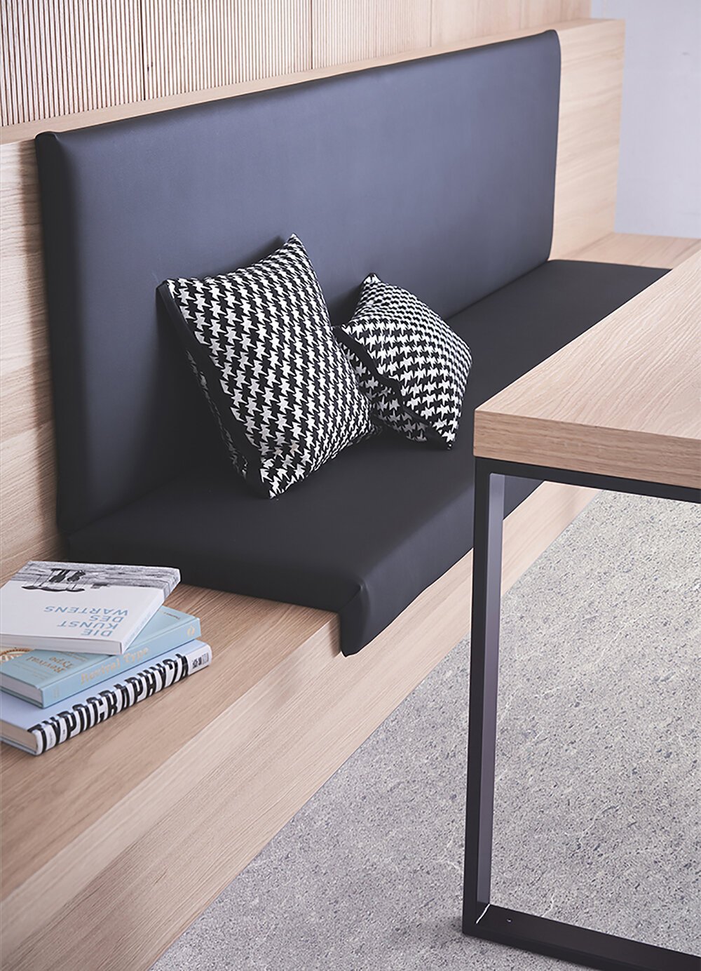
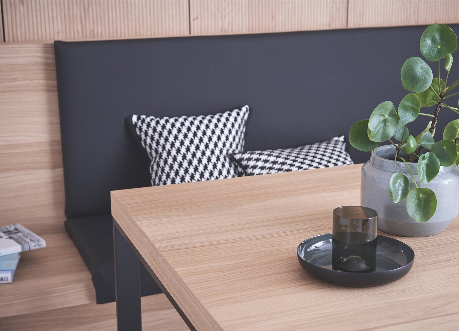
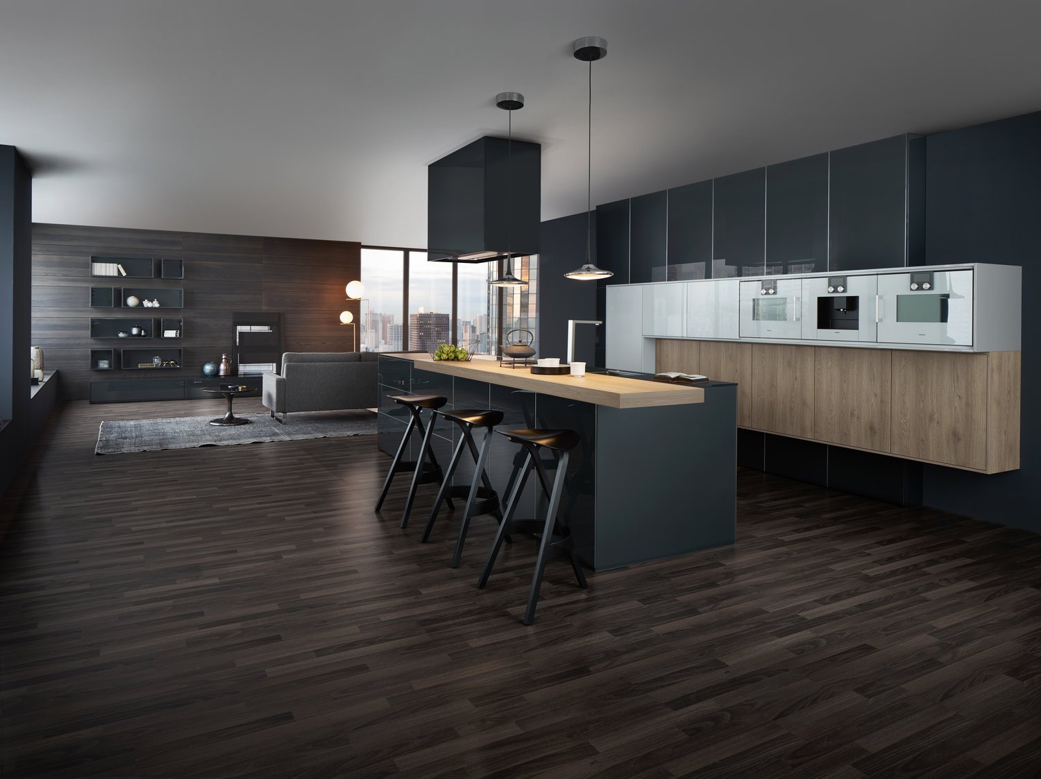
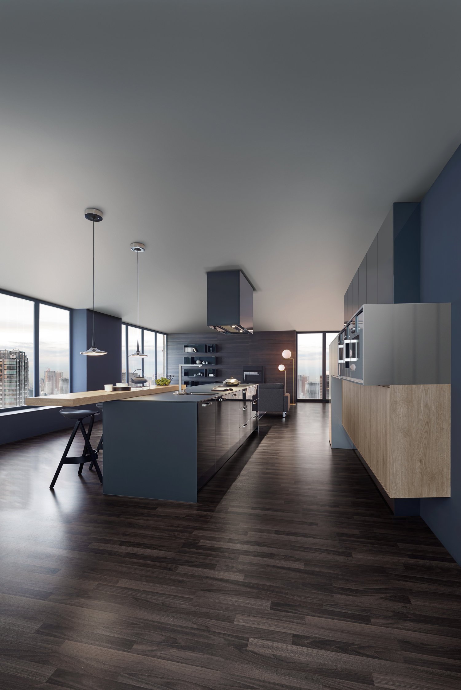
This kitchen embodies the fusion of kitchen and living to form a holistically planned living space. The handle-less island block and the seating area in dark wood flow into one another. The mitred pull-outs and panels elegantly merge with one another.
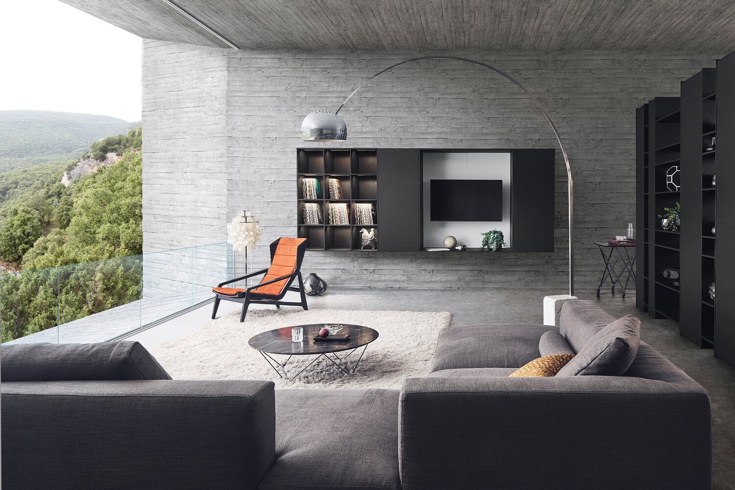
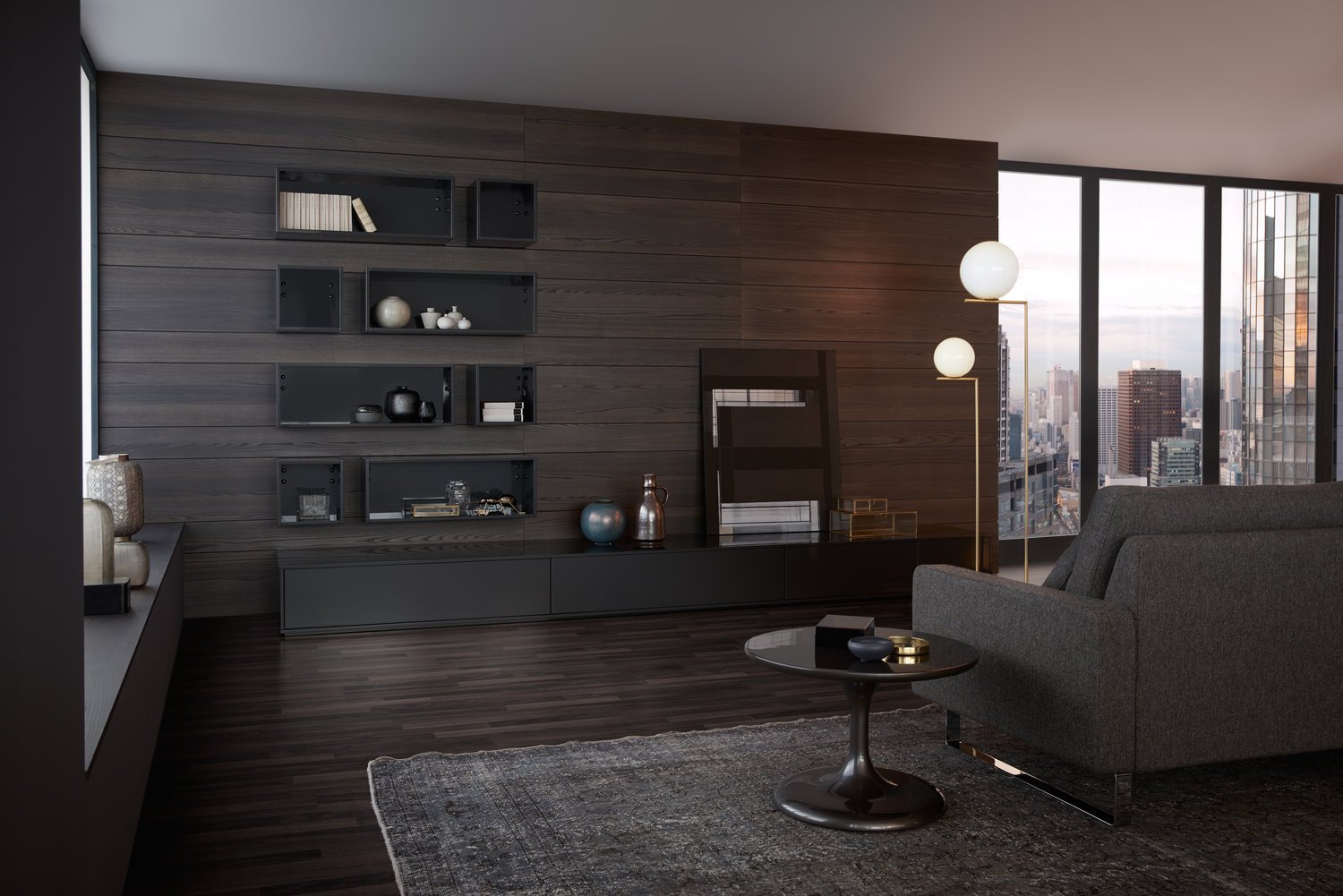
As the perfect continuation of the kitchen area, the living space merges both optically and functionally into this atmosphere. The architectural element featuring open and closed shelf and unit sections is a skilful way of dividing the room: it creates visible axes of vision into both areas without taking away any of the intimacy and thus makes for communicative connections within the room.
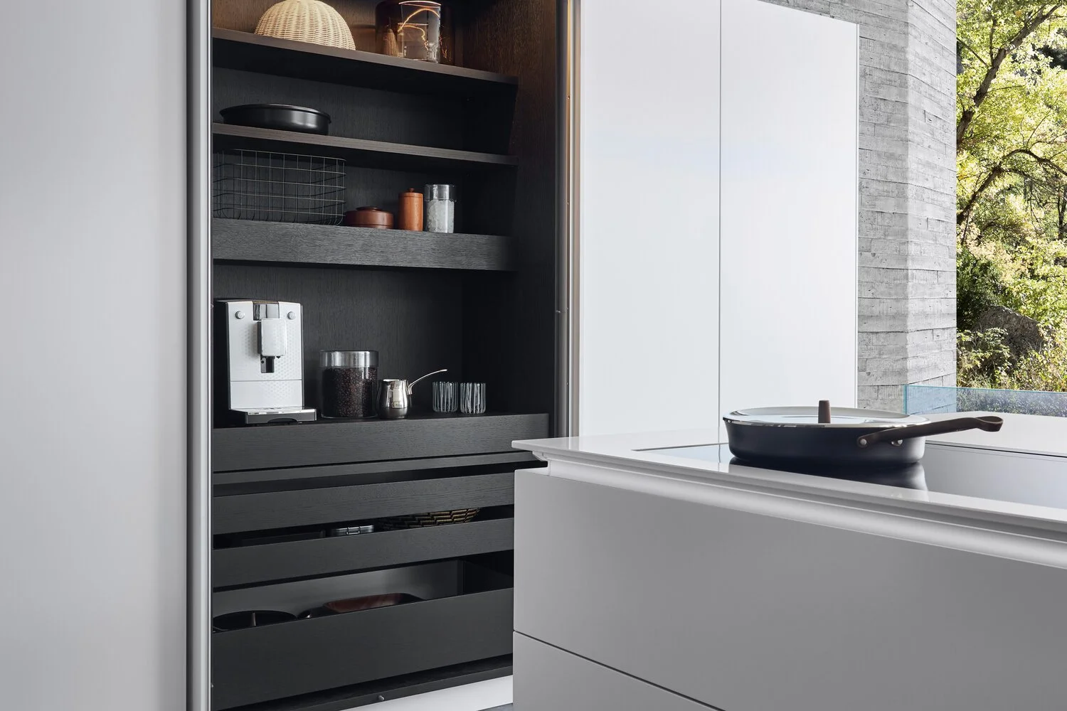
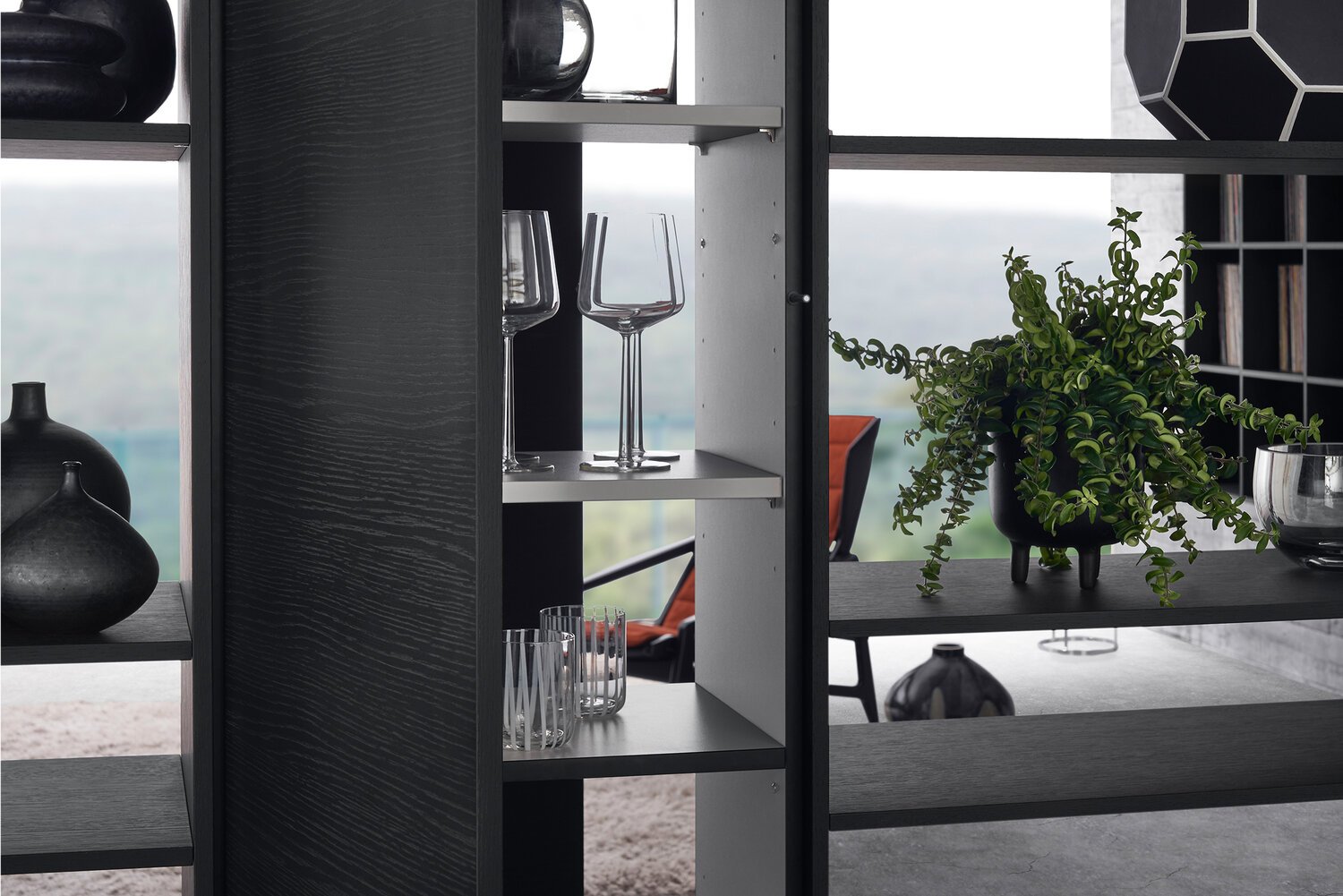
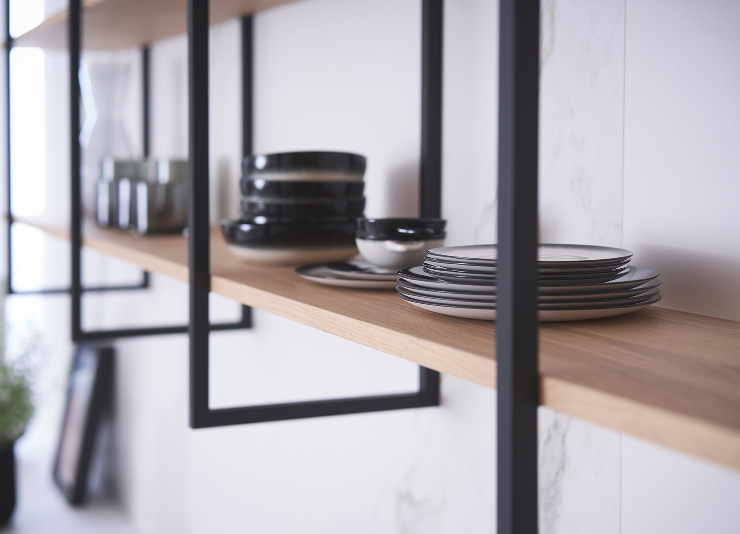
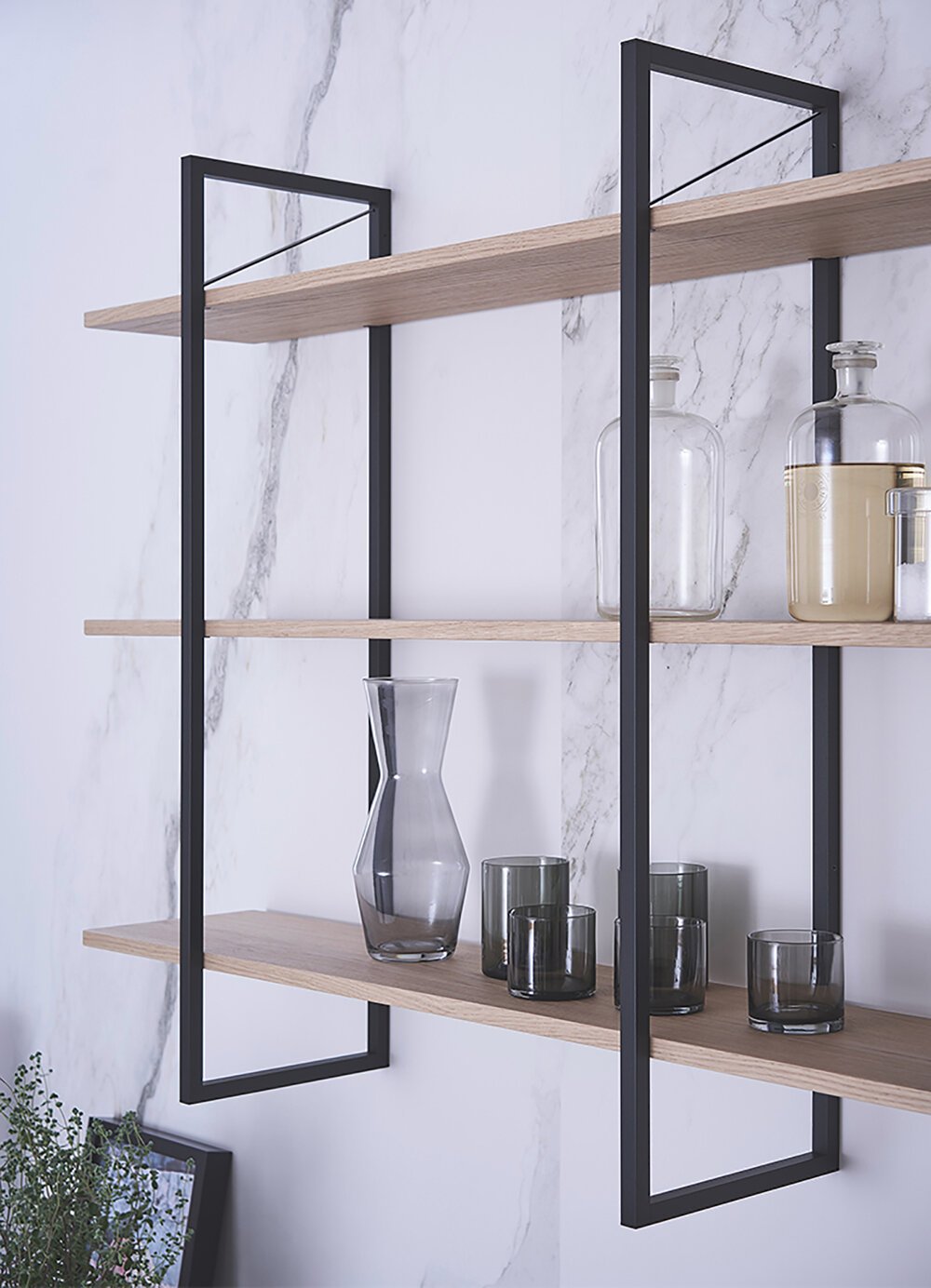
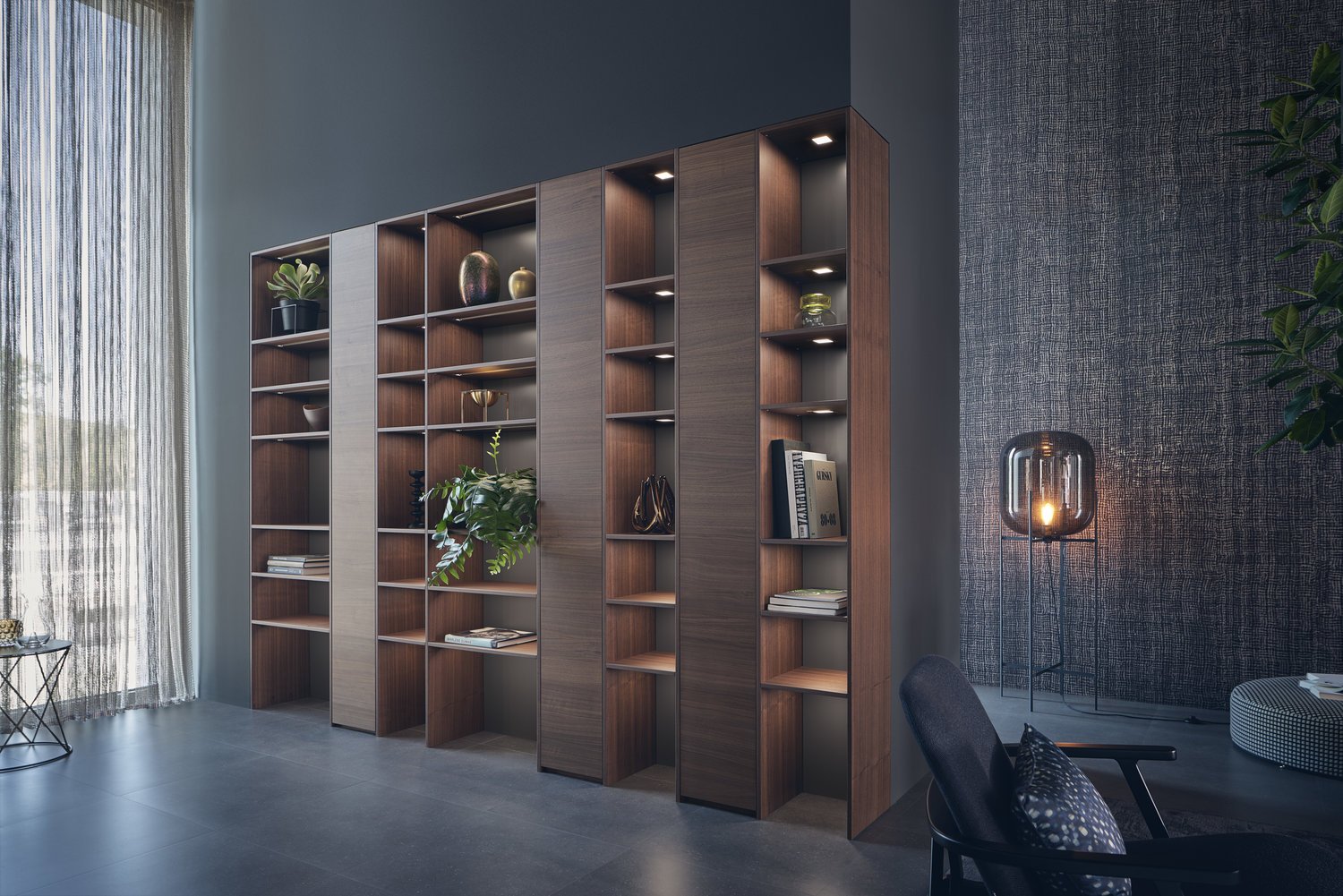
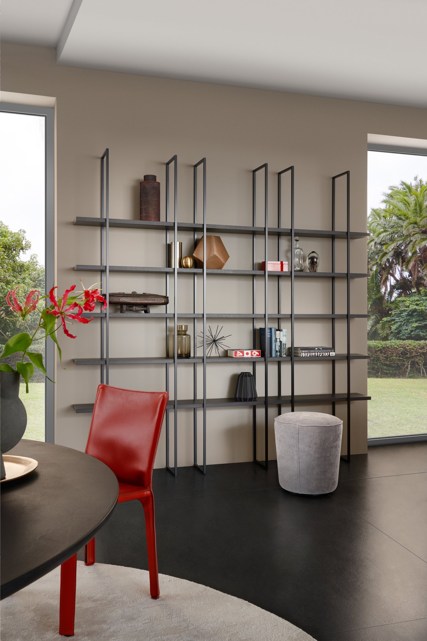
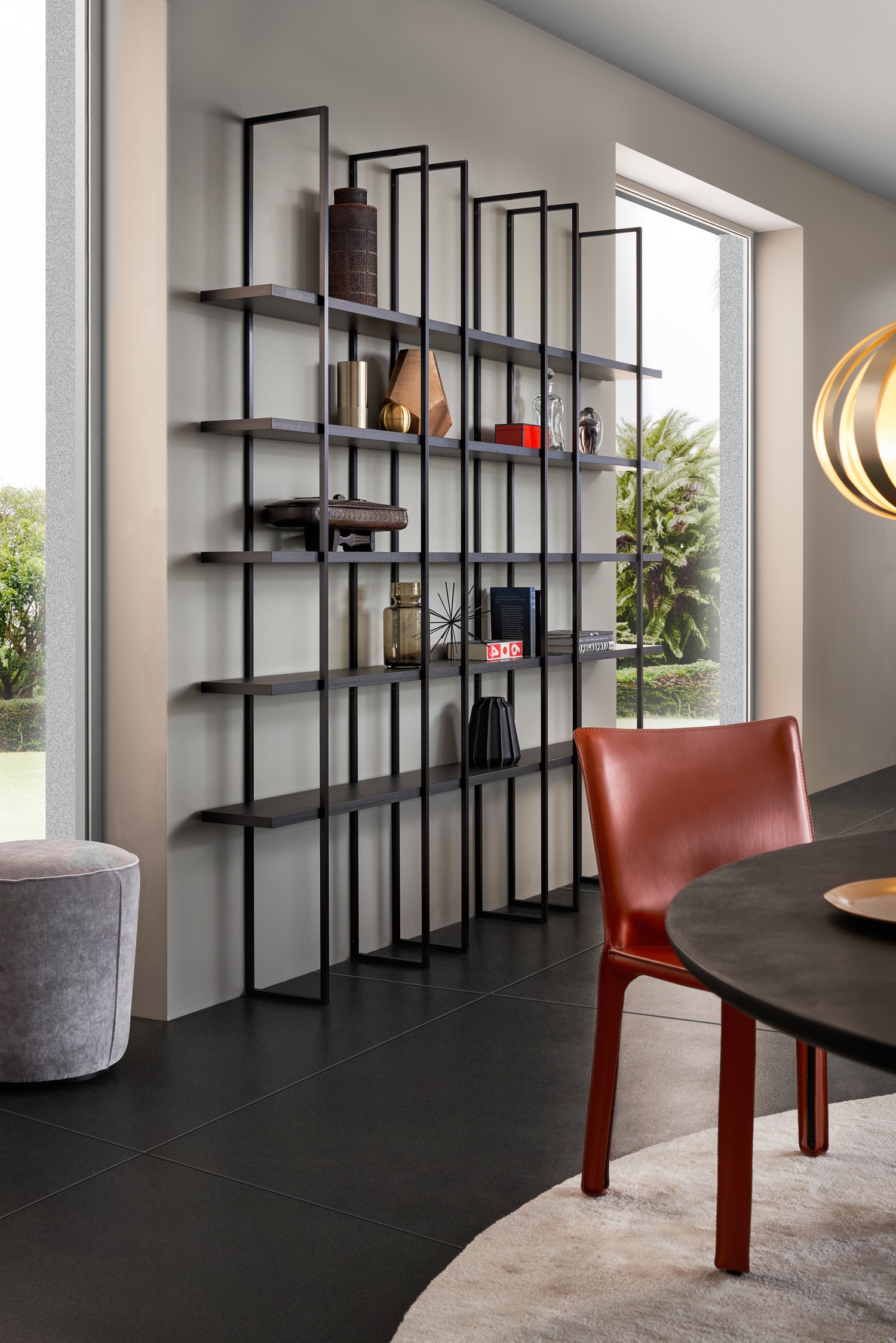
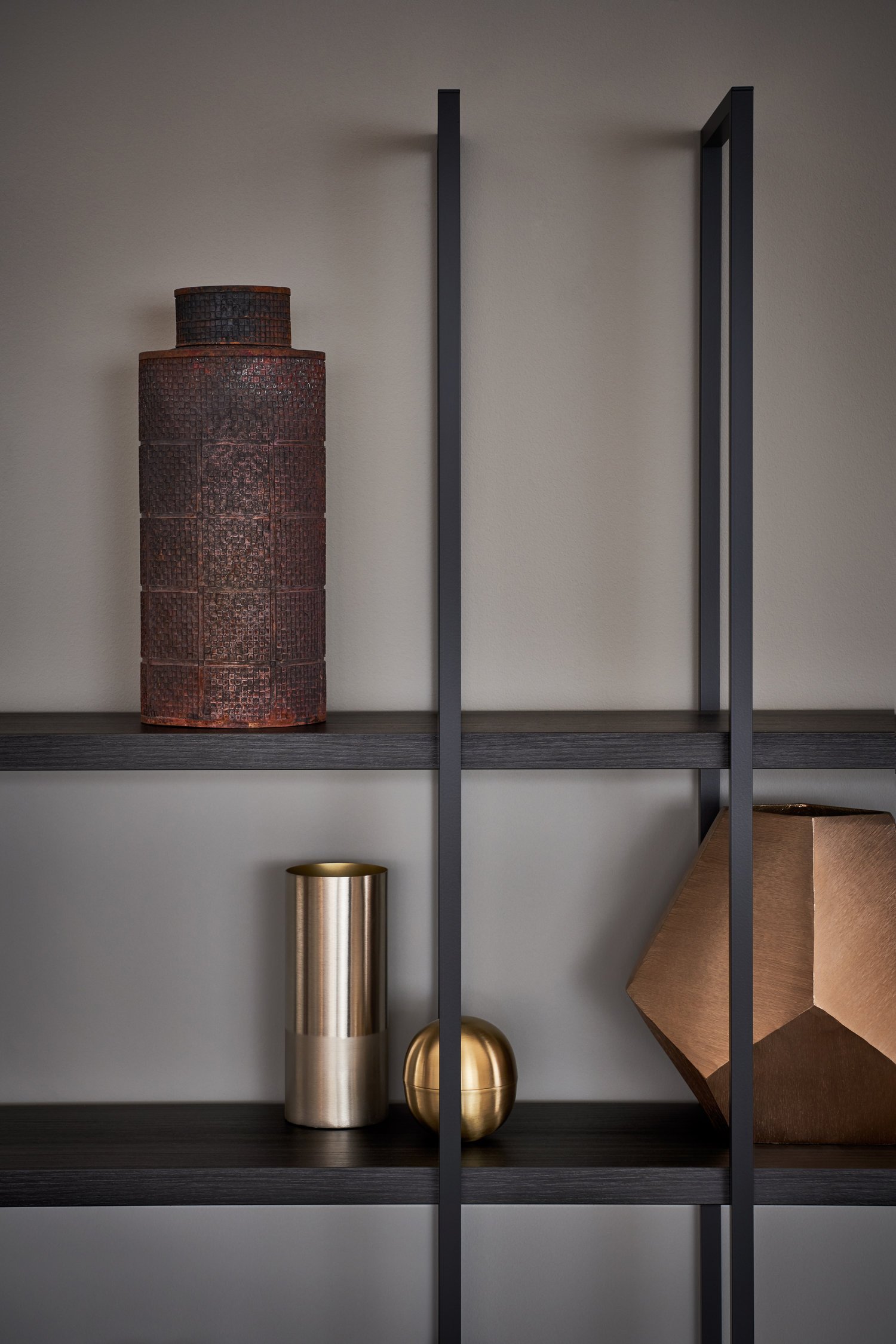
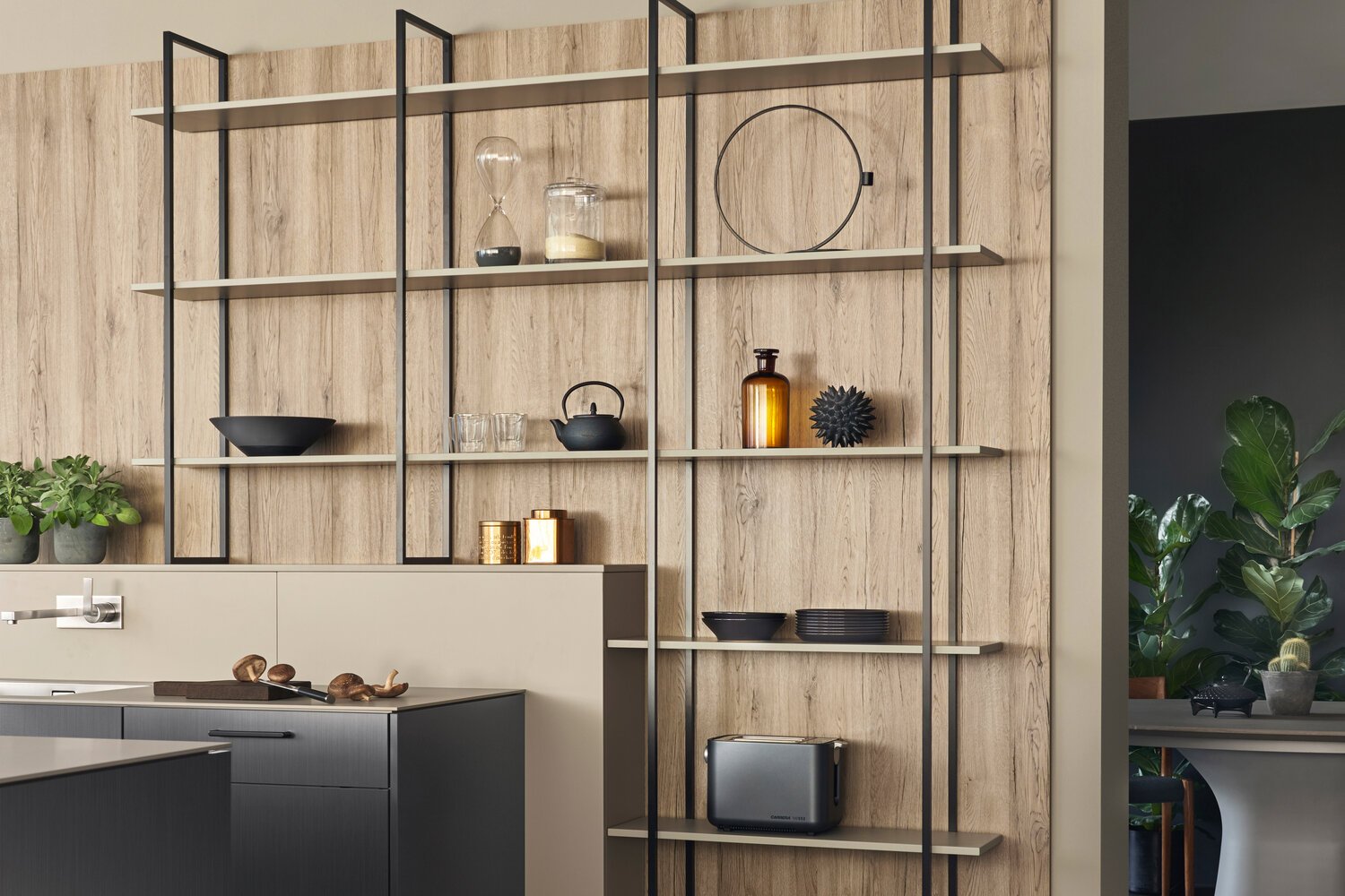
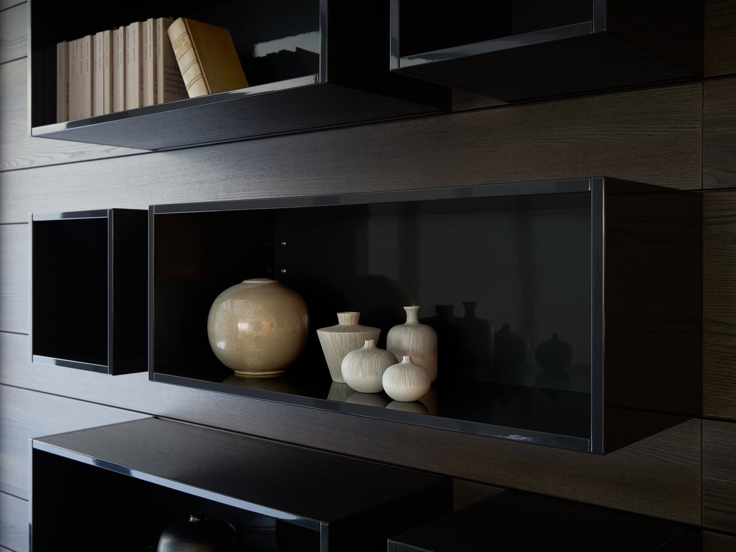
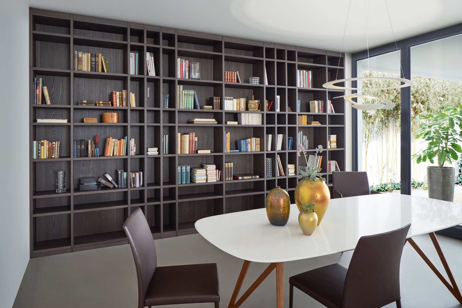
Its counterpart opposite is an individually plannable shelving system which showcases accessories in an elegant setting and picks up the high-grade wooden materials integrated in the kitchen. Within the kitchen and living area, the interplay of black and white with light lacquered surfaces and the dark oak of the LEICHT range TOPOS in combination with visible rough concrete highlights a timelessly luxurious contrast as well as an architecturally clean look.
BOSSA | F 45
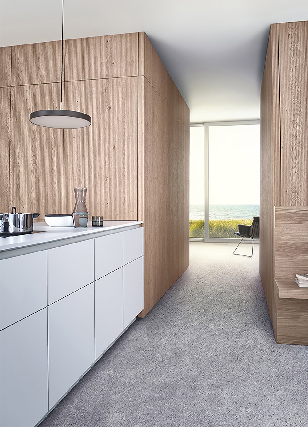
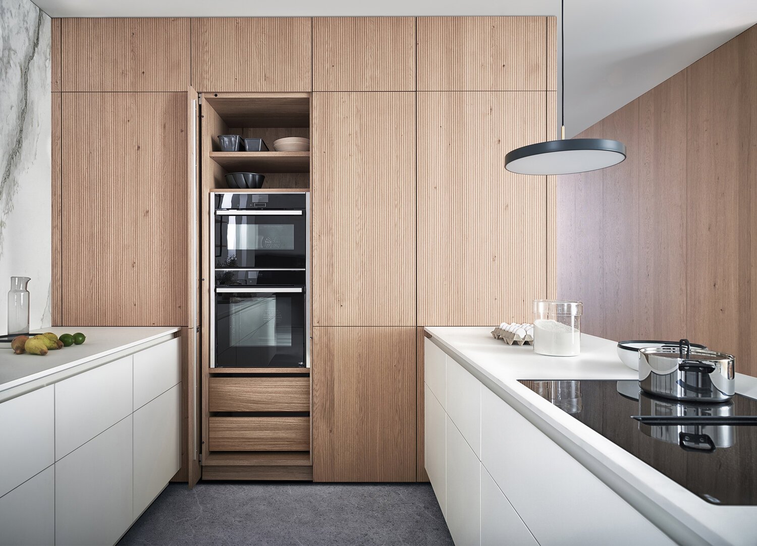
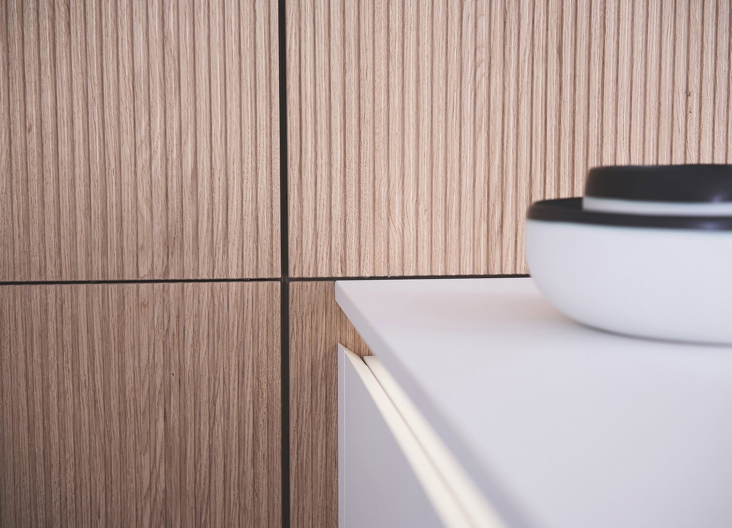
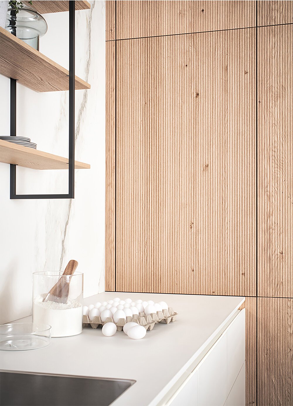
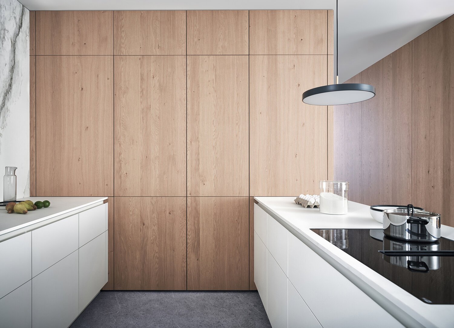
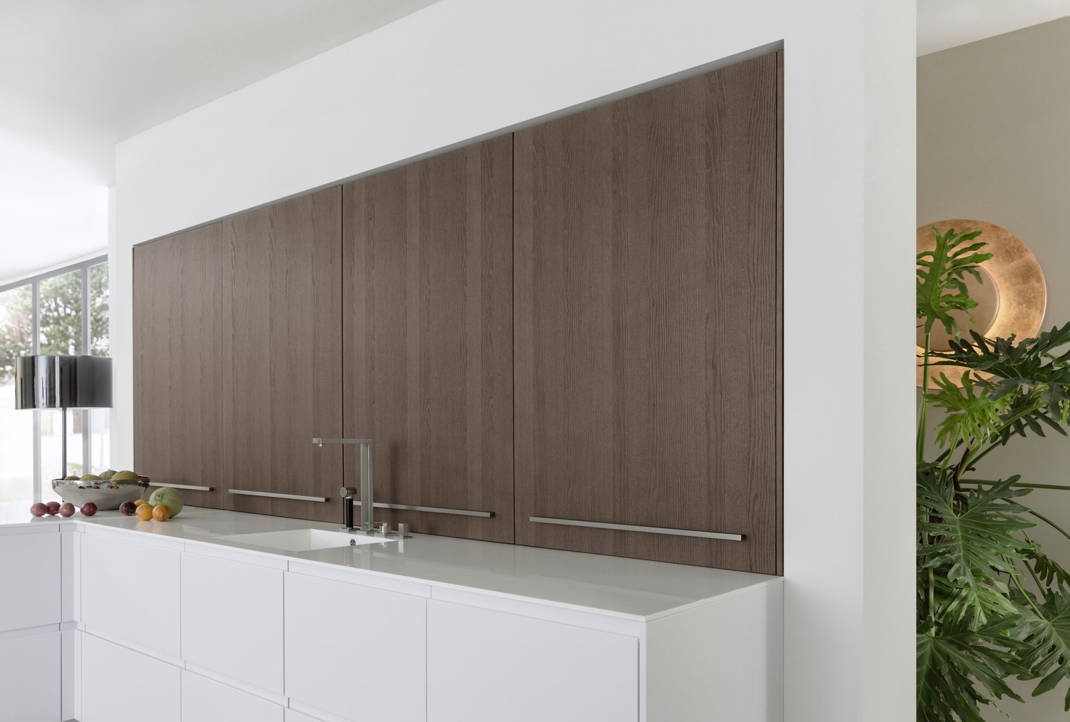
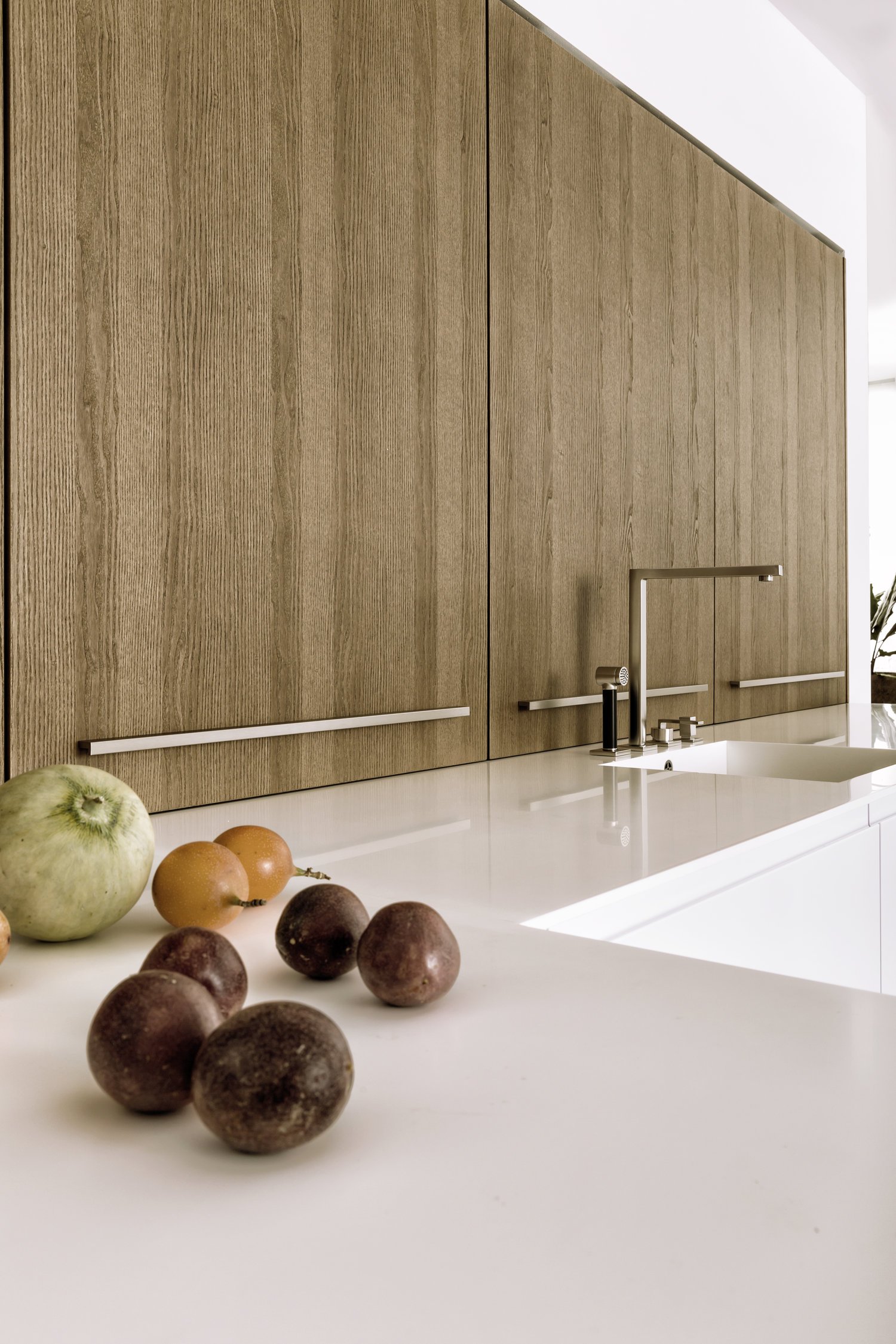
In architecturally sophisticated kitchen designs the new real wood surface BOSSA in light oak is used as front panelling from the entrance through the hall to the kitchen area. Large-scale wall elements running right up to the ceiling shape the creative look within the living areas. The vertically structured wall surfaces create a rhythmic, upward flowing effect with a lively impact.
The new surface ensures these kitchen modules are not perceived as functional but as homely elements, with the slimline cooking area very obviously centring exclusively around the two kitchen runs. In this handle-less, large-scale planning scenario, the incorporation of the BOSSA range exudes an inviting calm and unity thanks to the wood grain.
Calm, spaciousness, vitality: with the BOSSA wall panelling, LEICHT is presenting a new visual language in the kitchen and the entire living space. The high-quality real wood front in oak or walnut veneer gives every kitchen a unique look.
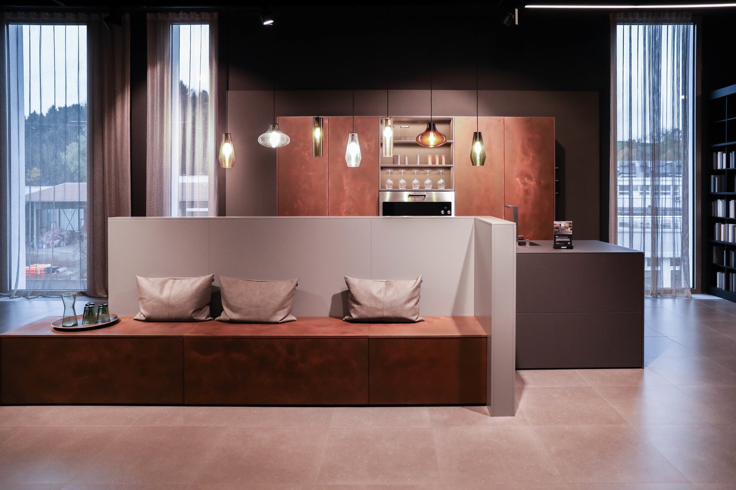
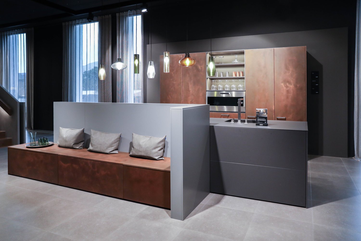
STEEL | CLASSIC-FS | TOPOS
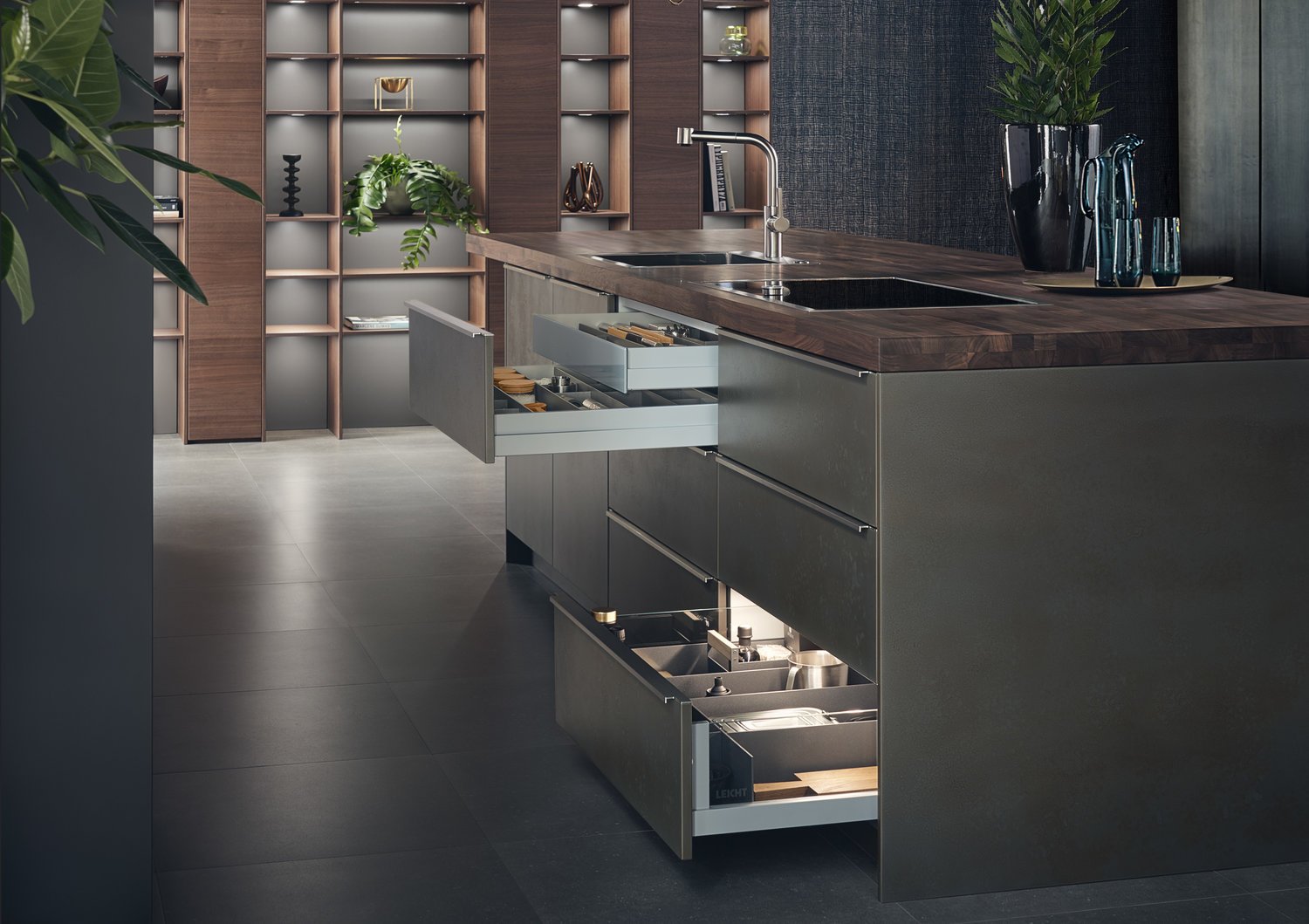
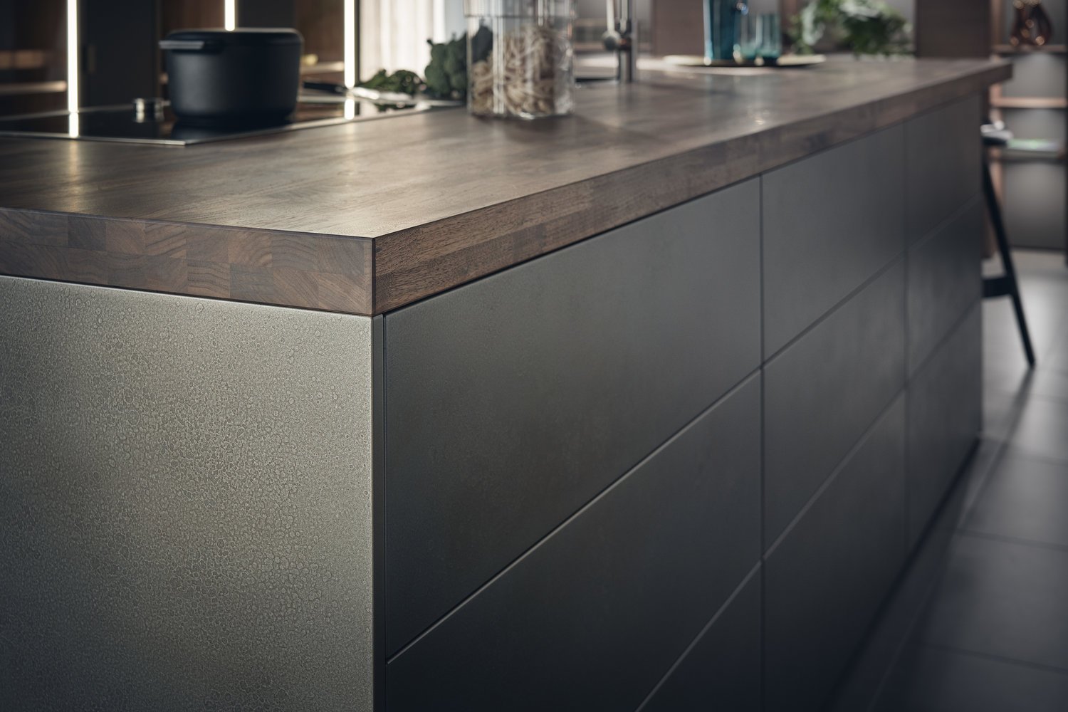
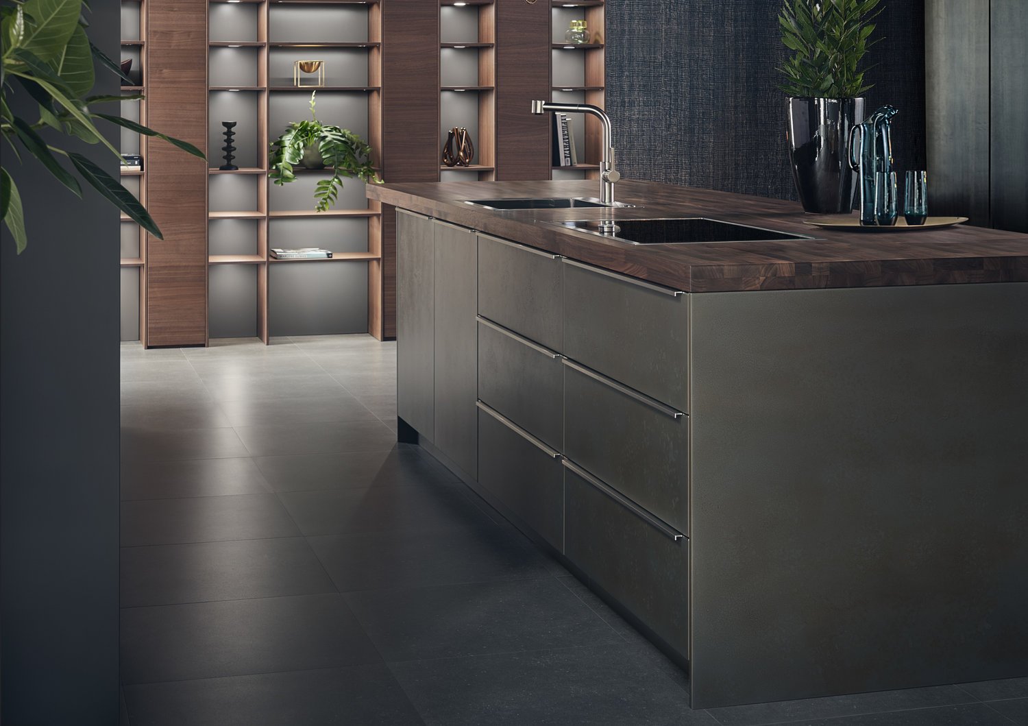
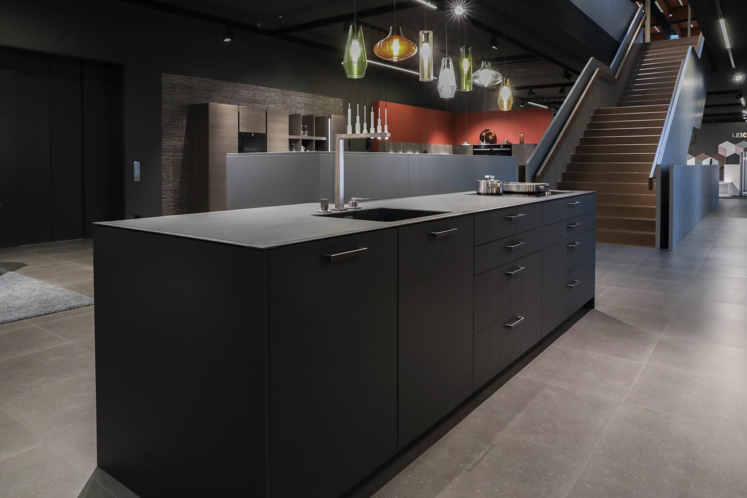
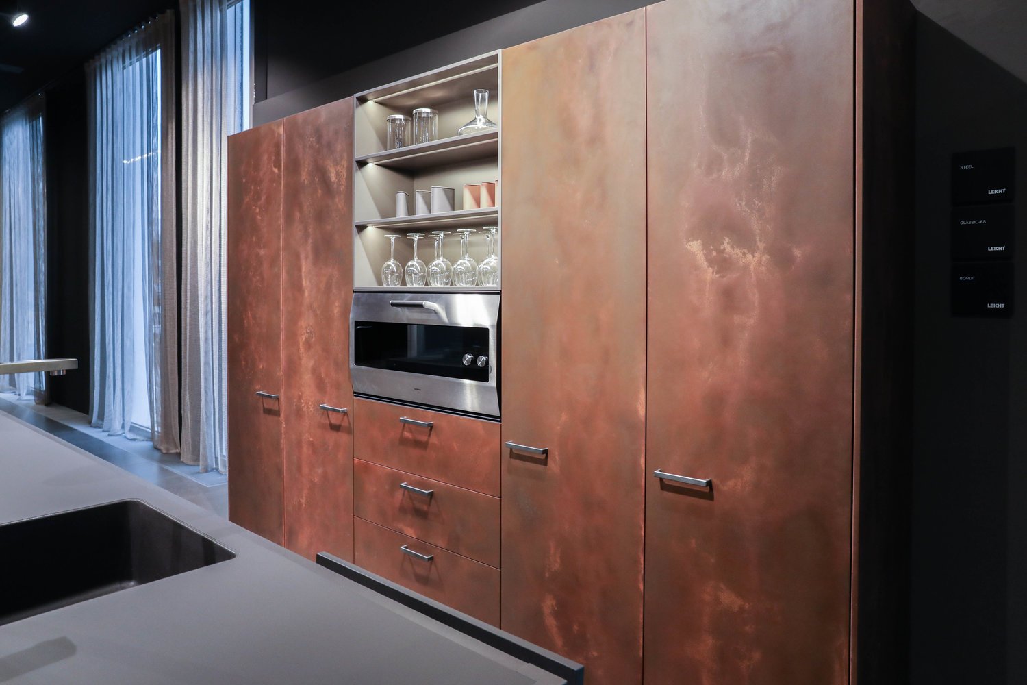
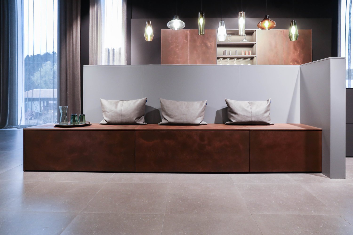
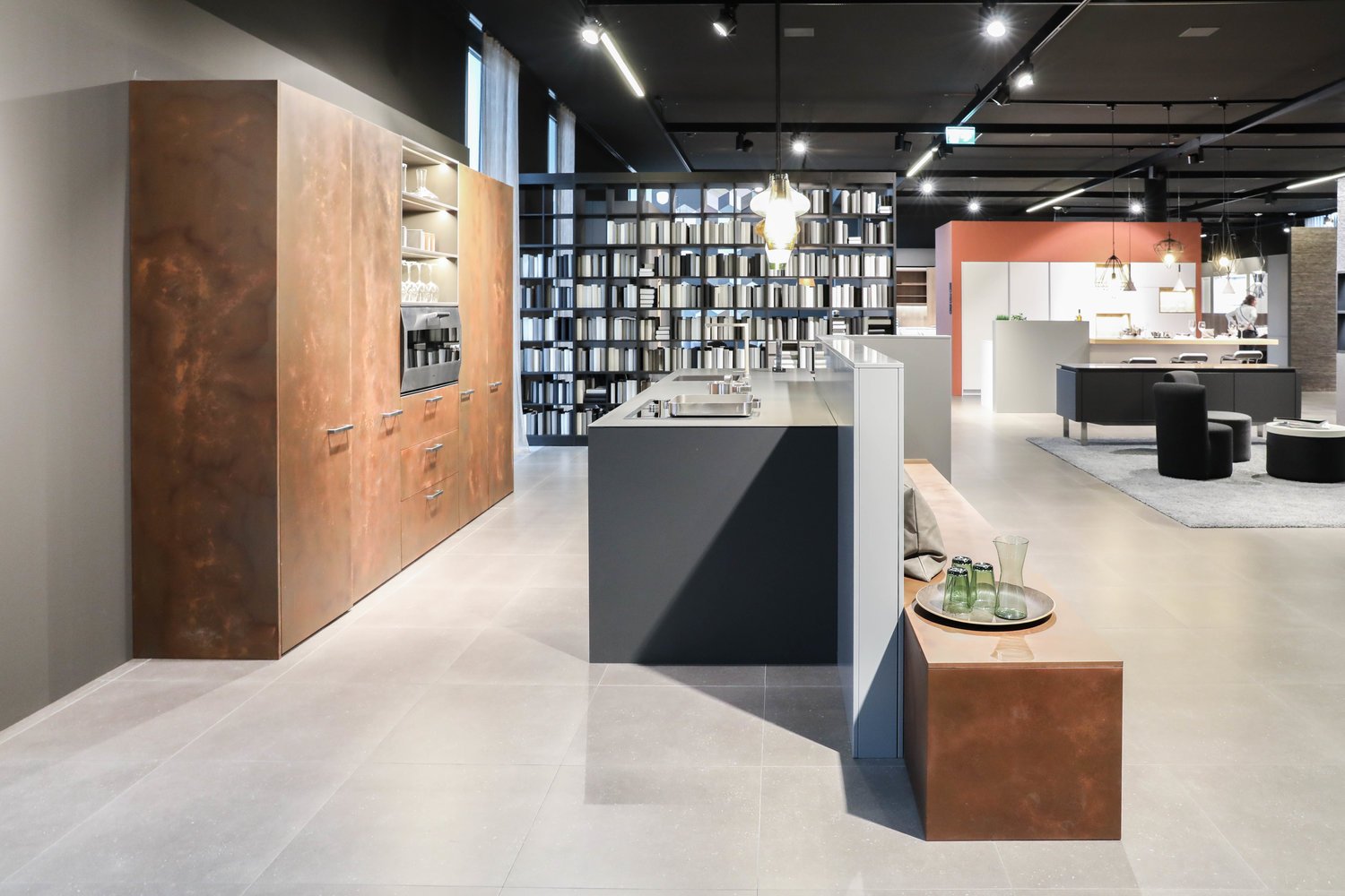
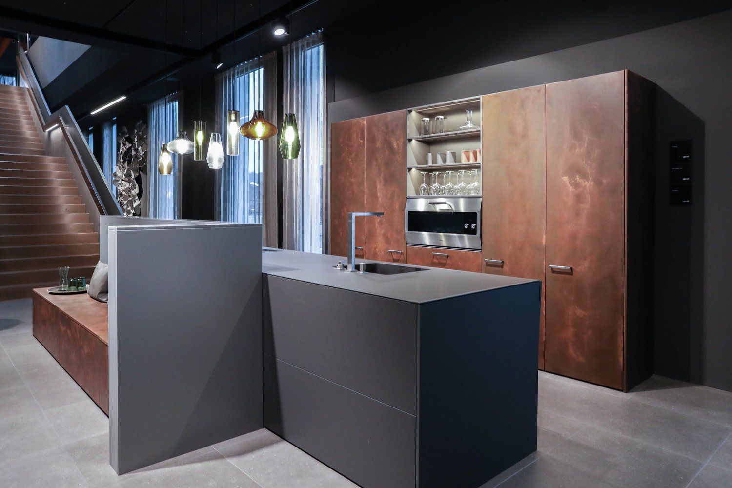
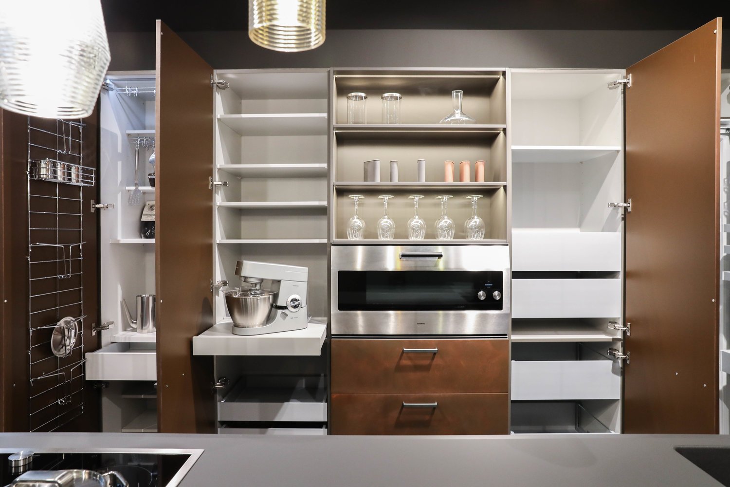
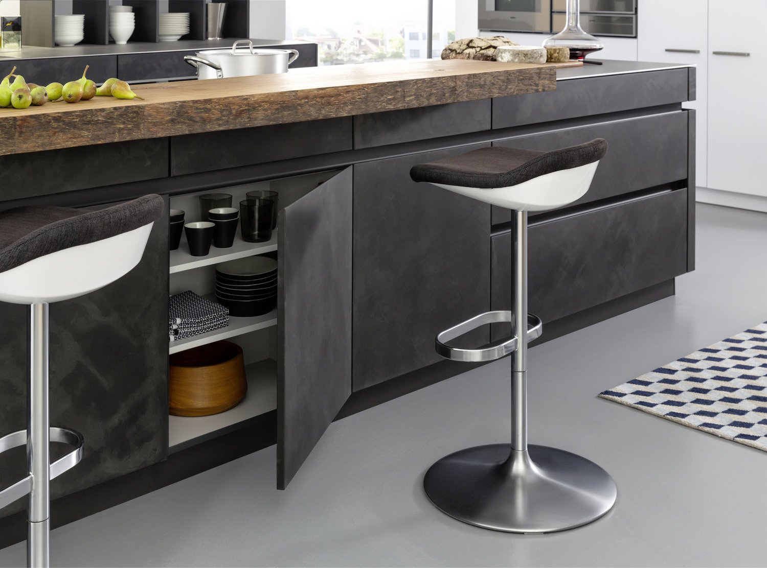
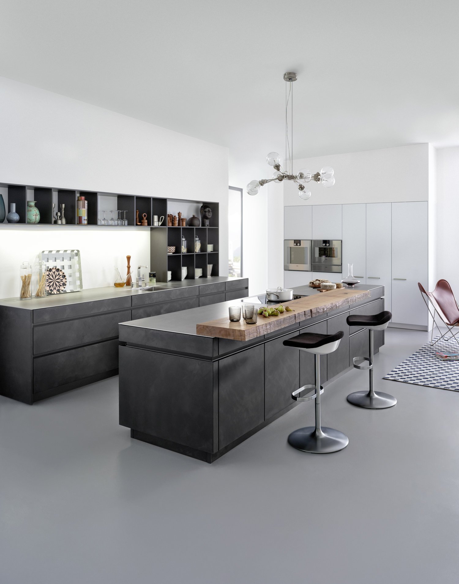
Steel surfaces are fascinating: in architecture and urban planning they have a puristic, authentic air. When refined for use indoors, the original quality – best summed up as „rough industrial“ – is embellished with another characteristic: elegance and sophistication. A kitchen like this is no longer recognisable as such as it is completely merged with the homely environment.
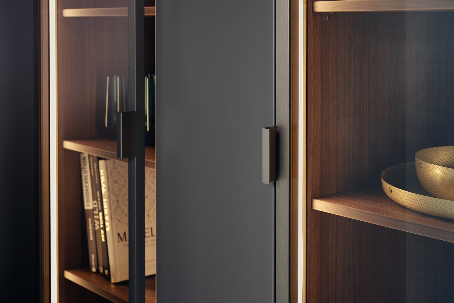
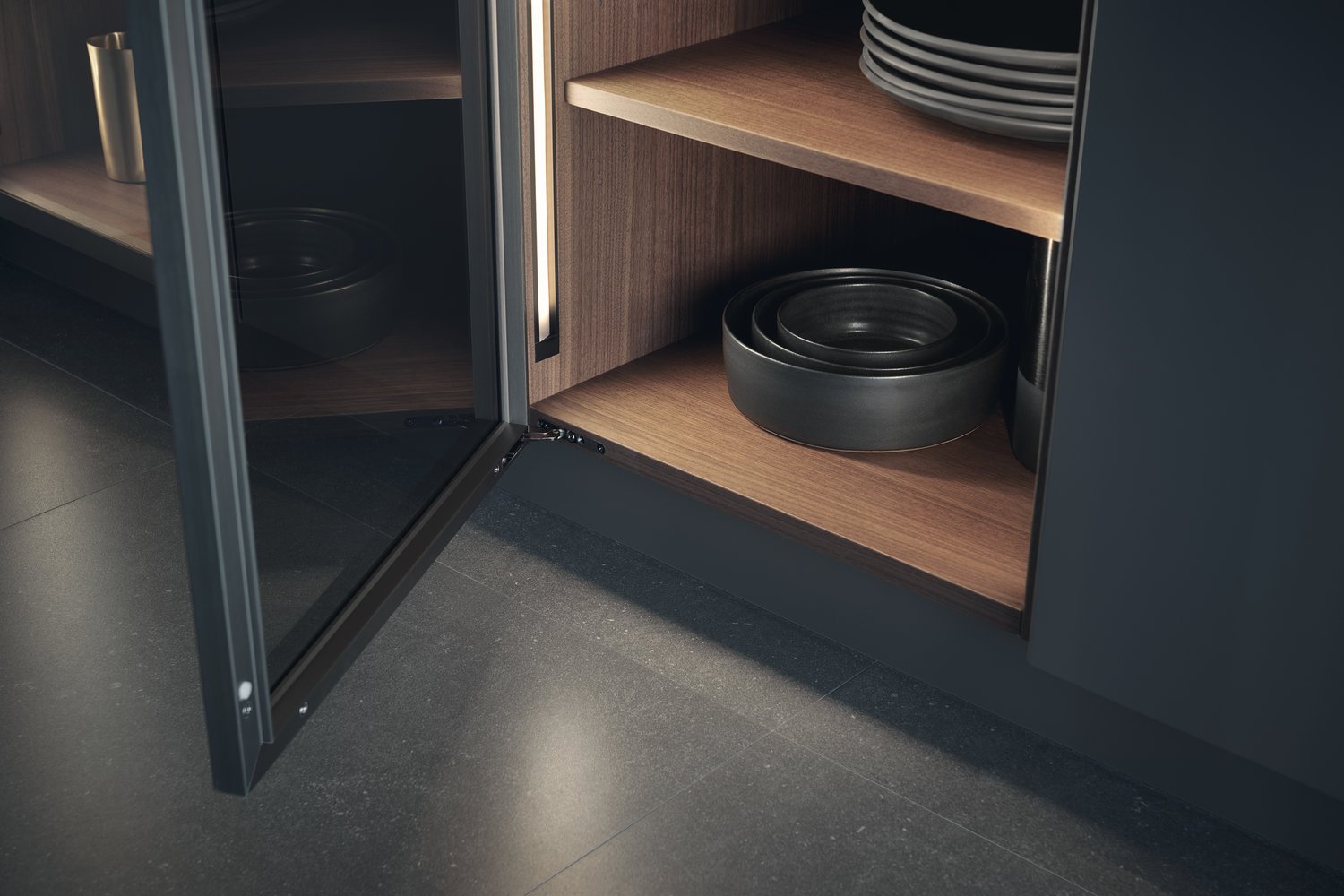
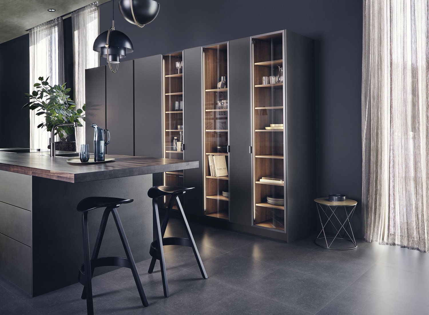
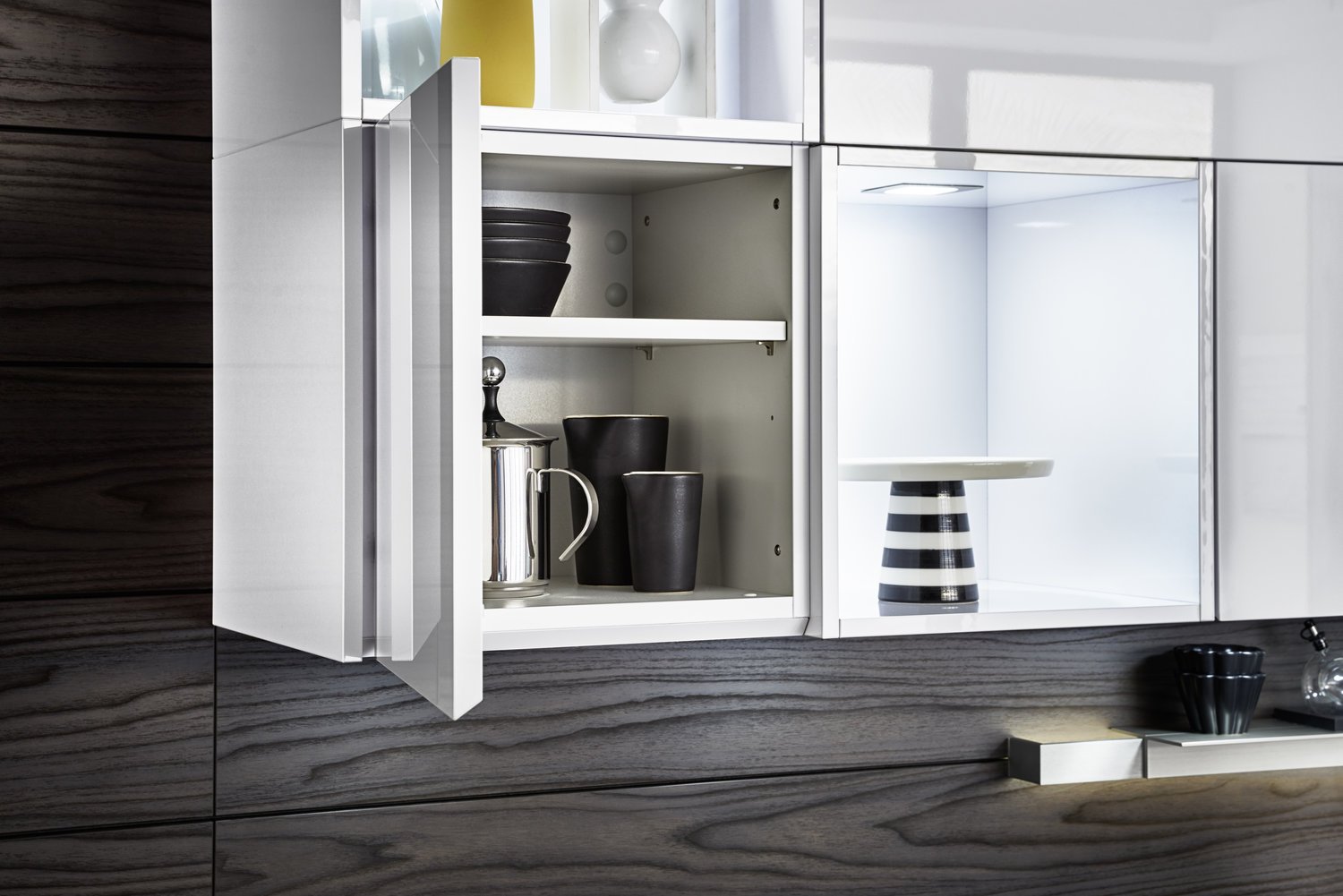
Metal-framed doors with slightly tinted glass and integrated lighting. Can be planned in a wide variety of ways and flexible in terms of dimensions. Frame colours: stainless steel, dark bronze, black steel.
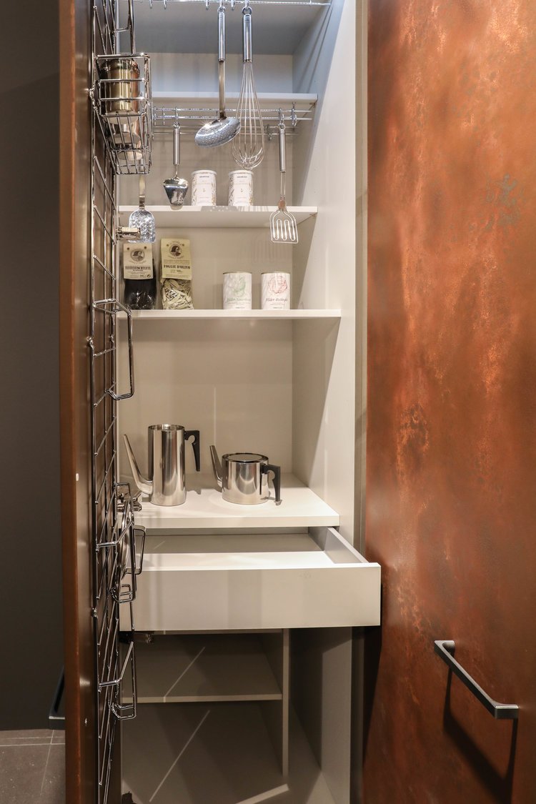
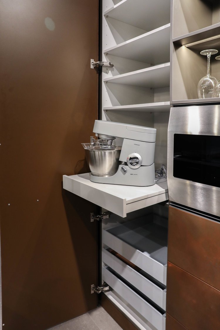
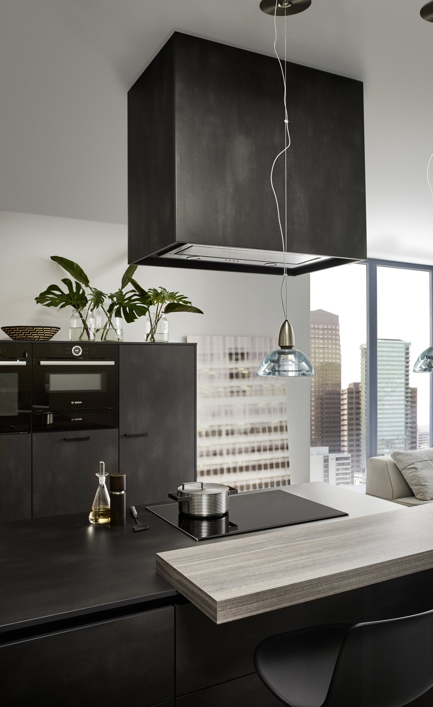
Steel has a fascination all of its own. As the material used in this kitchen, it resembles darkly annealed sheet steel with slight suggestions of rust. A special oxidation procedure generates a structure unique for every front. It reflects the light and gives an impression of depth. At the same time there is something archaic about it: the idea of having a kitchen which has been hand-crafted and is thus one of a kind.
BONDI | XYLO
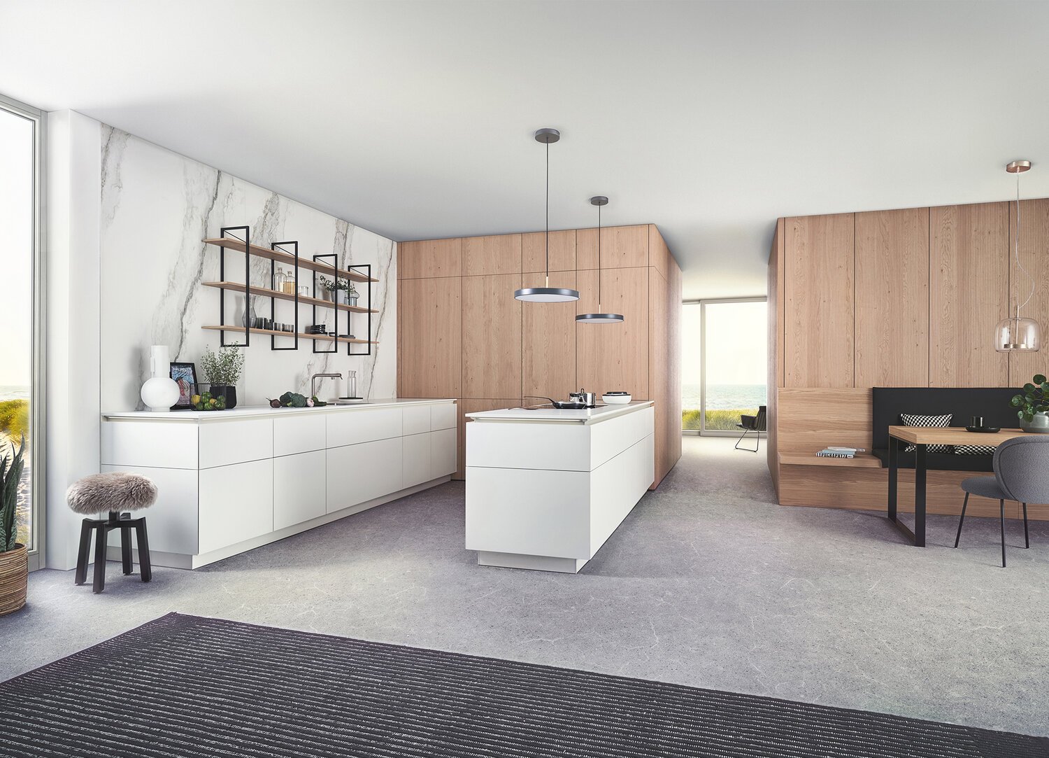
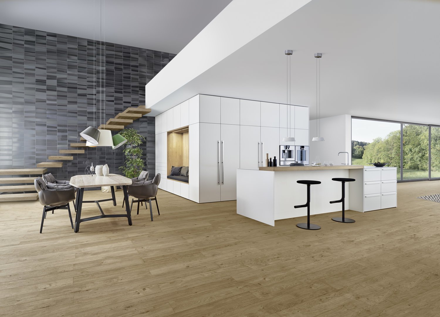
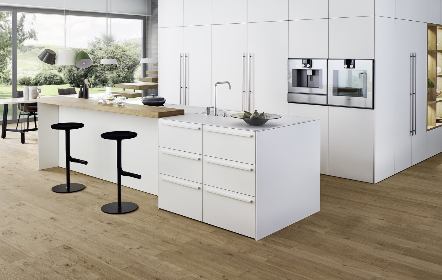
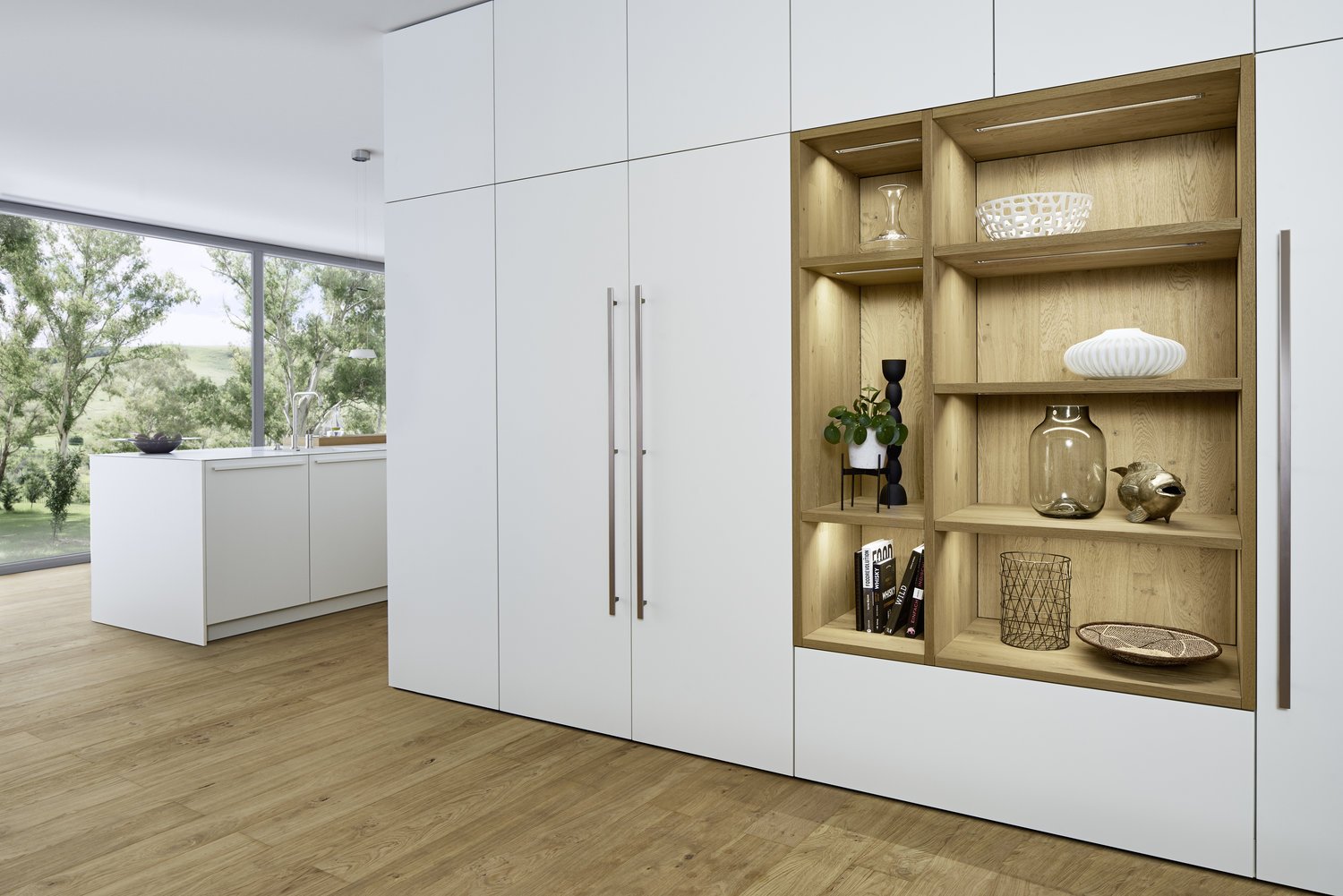
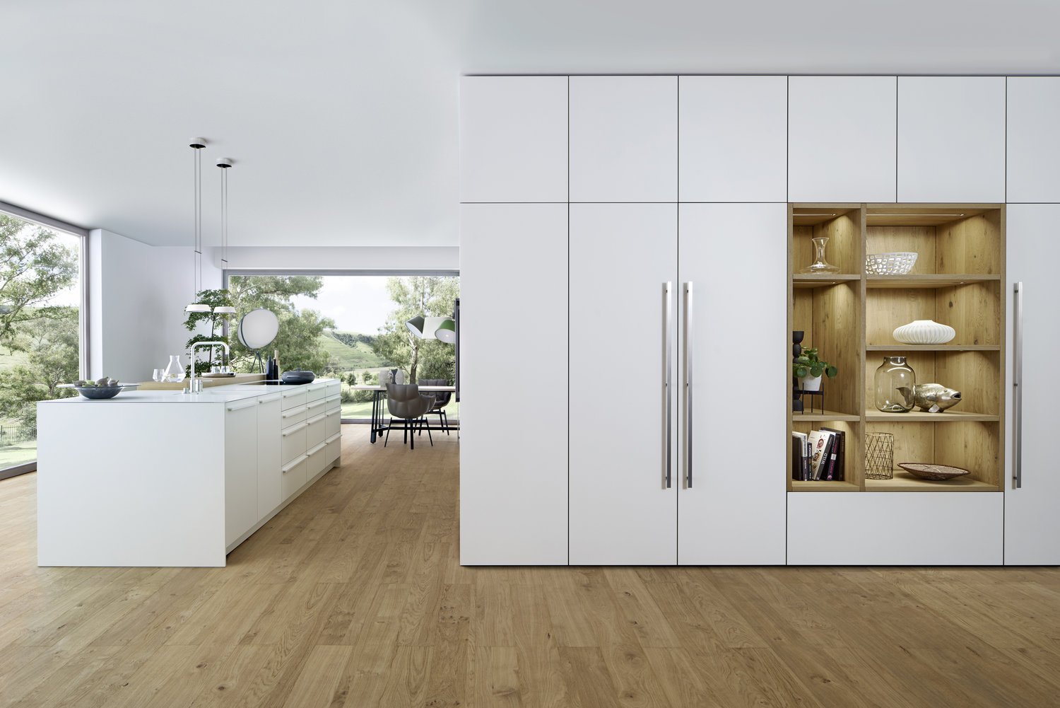
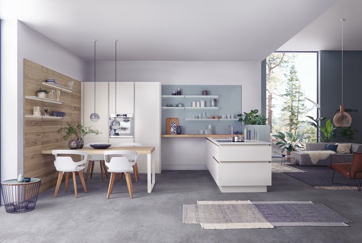
A calm kitchen architecture open to the living area as well as perfect functional details – these are the characteristics of this LEICHT kitchen. A homely atmosphere is the result of an interchange with open spaces and the brilliant combination of materials: elegant, matt lacquered surfaces contrast with finely structured genuine wood.
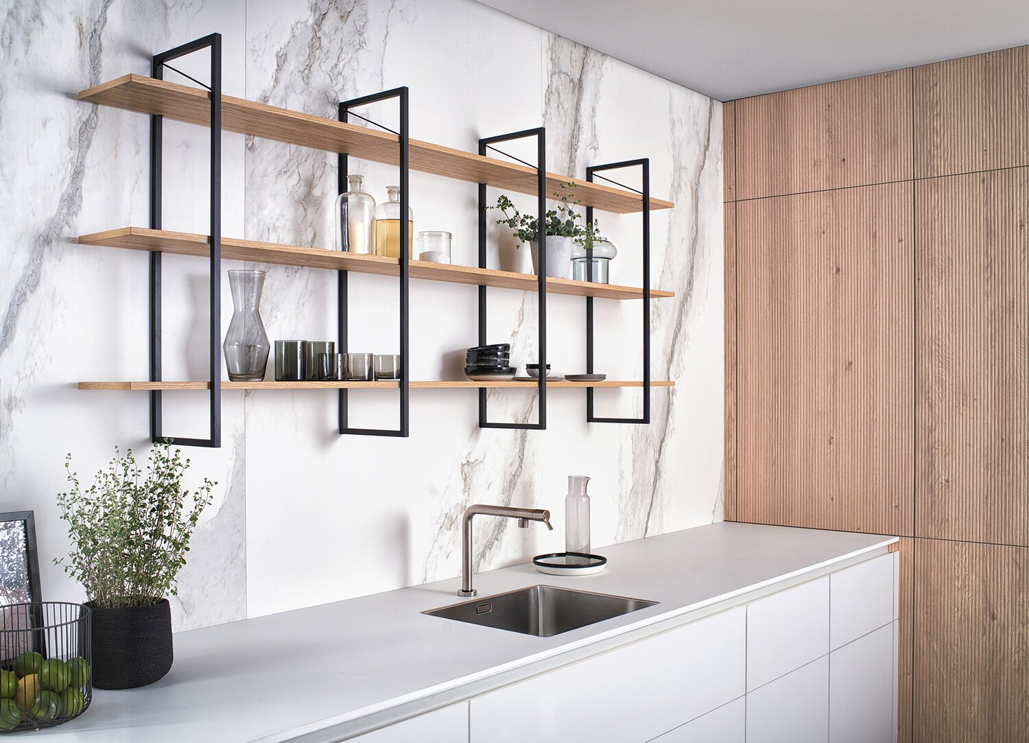
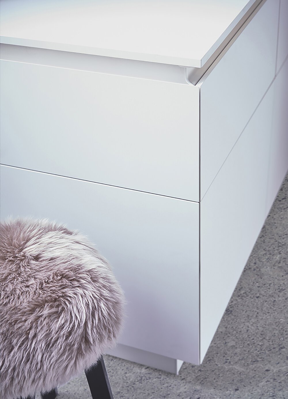
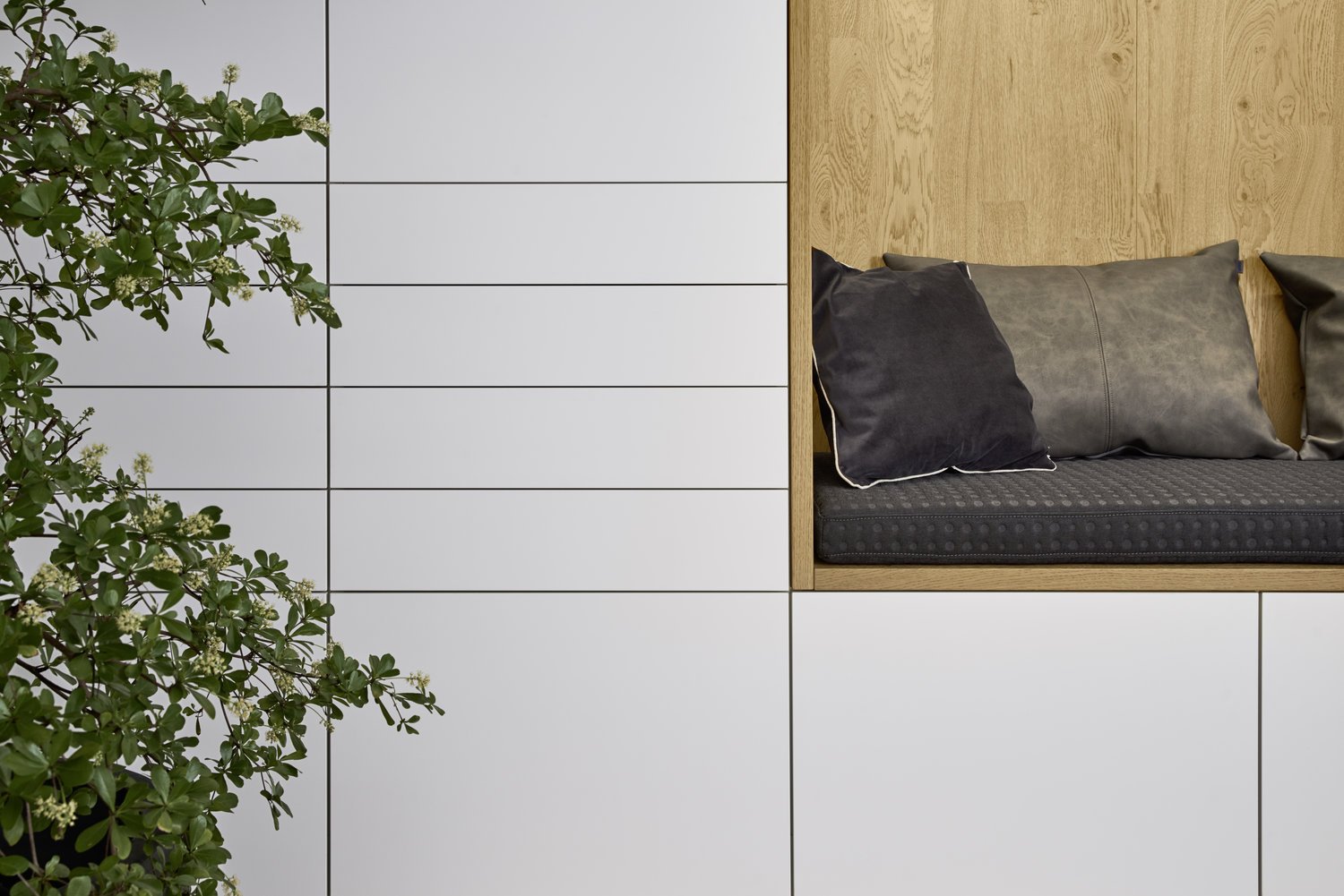
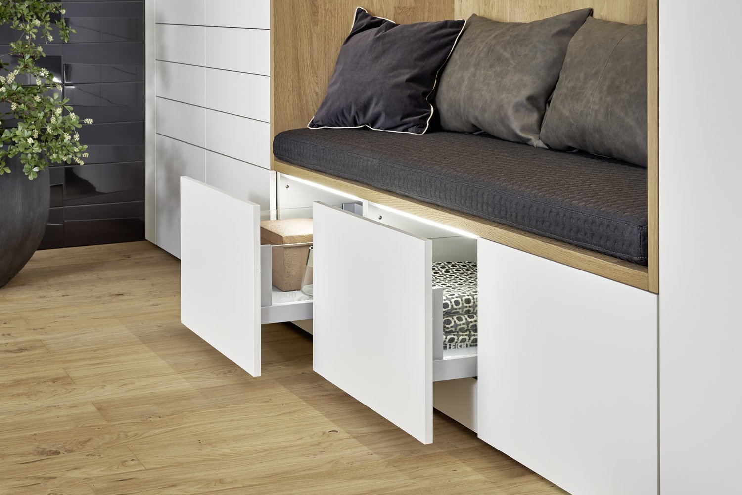
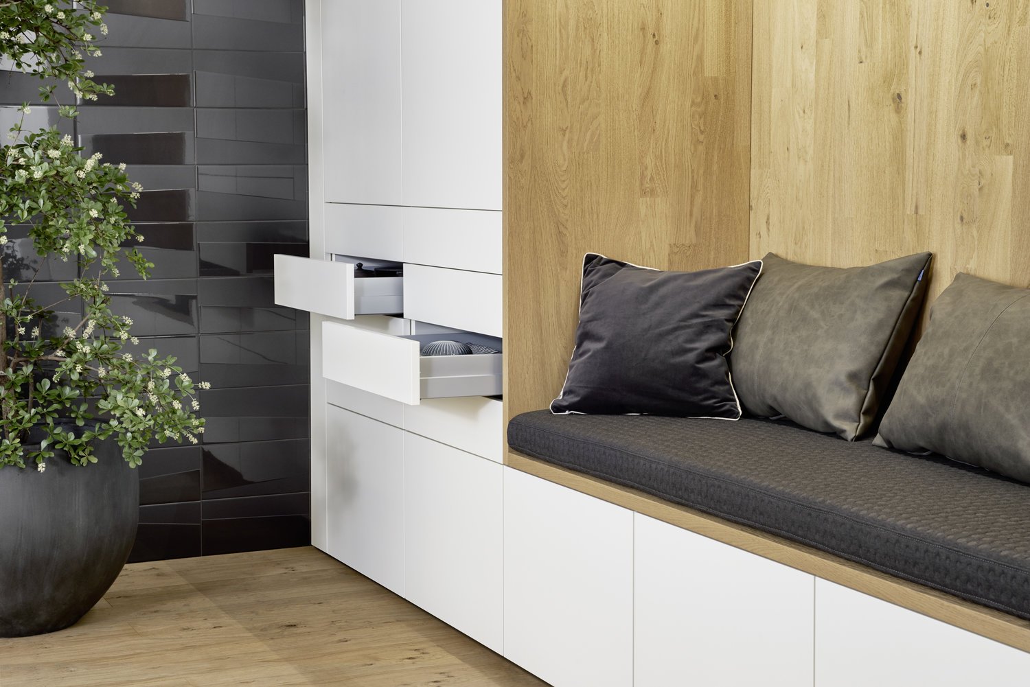
Elegant matt white in harmony with genuine wood and continuous fronts: the kitchen conceals its entire complexity behind a calm exterior consisting of an island and units extending down to the floor the front design of which can vary: open shelving can be integrated as can a comfortable, warmly lit seating alcove.
BONDI | ORLANDO
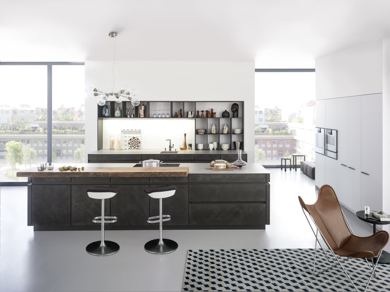
An exciting mix of light and dark results in a durable, traditional kitchen architecture, also reflected in the clear spatial composition of tall unit, island and open shelving. Olive grey in combination with finely structured mountain robinia sets an innovative impulse in high-grade, homely planning.
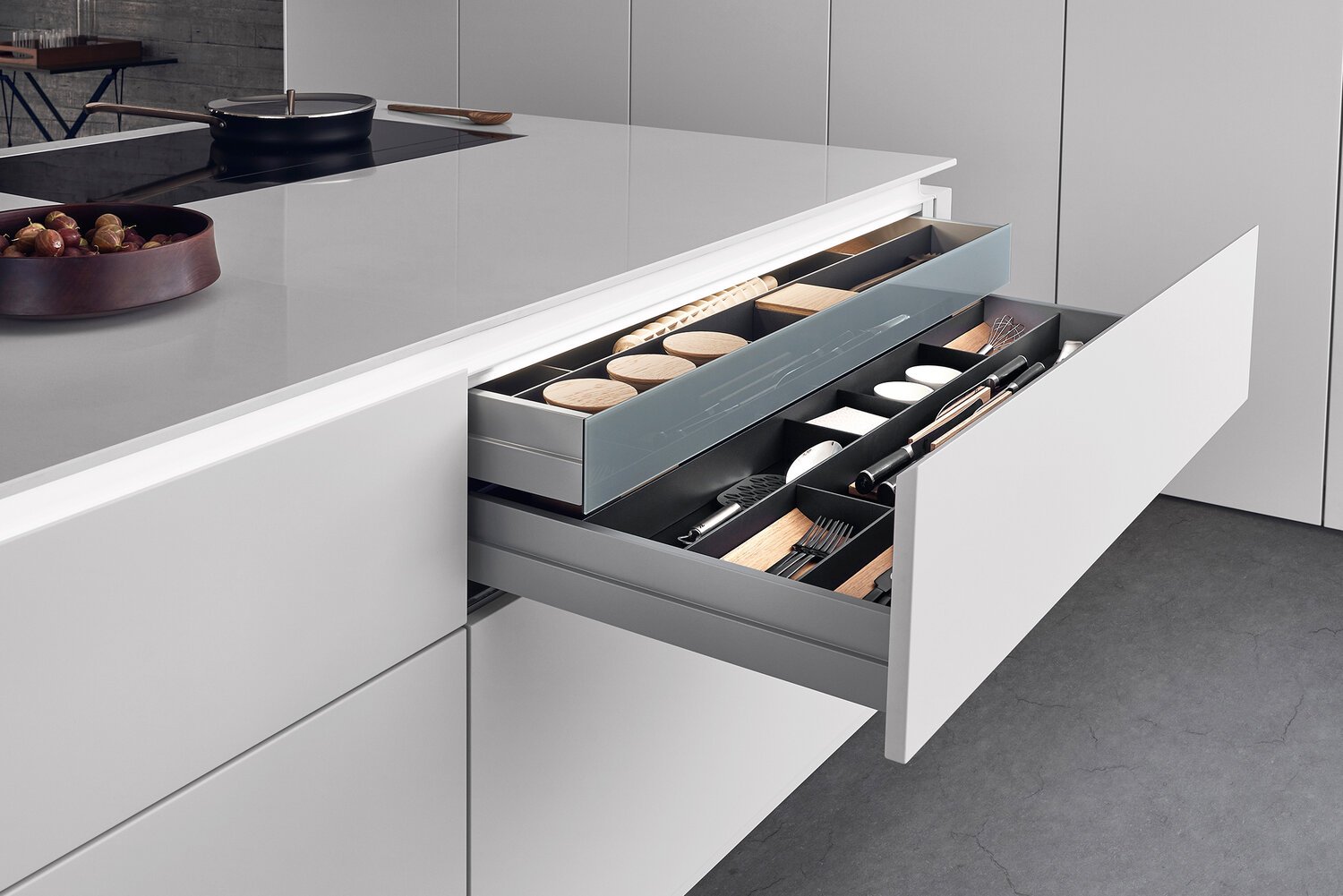
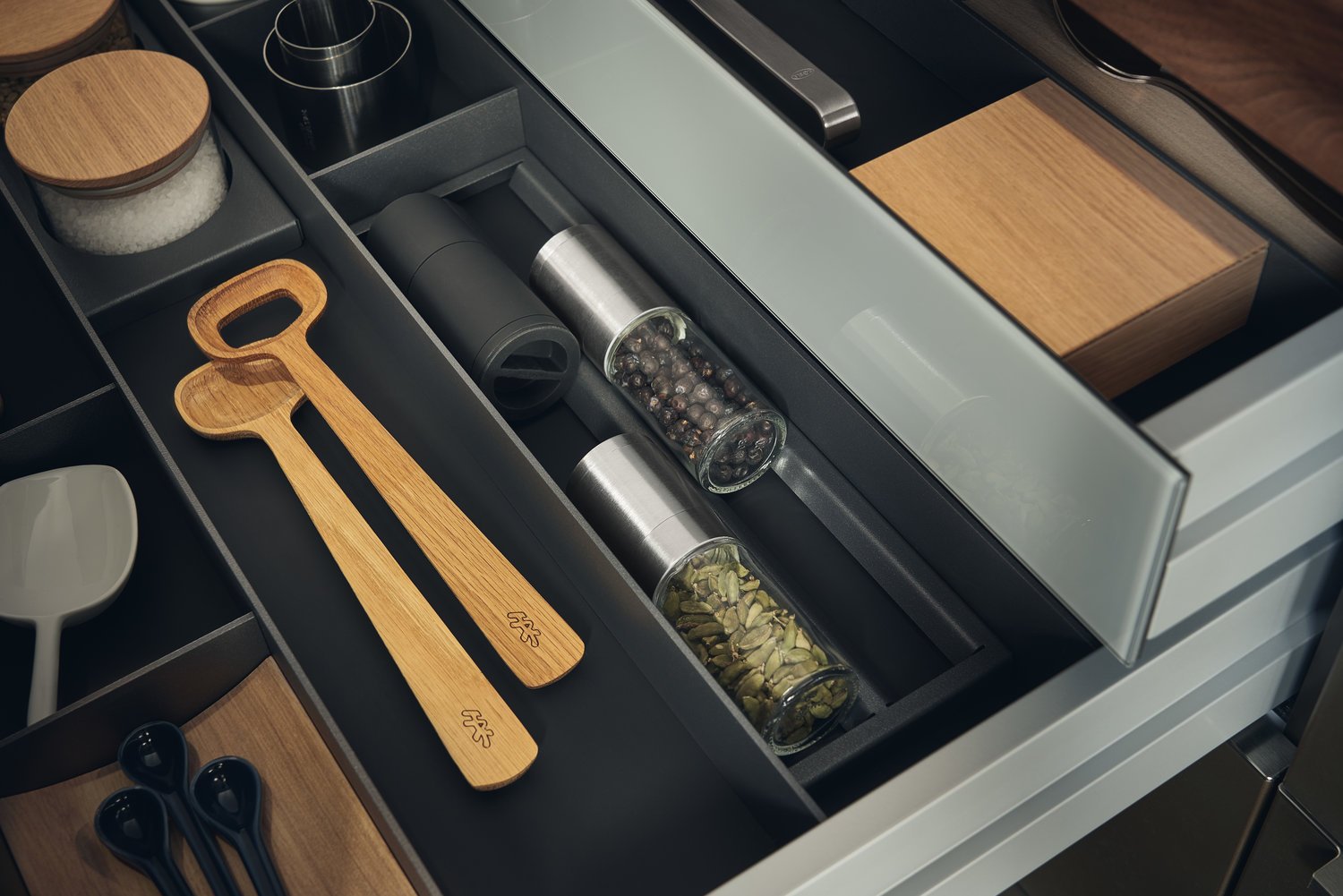
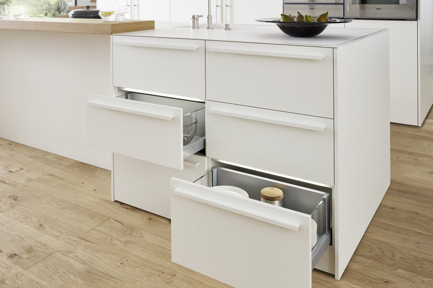
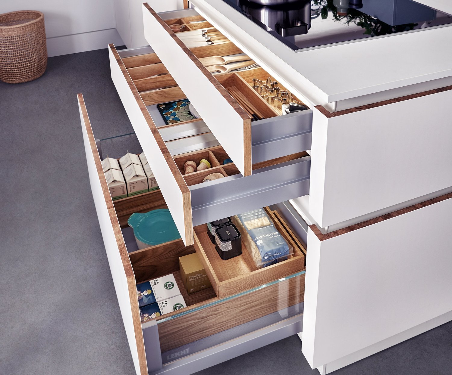
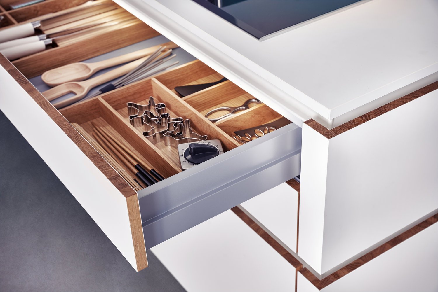
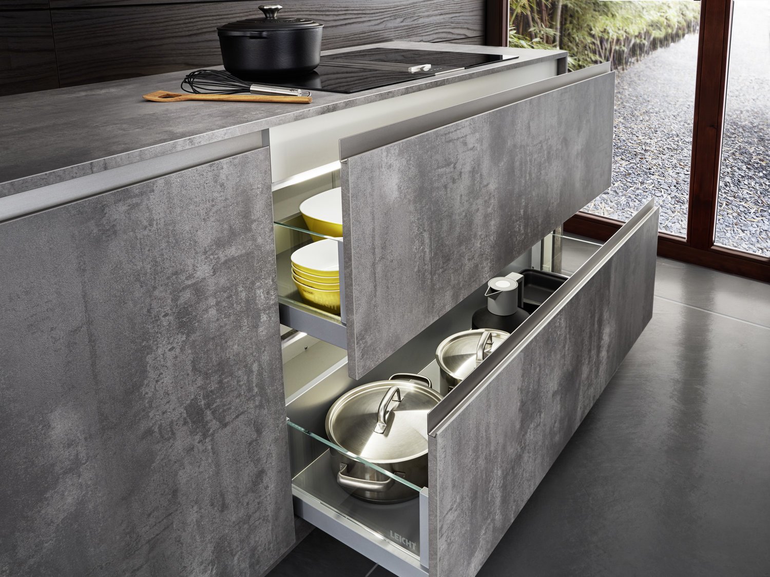
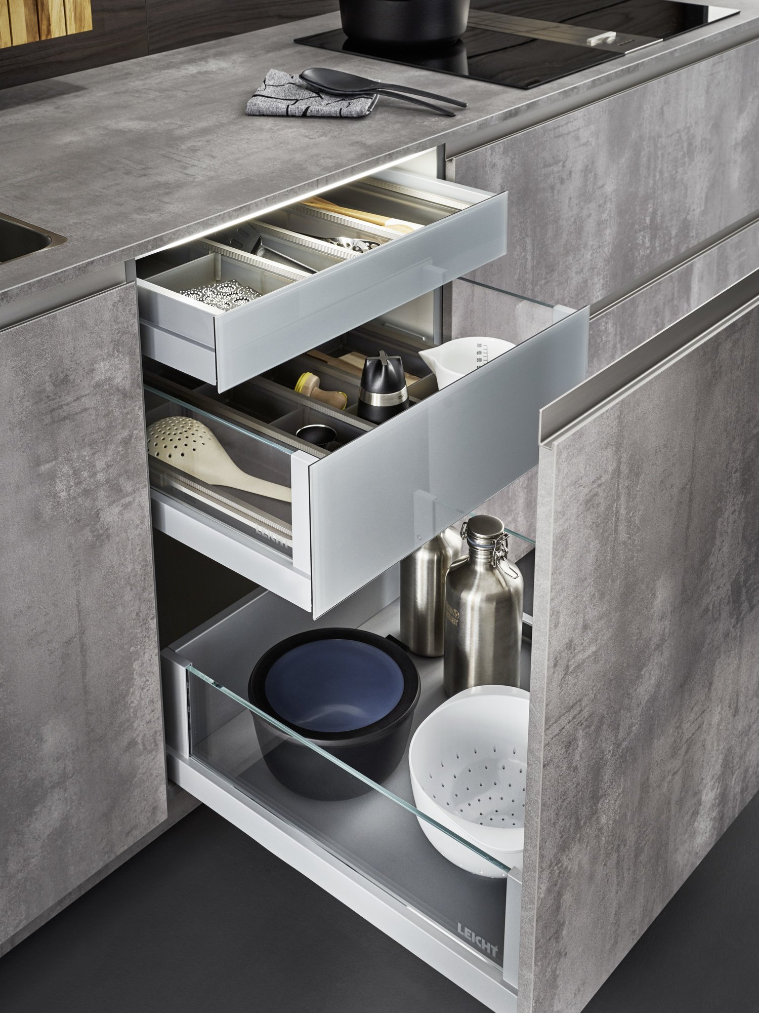
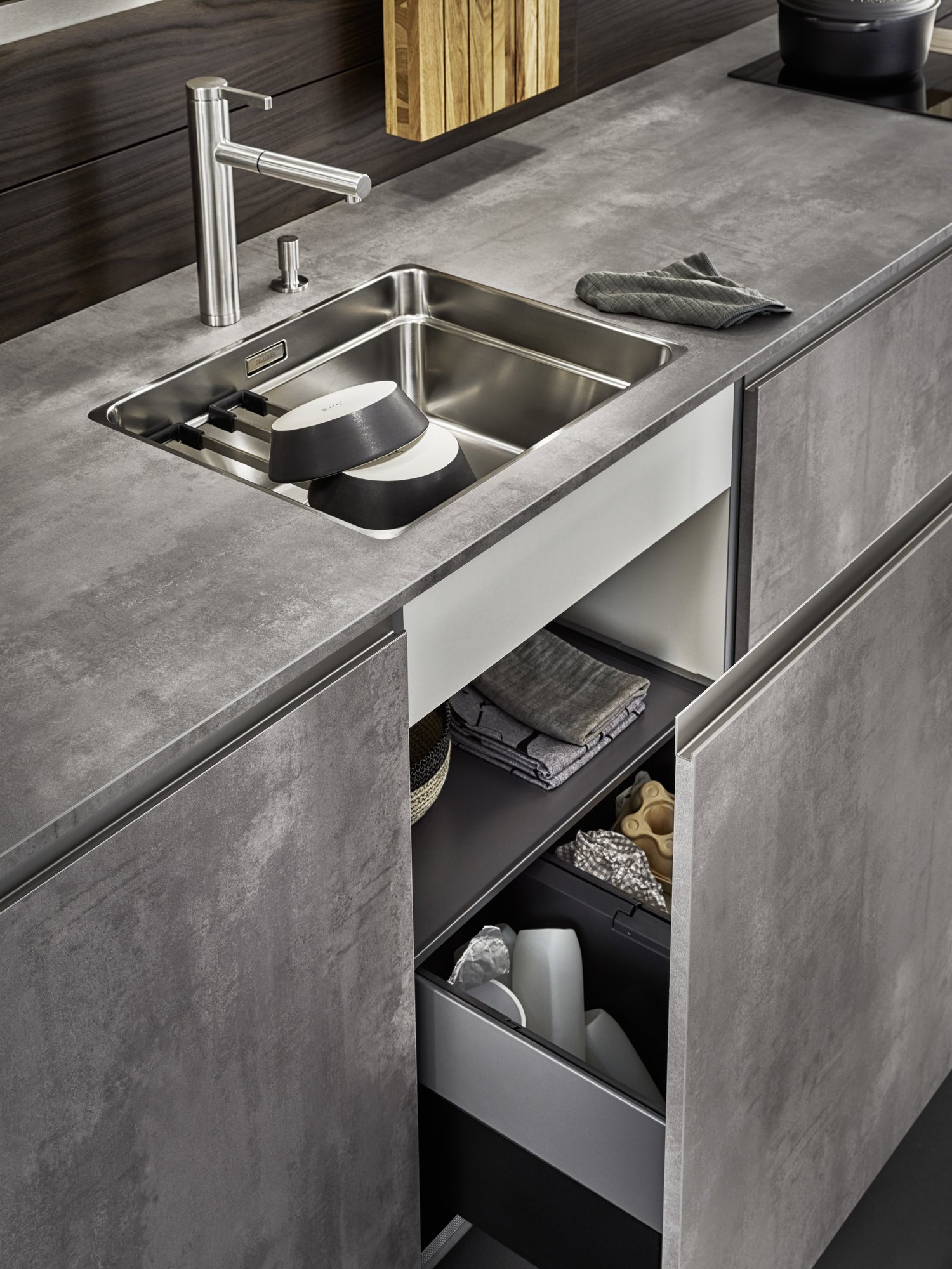
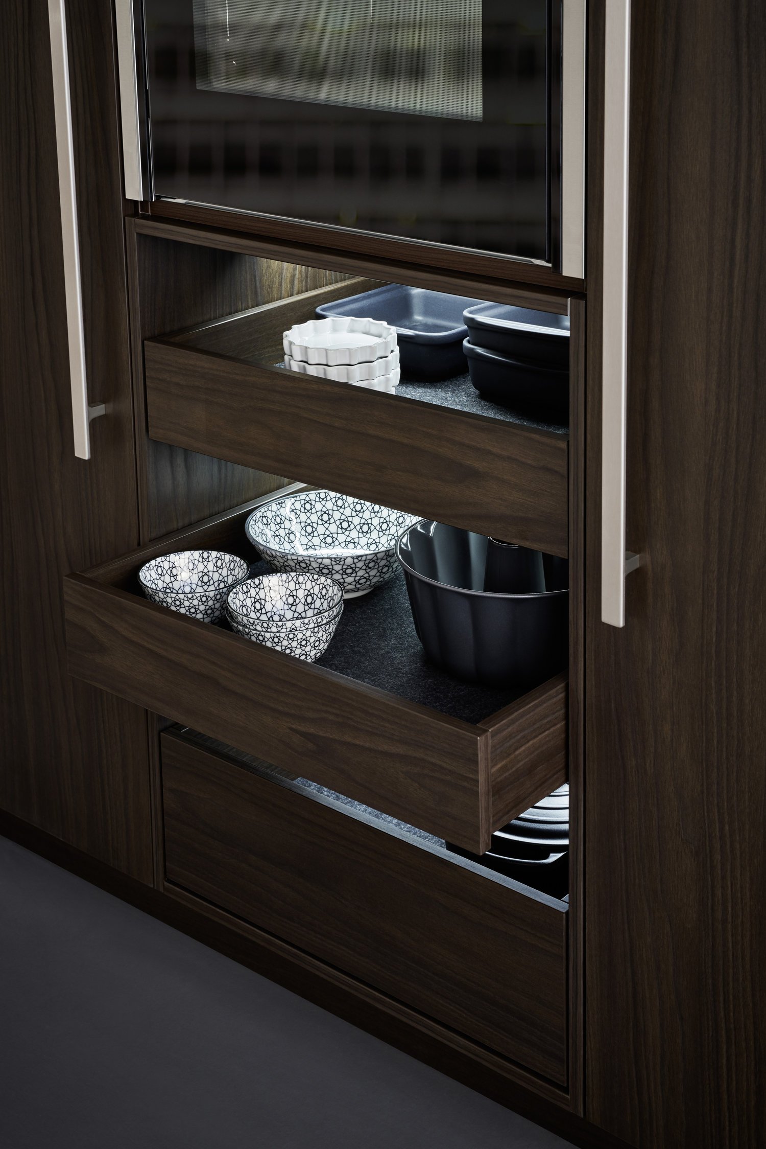
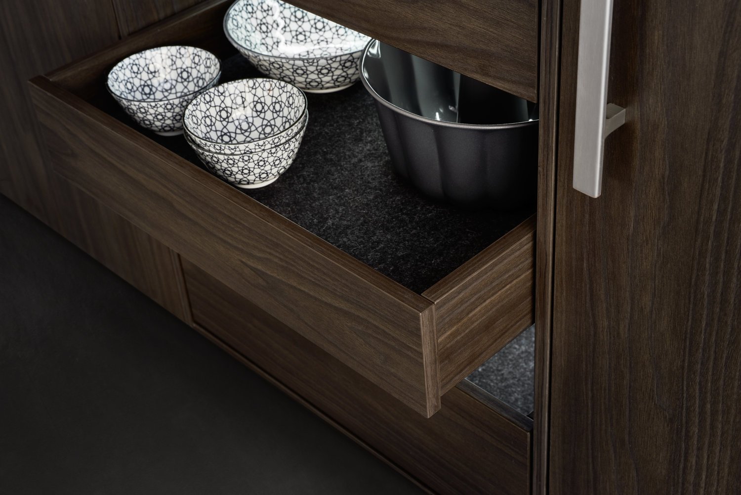
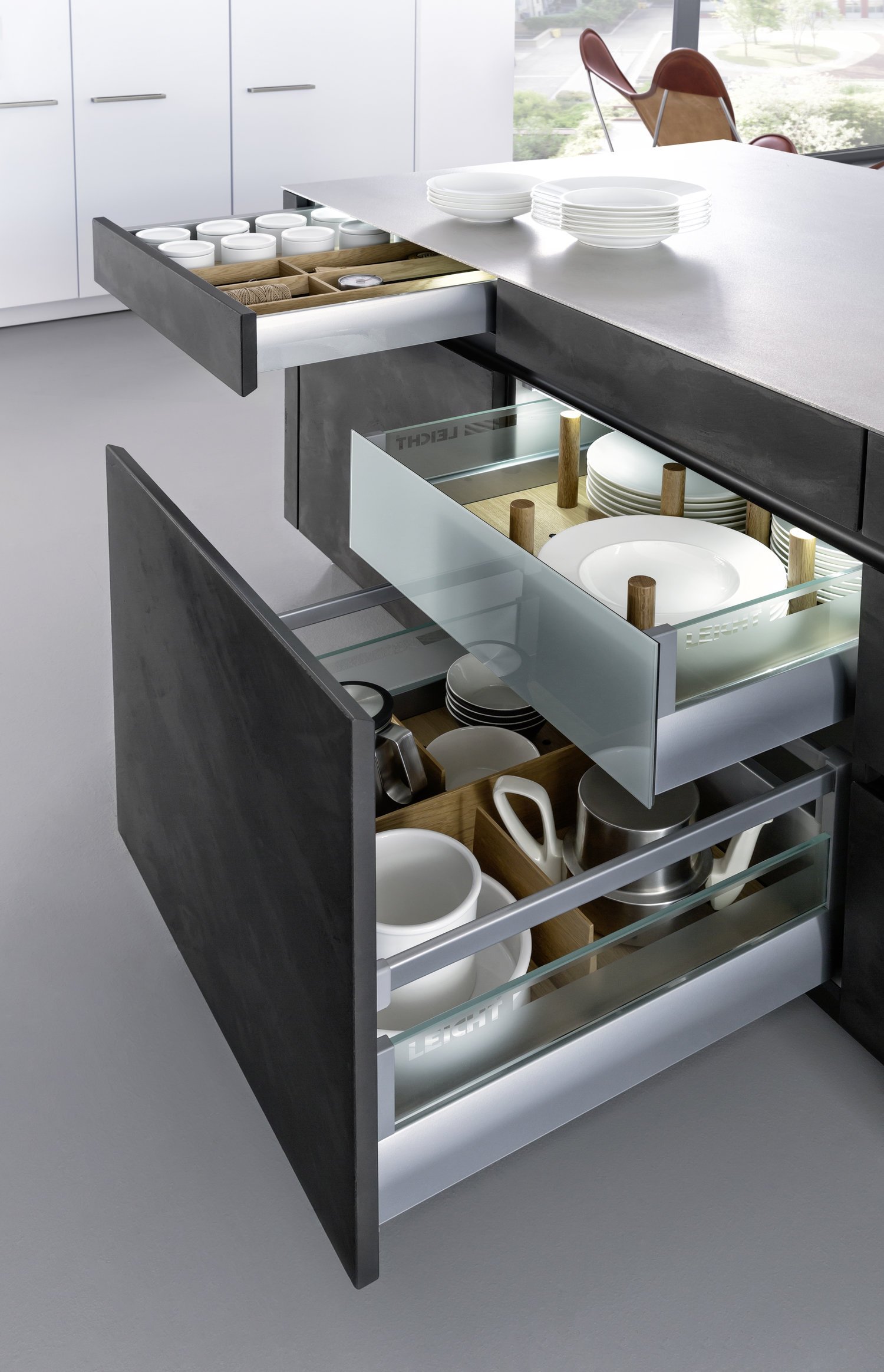
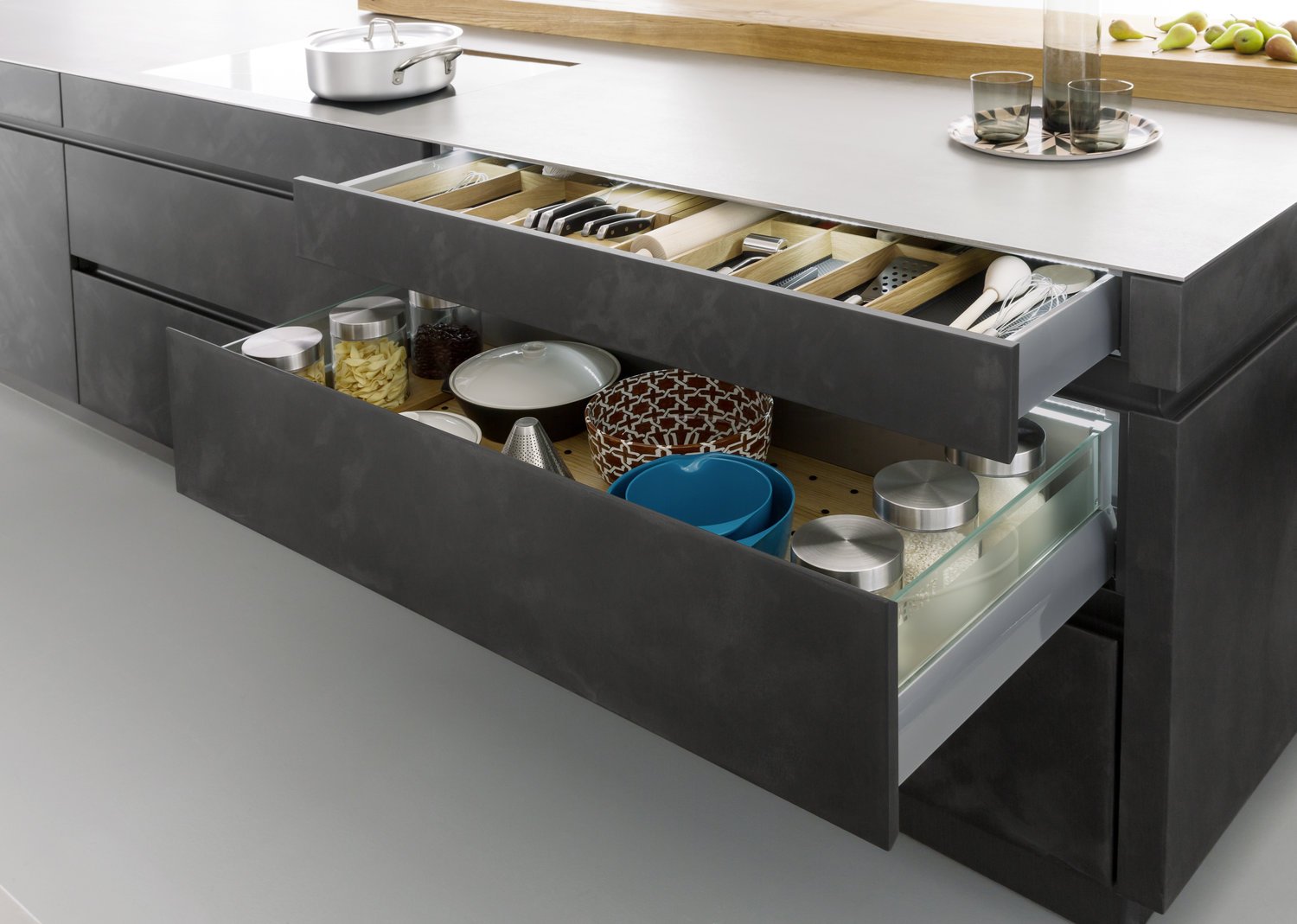
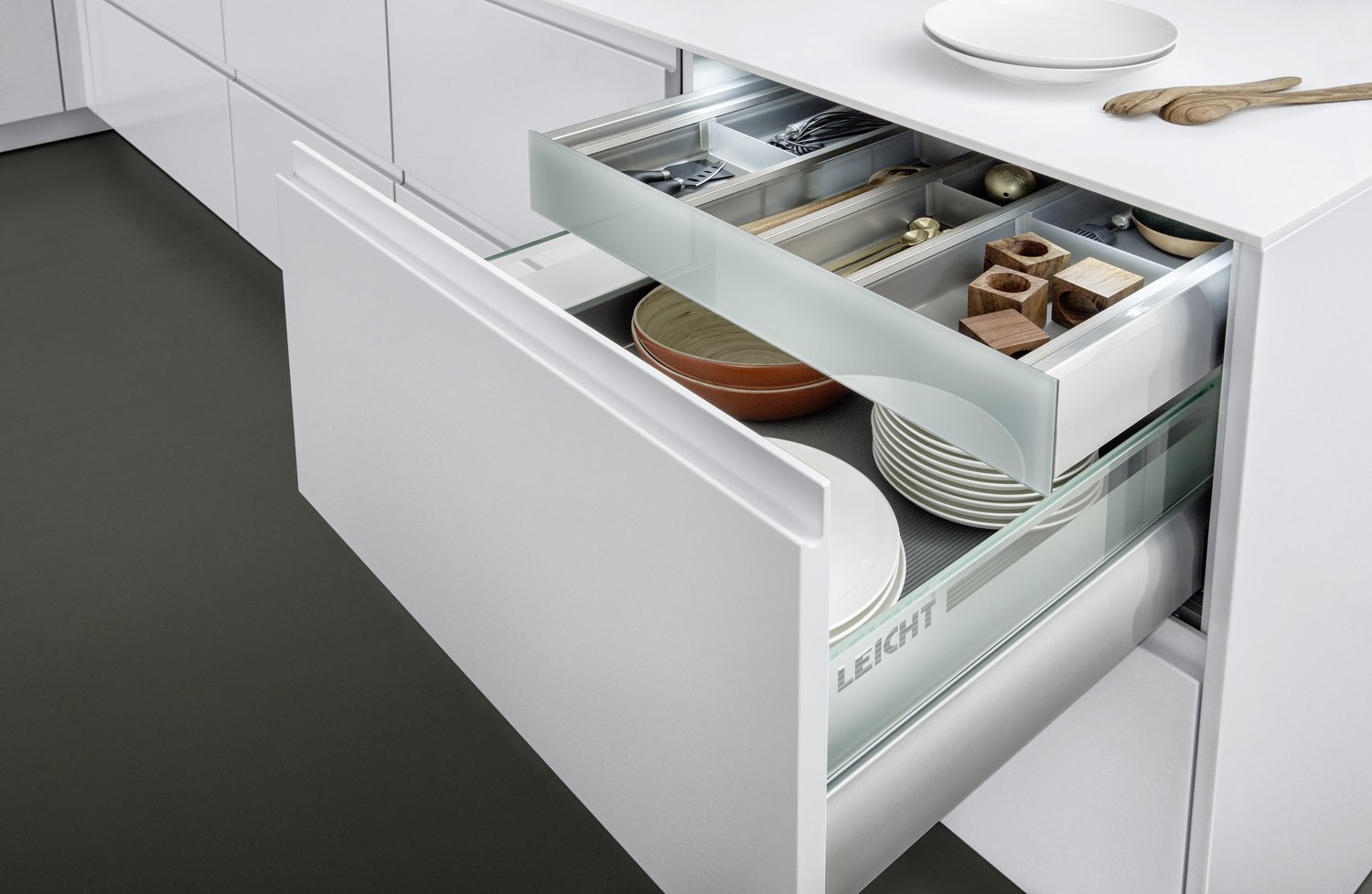
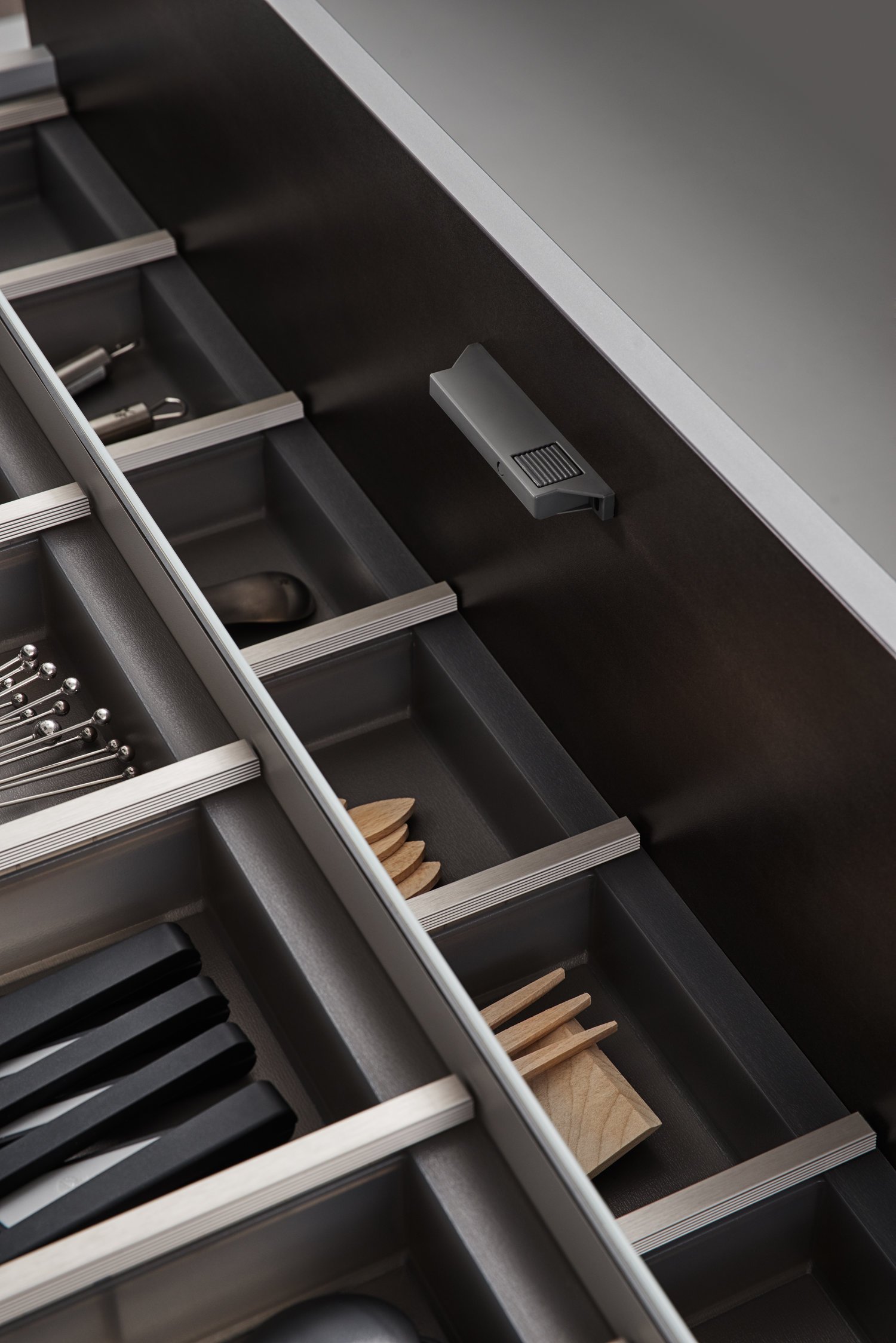
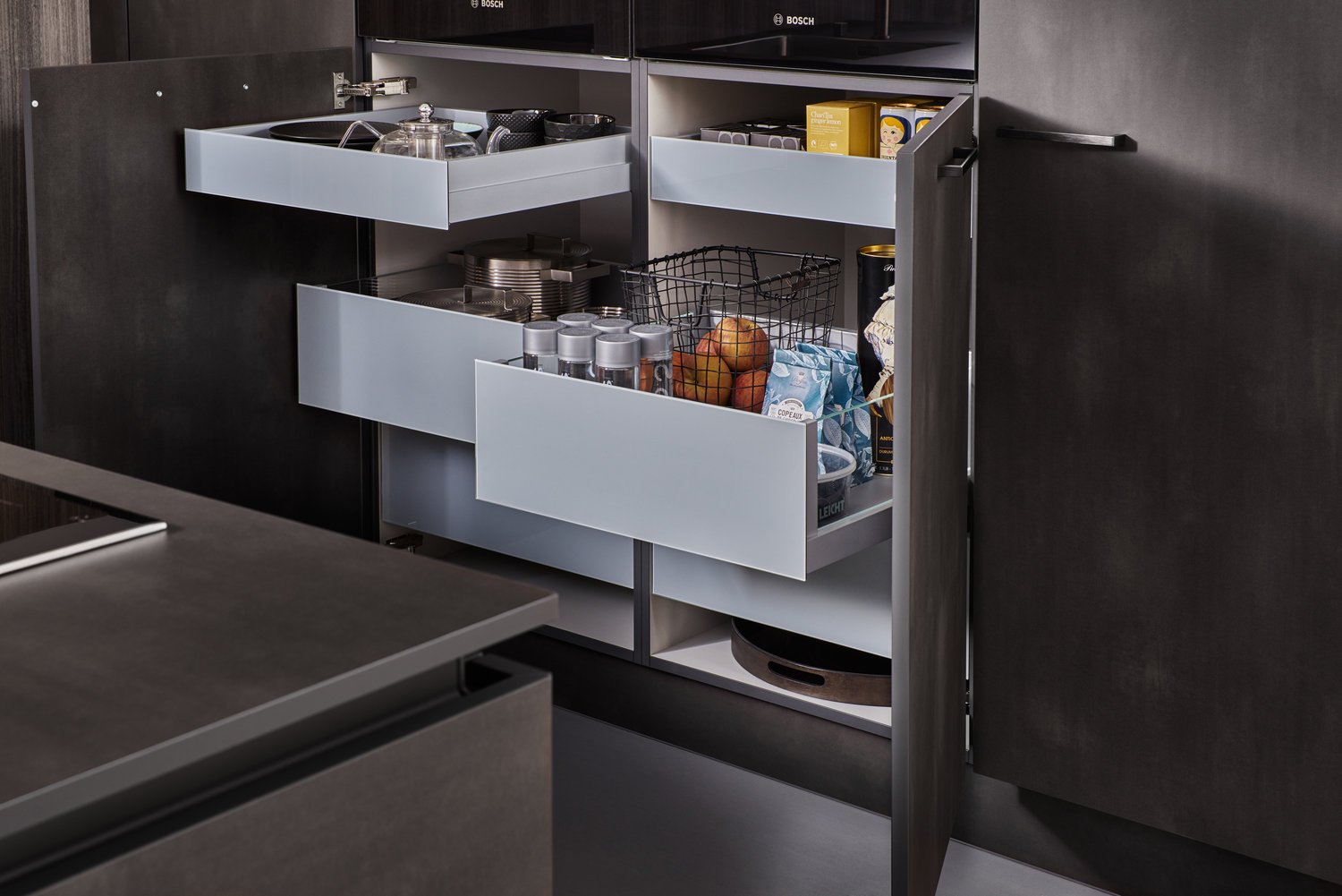
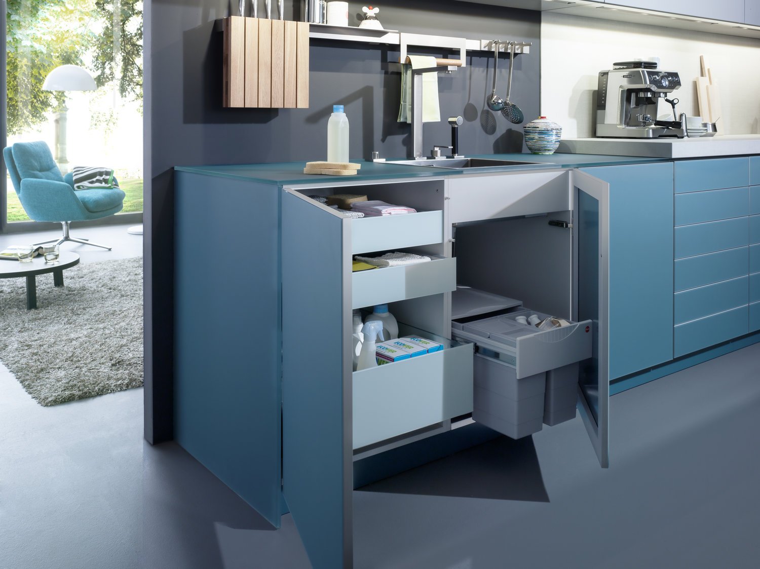
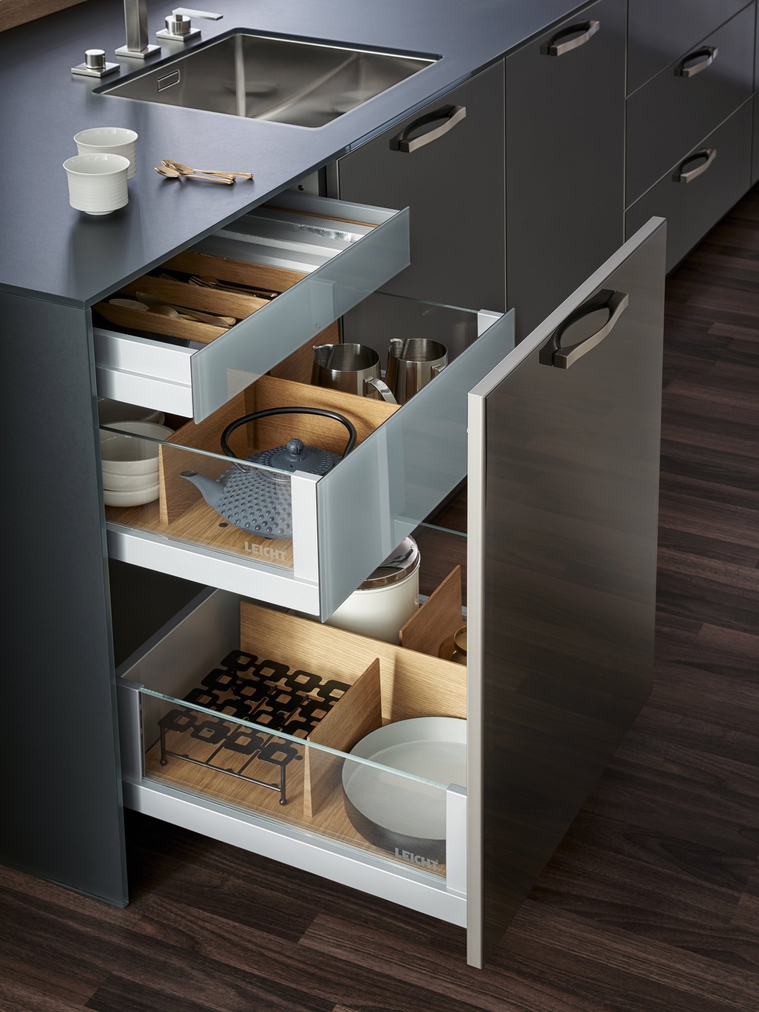
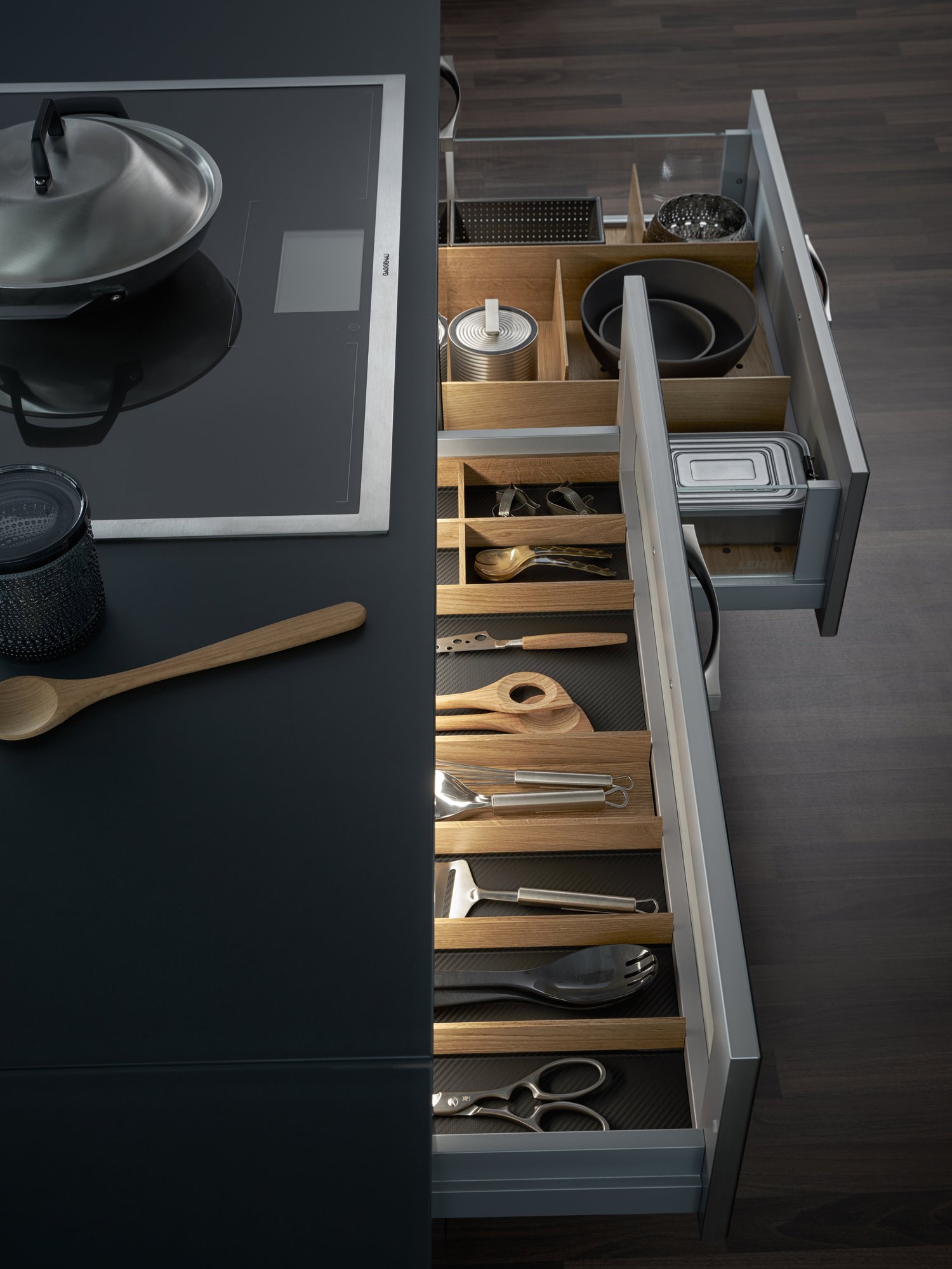
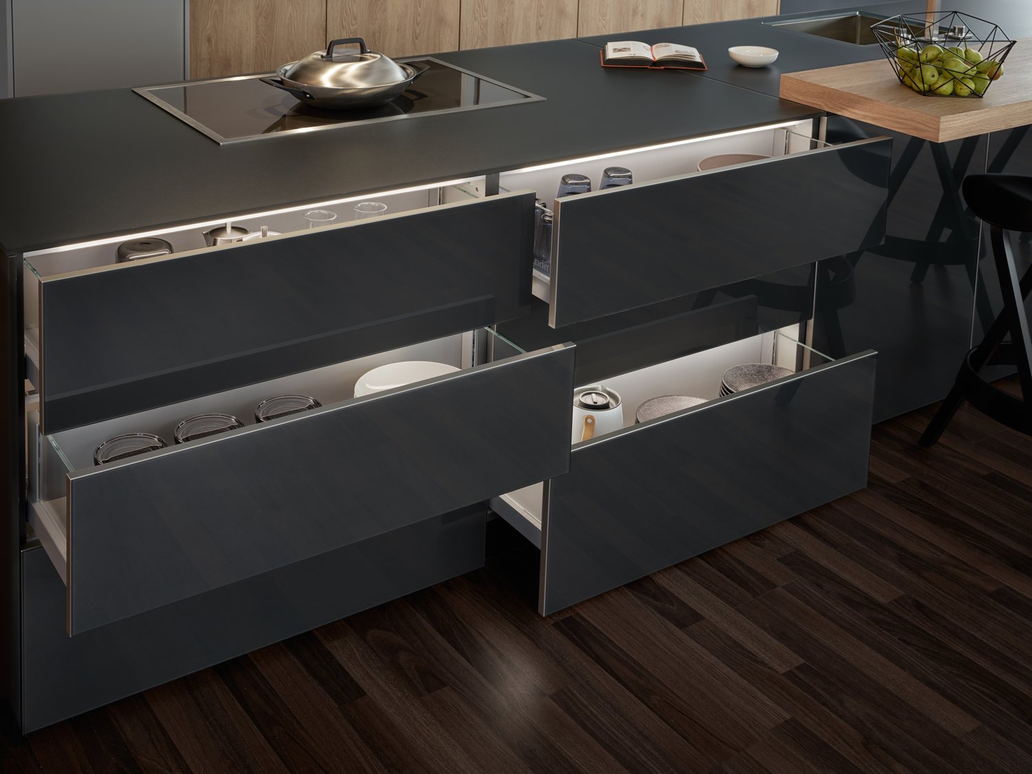
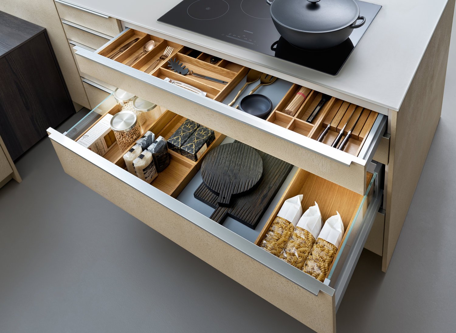
Handle-less fronts shape the clear and calm kitchen architecture; the open kitchen looks perfectly tidy and orchestrated. Its great functionality is revealed on opening. First-class, elegantly finished pull-outs offer plenty of storage space for kitchen utensils and are lovely to look at even when open.
STEEL
A metallic, patinated surface can have a number of different effects: LEICHT is a master at dealing with this durable material. To create fronts with the incomparable look of processed, corroded metal, the metal is sprayed on, worked by hand and then lacquered matt. The result: natural structures and a surface pleasant to the touch.
CLASSIC-FS | VALAIS
This kitchen, all in white, conveys a sense of timeless elegance, homely warmth and perfect craftsmanship. The focus is on the finely structured wood which is used in a number of different ways: as a delicate so - lid wood edge, in the varied interior fittings and as a top quality wall panel which acts as a flowing transition to the living area.
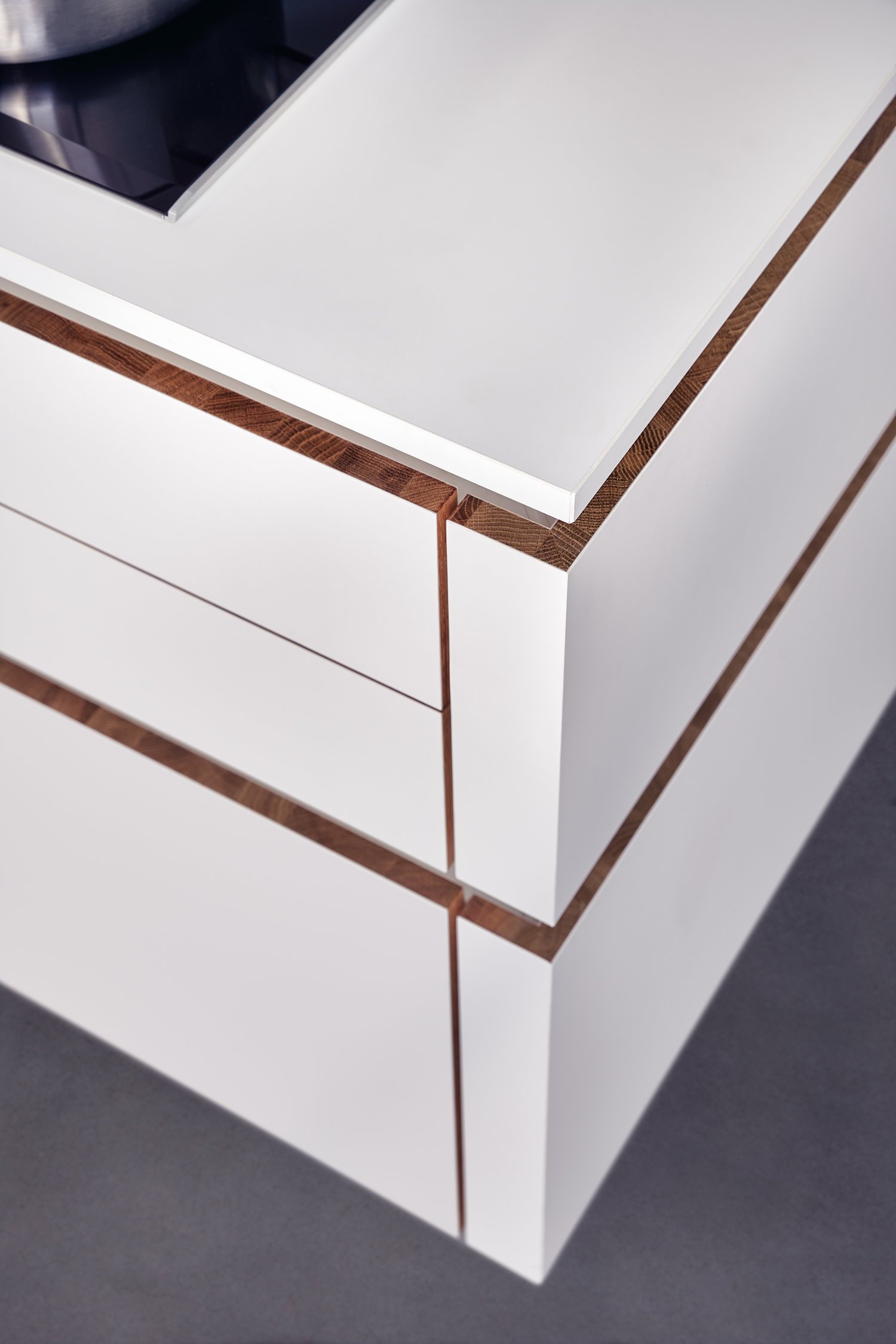
The kitchen is a ‚masterpiece‘: durable, solid, authentic. When you open the calm, handle-less fronts, a high-grade edge made of finely structured oak becomes visible – an expression of solid craftsmanship which lends the range considerable emotionality. In perfect harmony with this edge: the timeless fronts in matt white.
SIRIUS | IKONO | ORLANDO
The interior concept comprising cooking run, wall units and tall unit is given a homely touch with a rear panel made of finely structured genuine wood. There is great diversity both in terms of the sur - faces and what‘s inside drawers and units. The floor units featuring elegant concrete reproduction are a genuine eye-catcher.
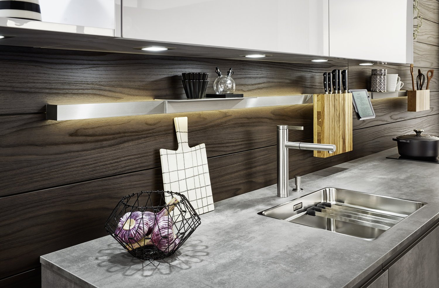
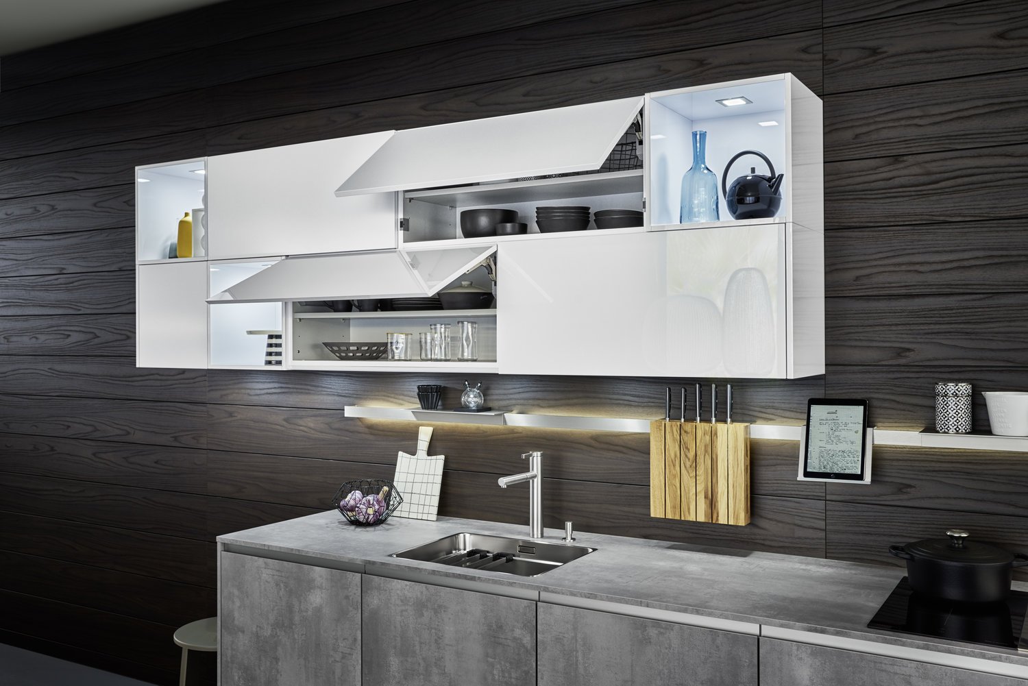
The wooden panels on the back are an elementary part of the LEICHT planning concept and spread a sense of warmth and homeliness. The unit fronts gently glide upwards; the delicately illuminated rail with useful accessories is both convenient and attractive. Every detail helps form a harmonious overall picture.
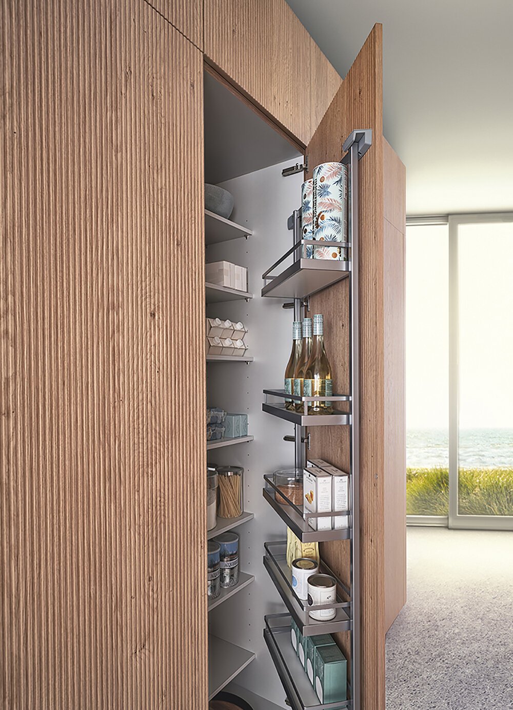
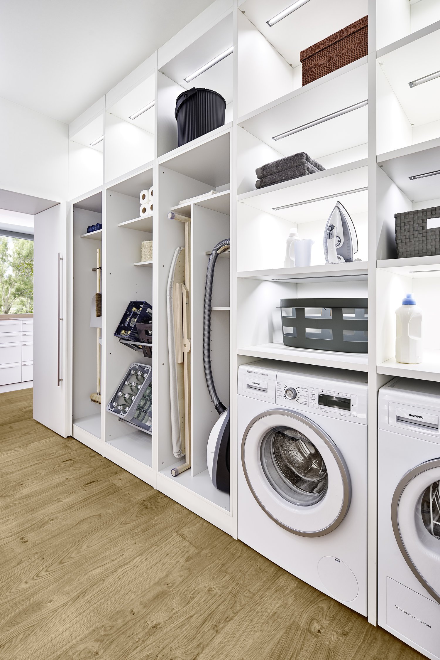
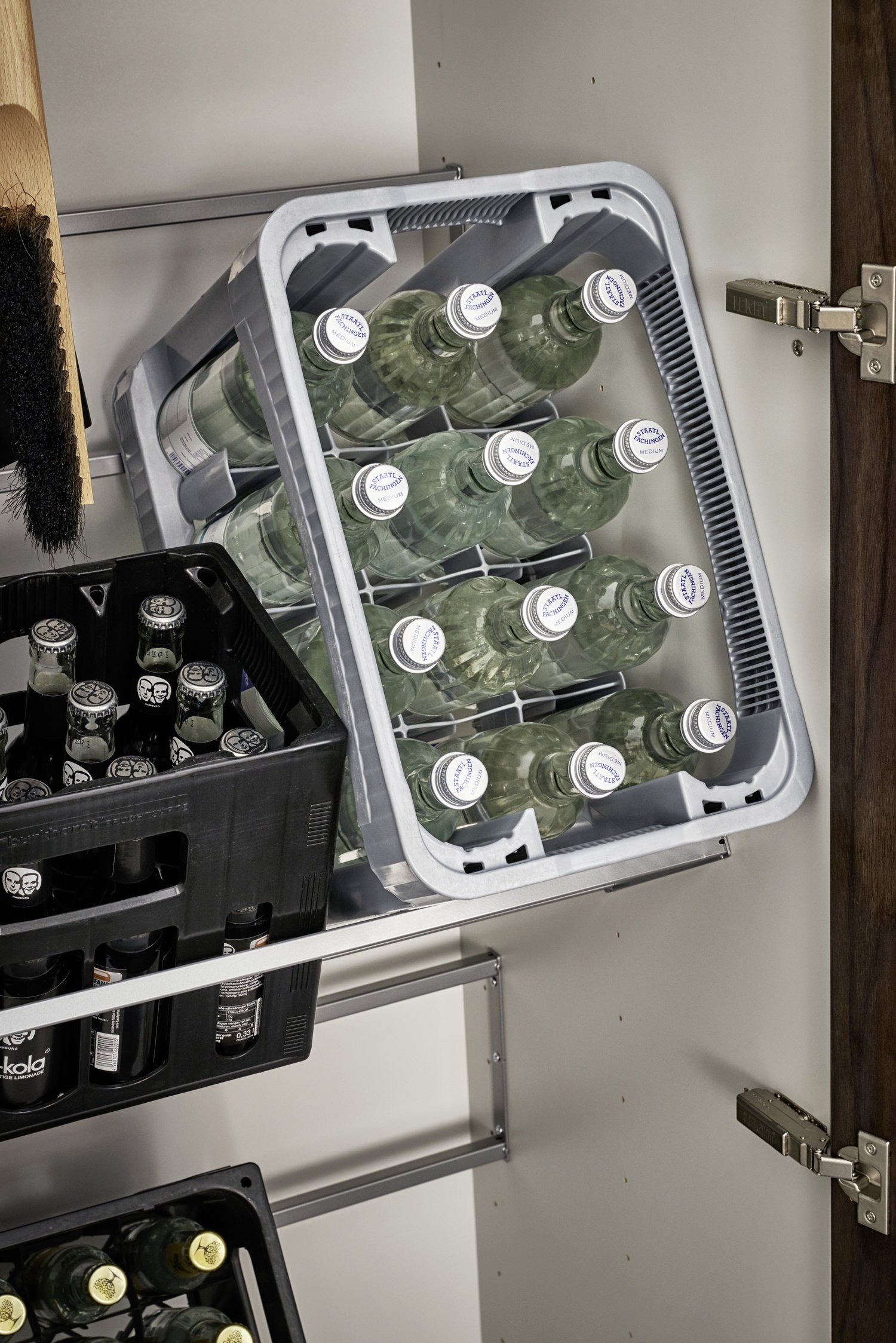
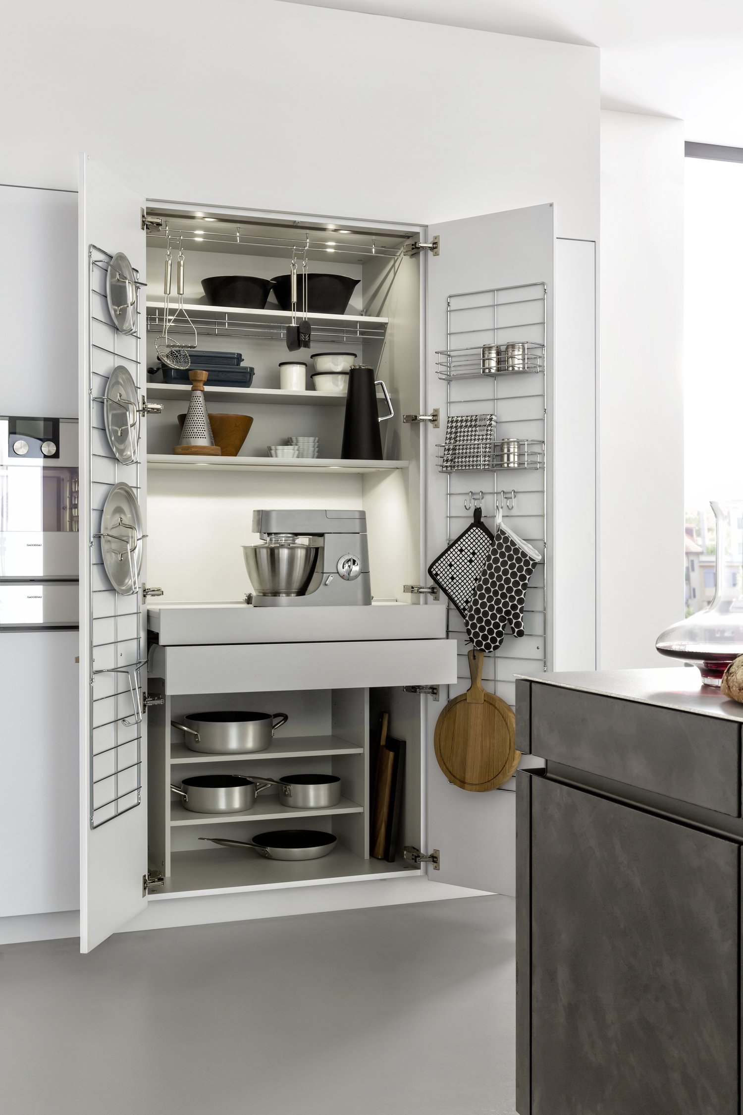
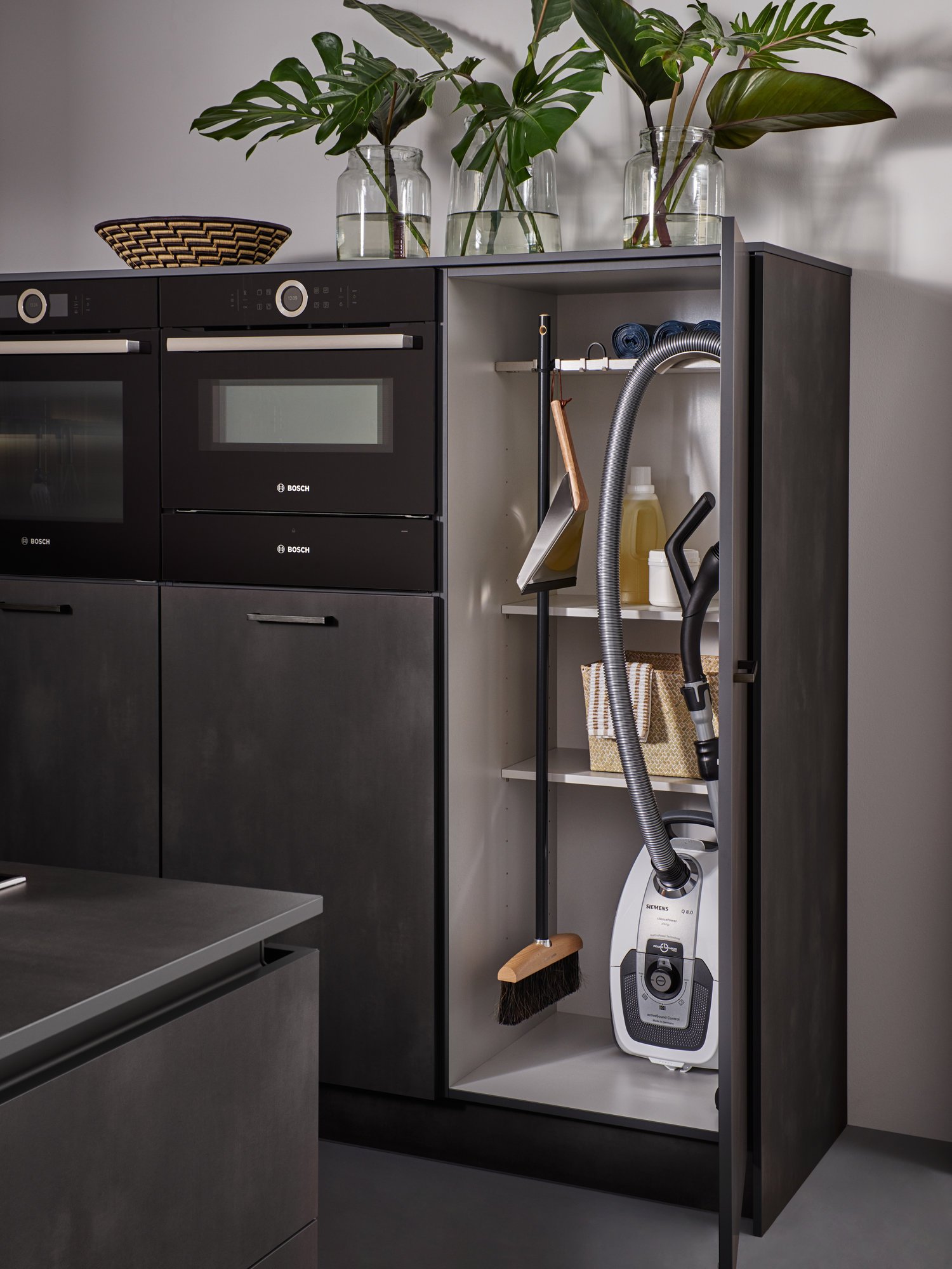
The tall unit with continuous fronts, so calm to the outside, opens up to reveal a whole range of different useful storage solutions: even bulky goods such as crates of drinks are easy to accommodate. On closer inspection you will discover a number of solutions that have been planned down to the last detail: for example a narrower shelf with special fixtures for a brush and dustpan.
As a reproduction concrete indoors is fine and homely. All surrounding materials and colours provide a charming contrast to the concrete. The reserved grey with its natural-looking surface puts the focus on the special features of everything around it. The white is even brighter, the wood more characterful and the violet even more intense.
TOCCO | CONCRETE
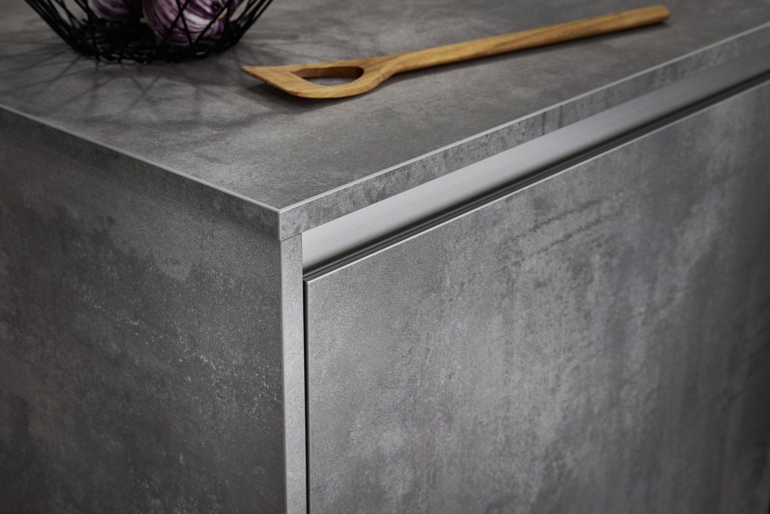
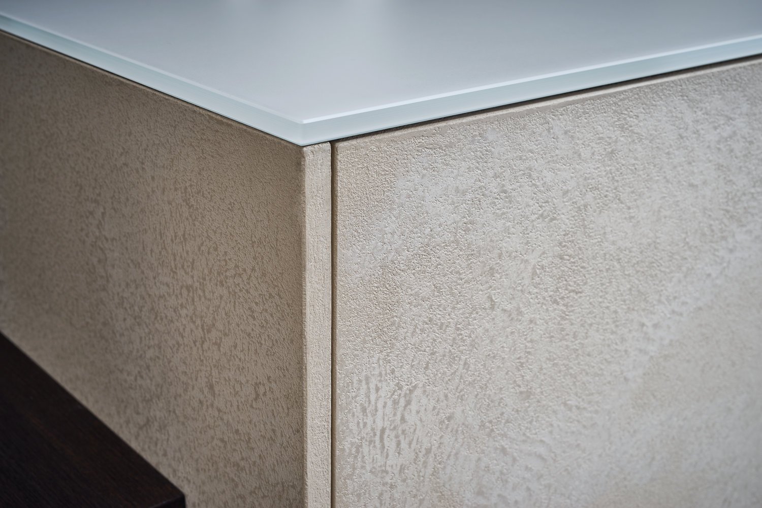
Concrete, the building material of choice for modern architecture, also unfurls its puristic look in kitchens. For this purpose, kitchen fronts are filled with fine concrete in a highly skilled process to achieve the characteristic concrete surface. A protective lacquer coating makes this finish suitable for use in kitchens.
The more different the materials, the more interesting and exciting the interaction: concrete fronts, an elegant stainless steel worktop and the natural solid wood of the bar create an attractive trio. The slim-line shelving is colour-coordinated with the fronts.
The white tall units integrated flush into the wall offer plenty of easily accessible space, for example in the clearly laid out cookware centre. Pullouts and drawers permit direct access from above. They are equipped with interiors of solid wood and modern guiderail technology with inde - pendent close and convenient cushioning.
Like the colours of daybreak or fog rising from damp meadows, grey too is an interim colour between black and white. Achromatic and matter-of-fact. But grey is not cool at all, particularly in combination with colours and materials from nature.
CLASSIC-FS | TOPOS
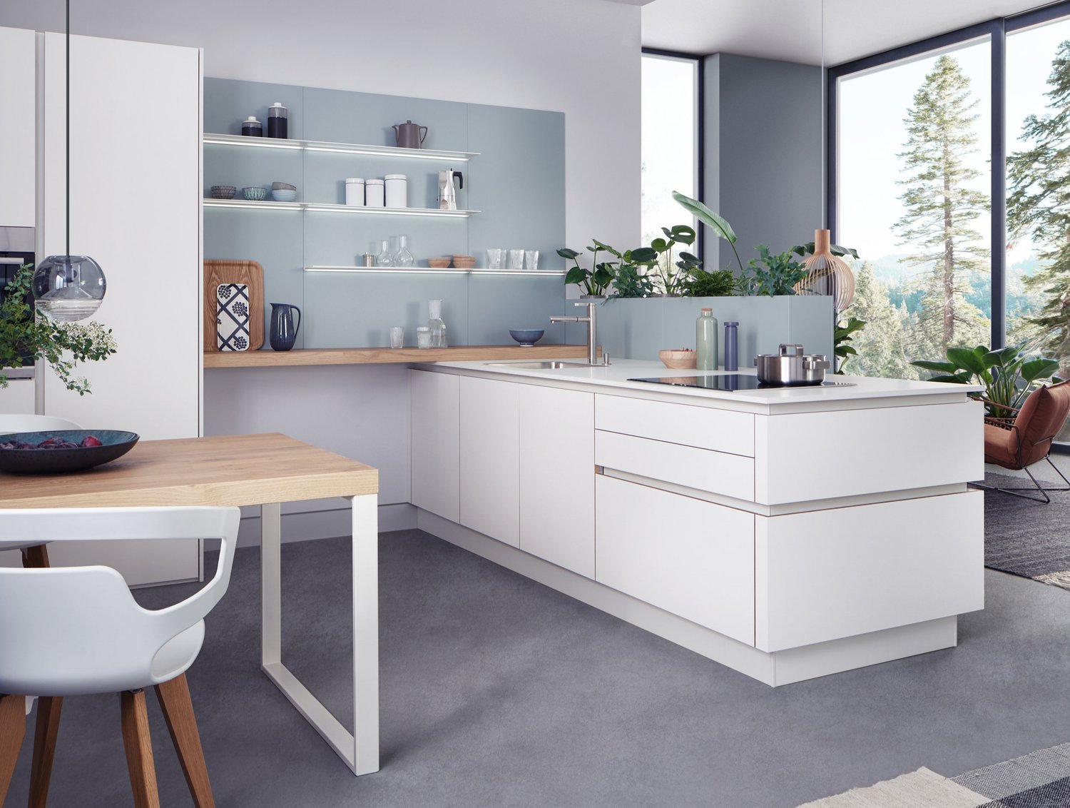
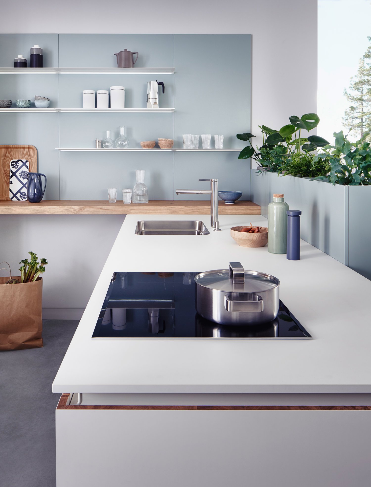
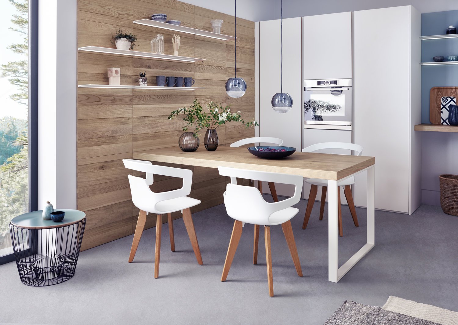
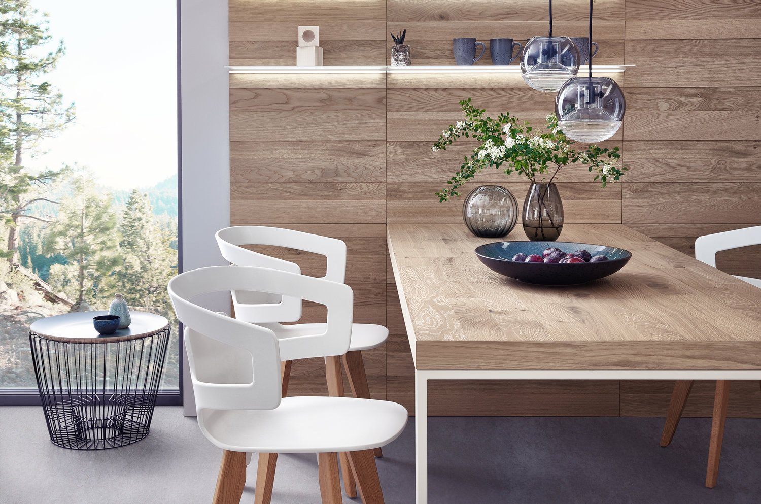
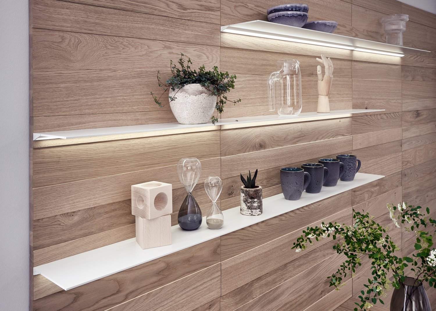
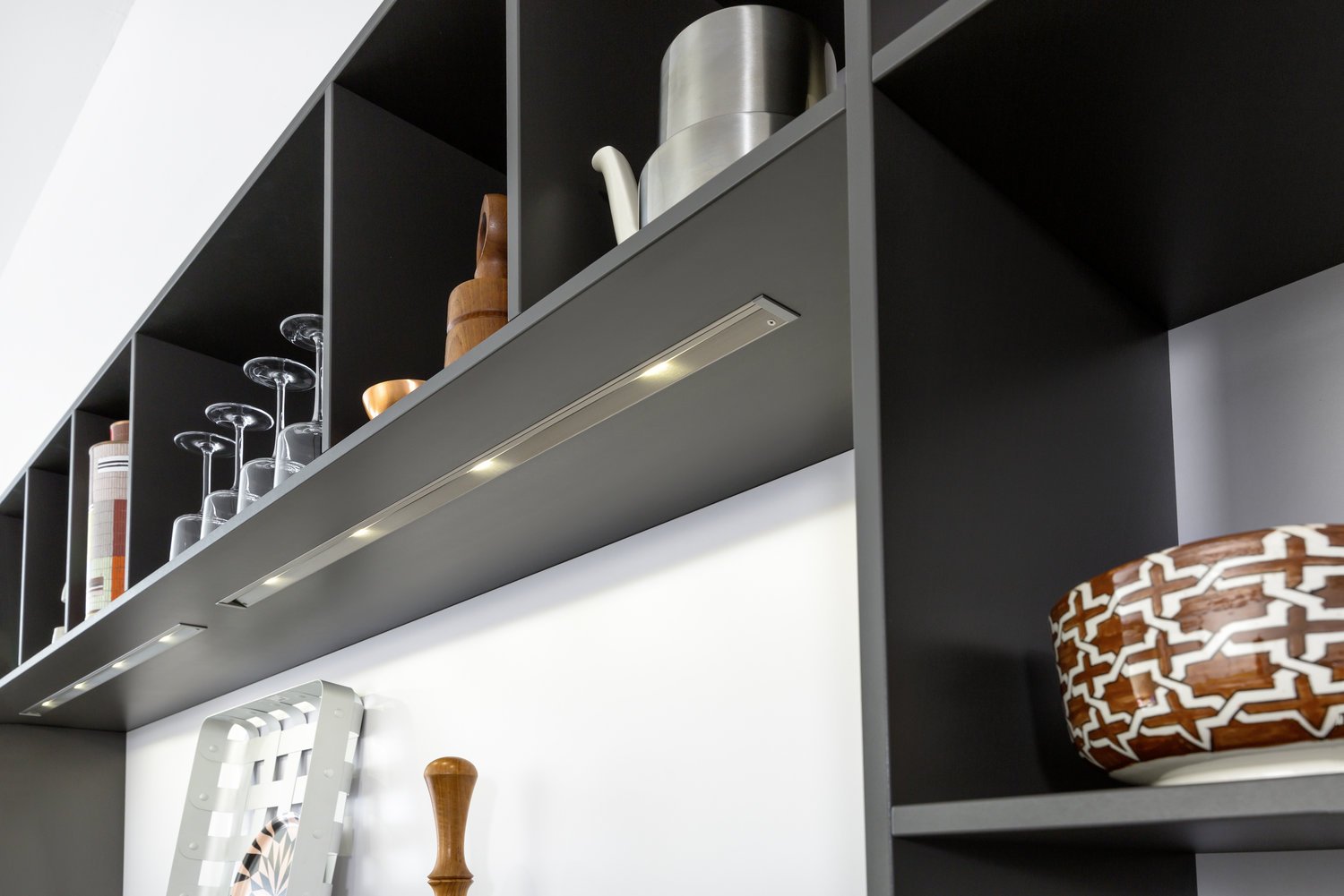
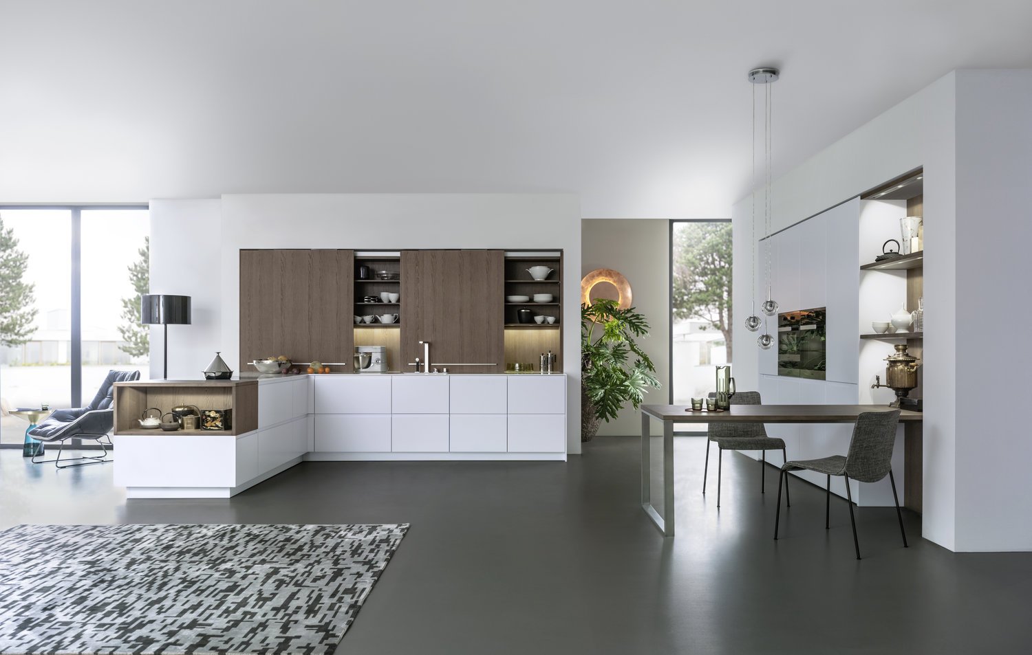
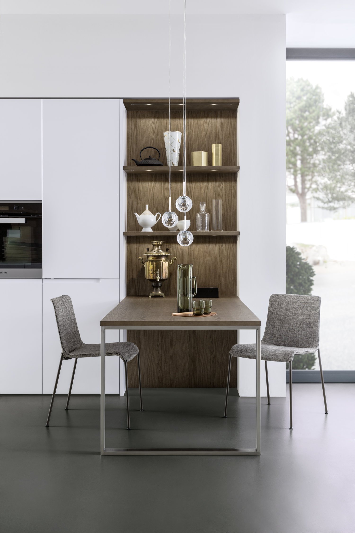
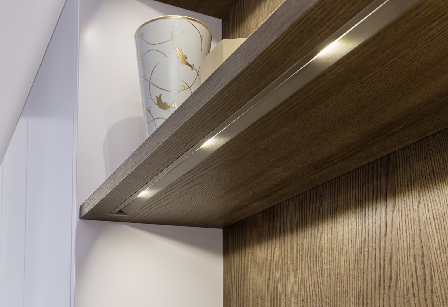
Wood looks at its best in combination with plain colours, here in ash madeira with a white matt lacquer. The shelving with its glare-free LED stripes forms the backdrop for the inserted dining table. It provides plenty of space for everything you like to have to hand close to where you are sitting.
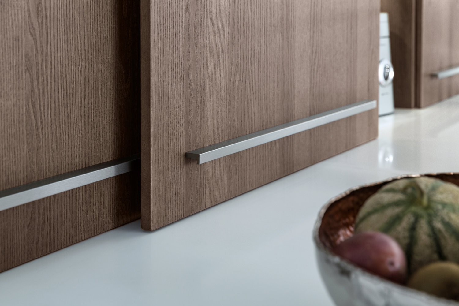
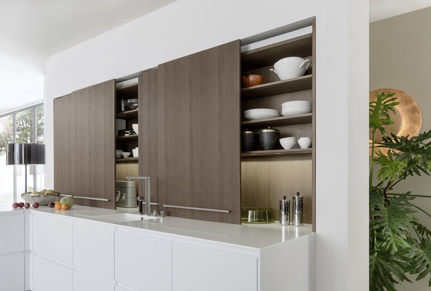
Classy ash unfurls its true appearance and elegance on the smooth, large sliding doors of the top cupboards. The entire storage space above the worktop is thus closed; the full depth of the worktop can be used.
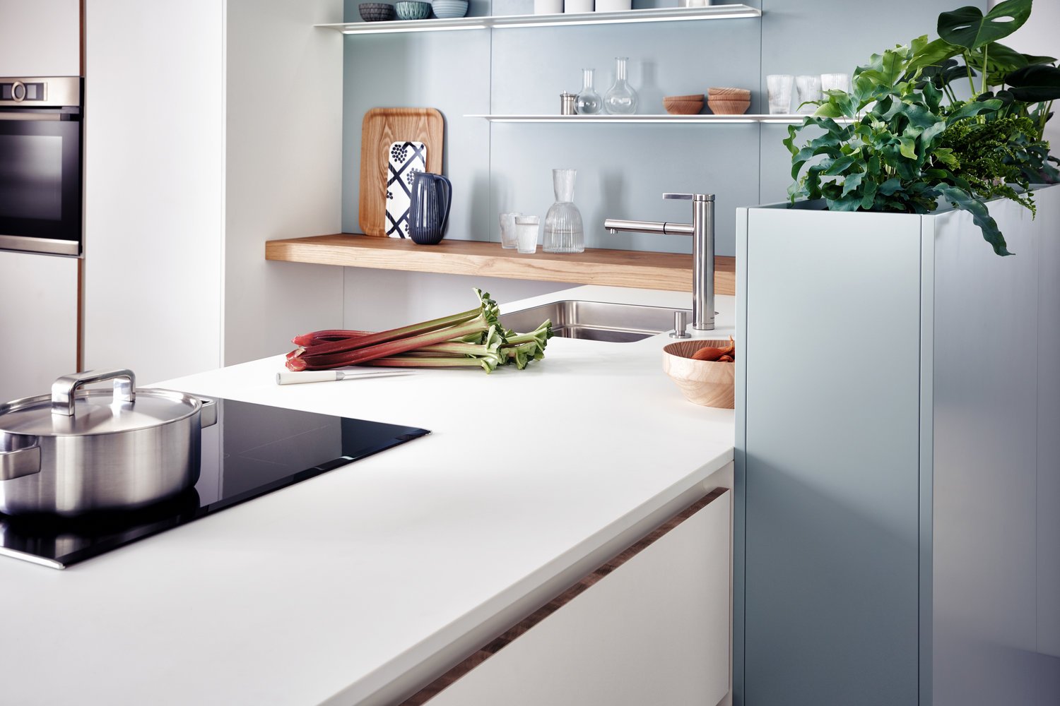
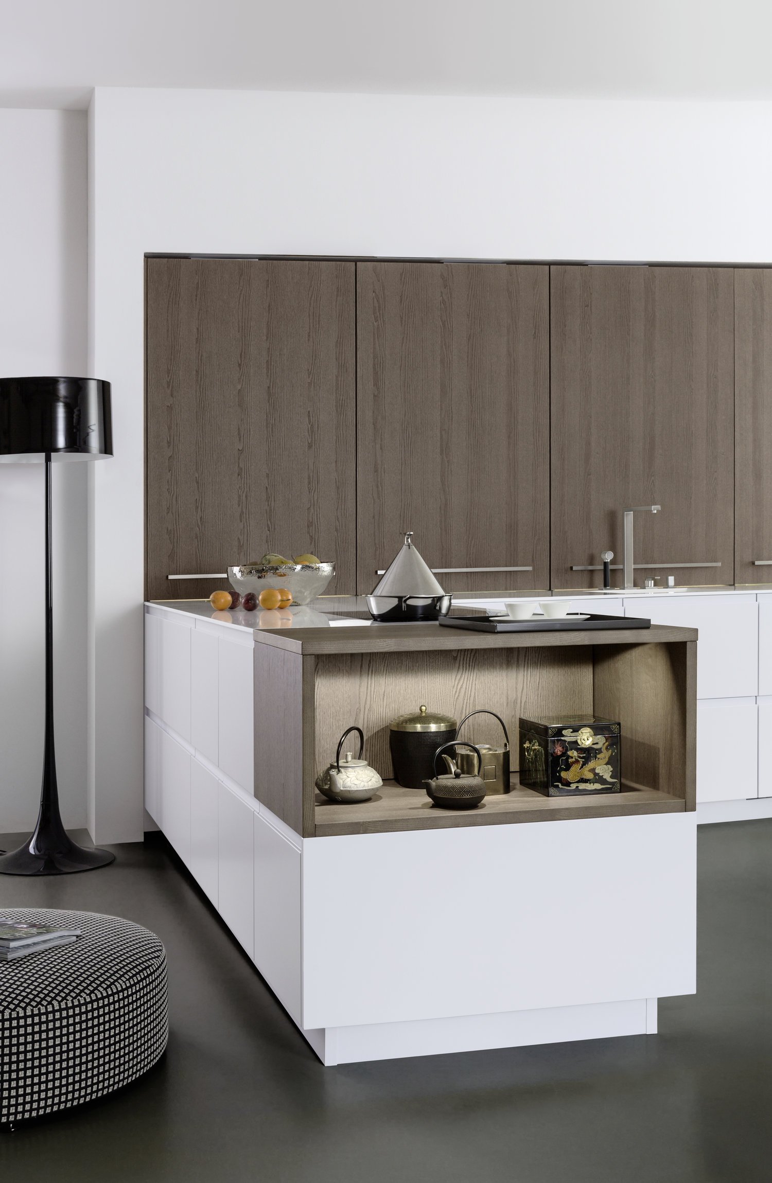
Creative planning ideas and individual touches can be implemented in LEICHT kitchens whenever you like. Here, an open shelf facing the room is the perfect conclusion to a free-standing row of floor units. The pull-outs with their lacquered recessed handles are all 40 cm high ensuring a calm front.
Light and dark, warm and cold, smooth and textured – people love contrasts. Because opposites attract, relate to each other, arouse emotions. Contrasts are also fundamental for visual perception, they create excitement and liven up a room.
ORLANDO | MINERA | MINERA-C
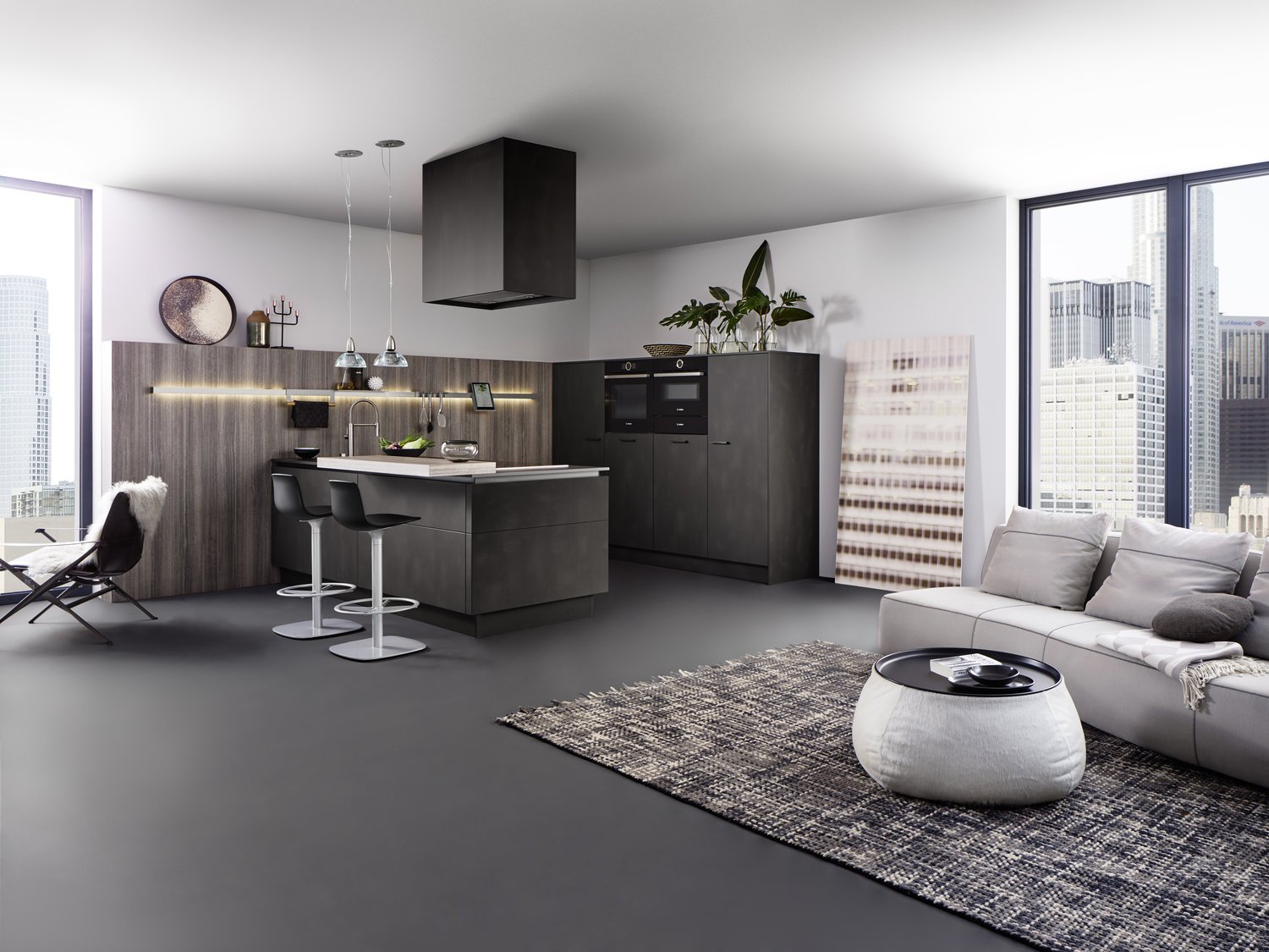
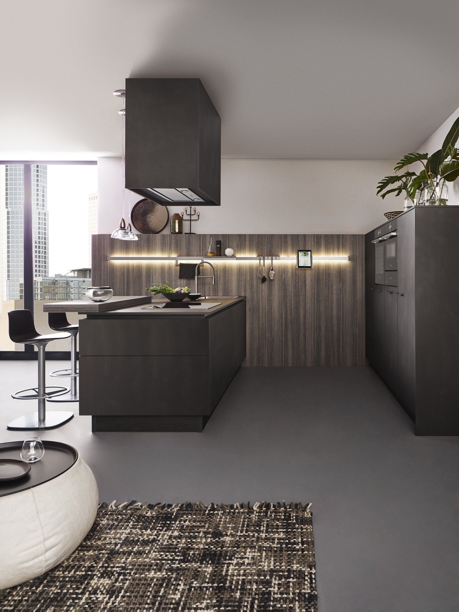
The room as a whole, kitchen and living area are one. The two surfaces, combined in use here in a modern way, look warm and natural: they are fascinating with their slightly metallic shimmer and high-grade replication of finely structured eucalyptus wood.
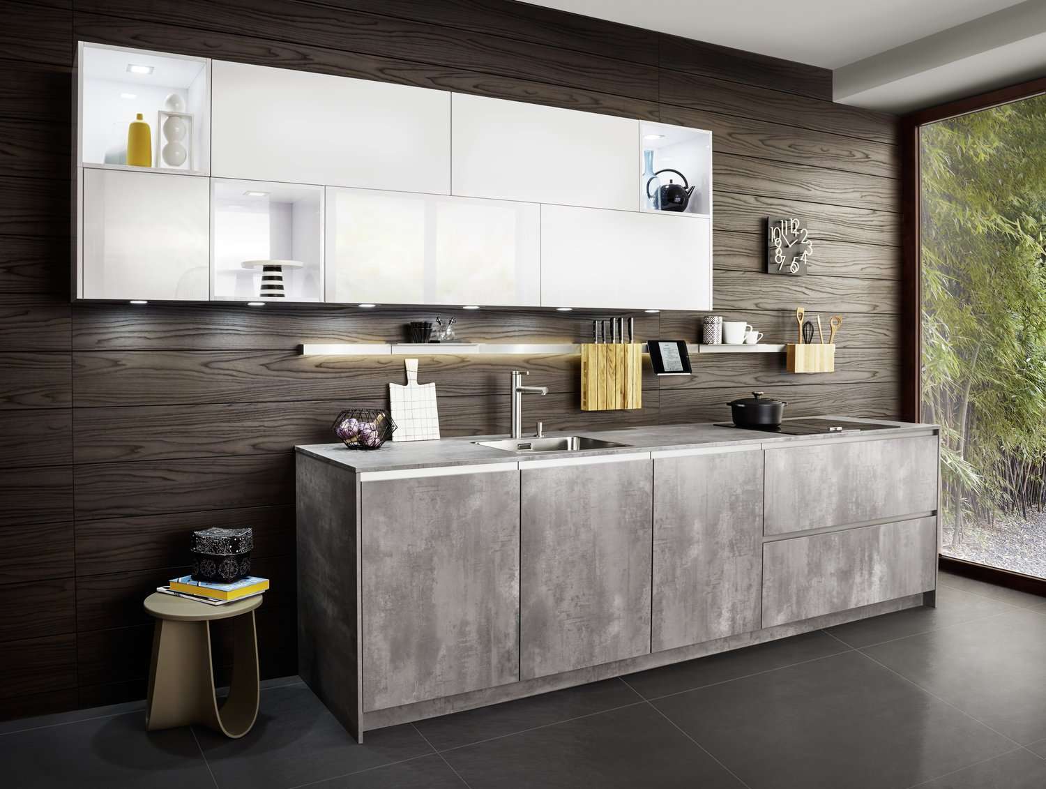
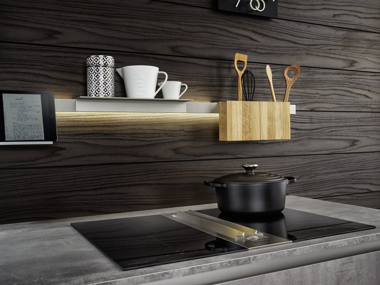
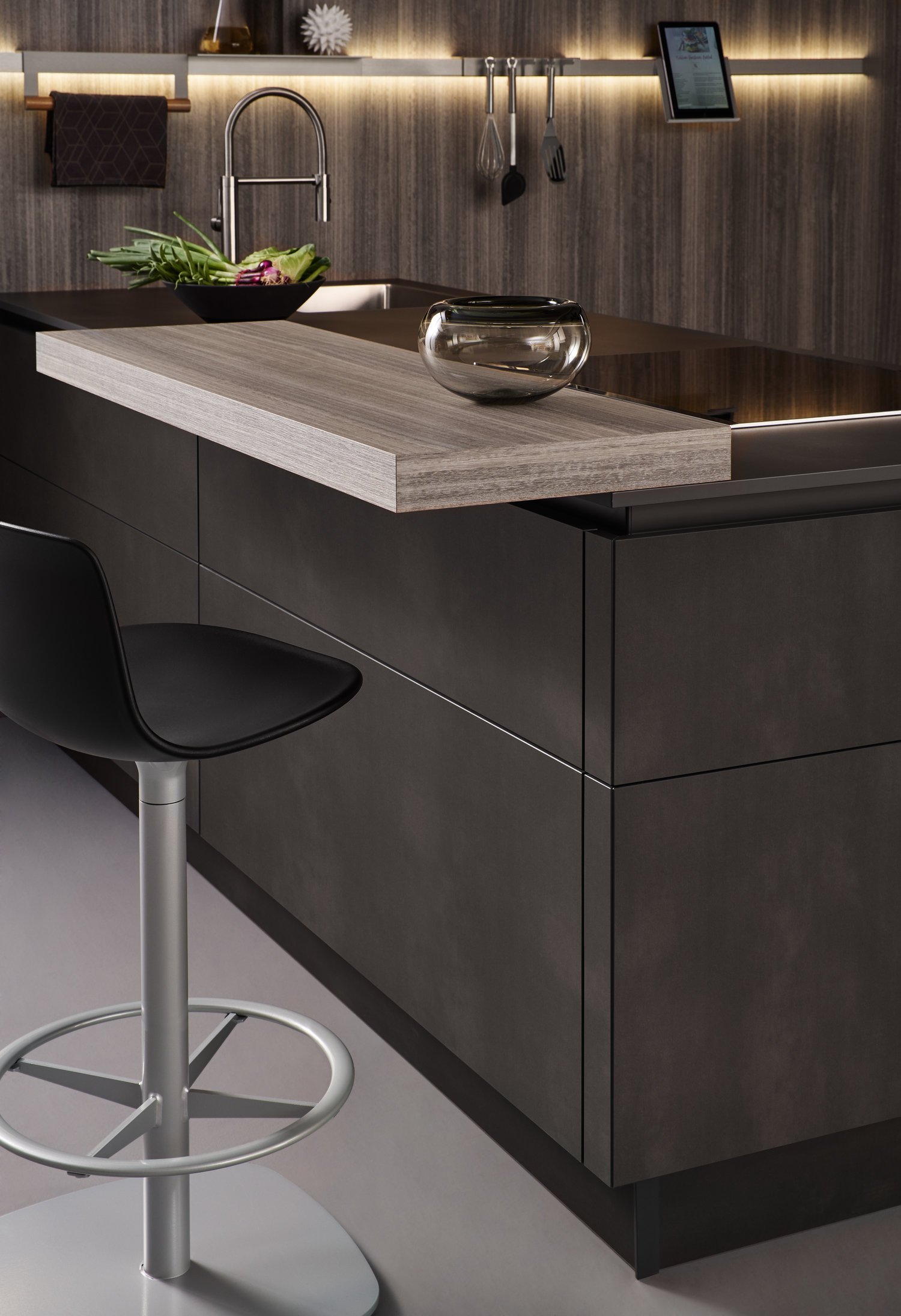
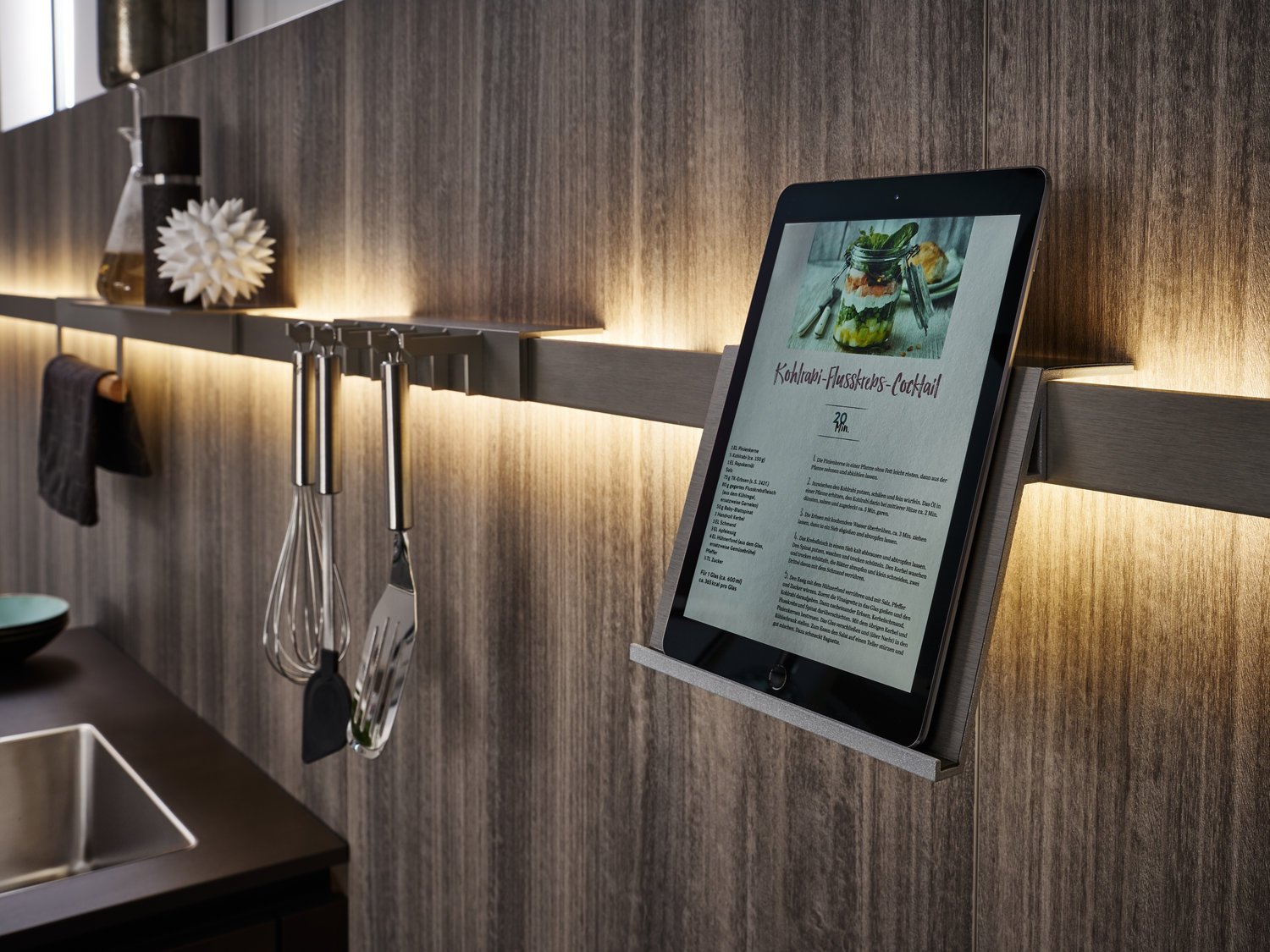
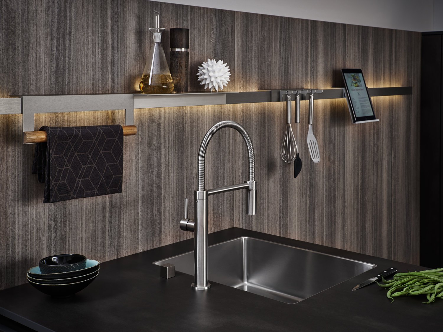
An innovative kitchen architecture for inspiring cooking events: homely, young, dynamic. The high boards are connected over a corner with a parapet and coordinated perfectly with the island. The atmospherically illuminated rail is both an eyecatcher and a functional element. It can hold the kitchen utensils and is also equipped with a tablet holder.
LARGO-FG IOS-M
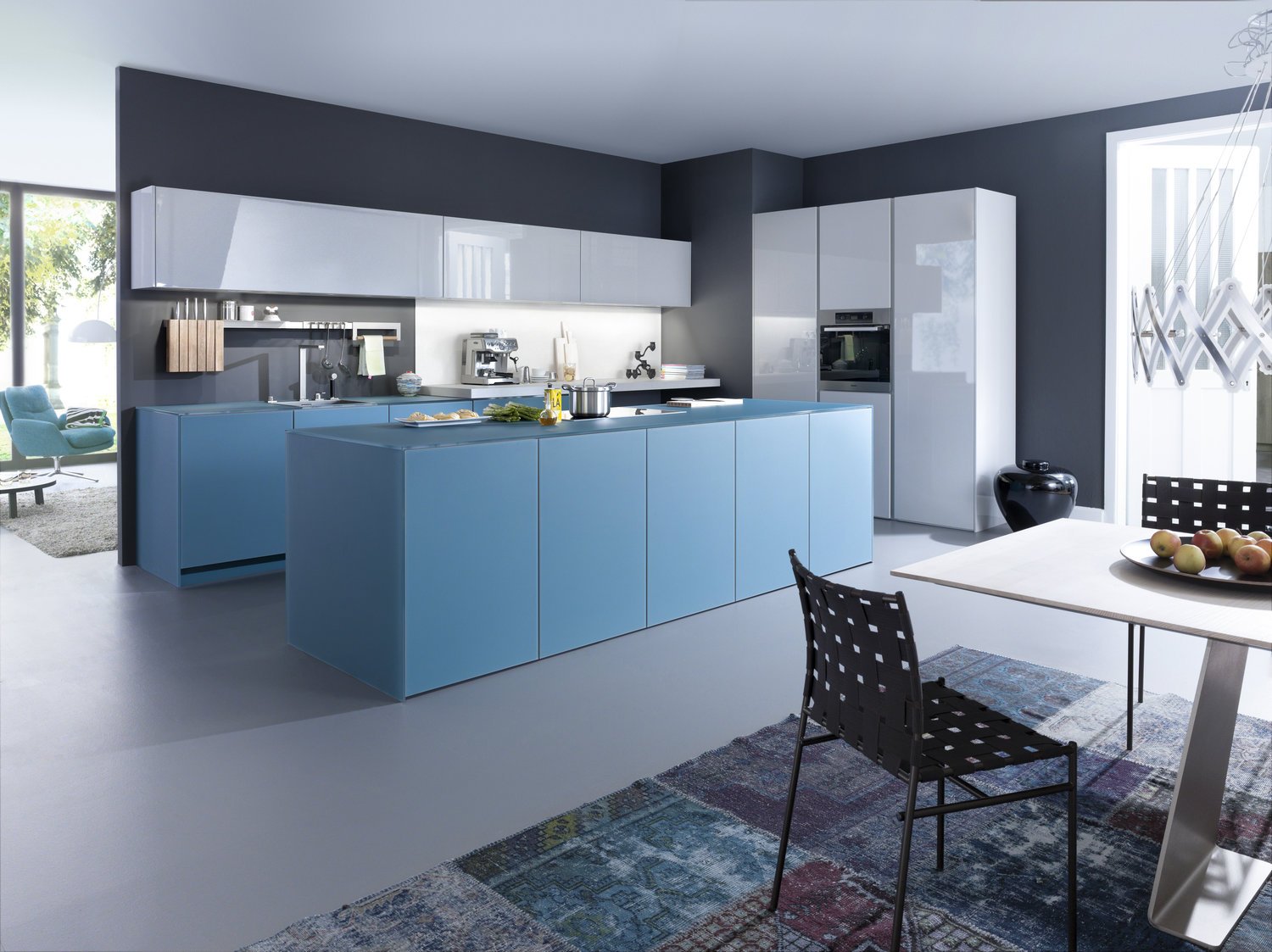
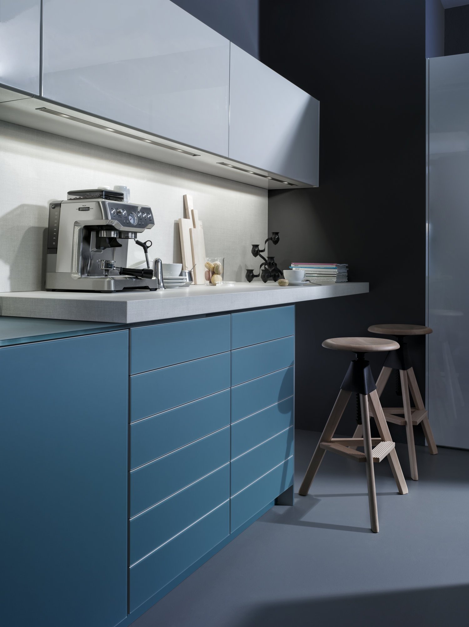
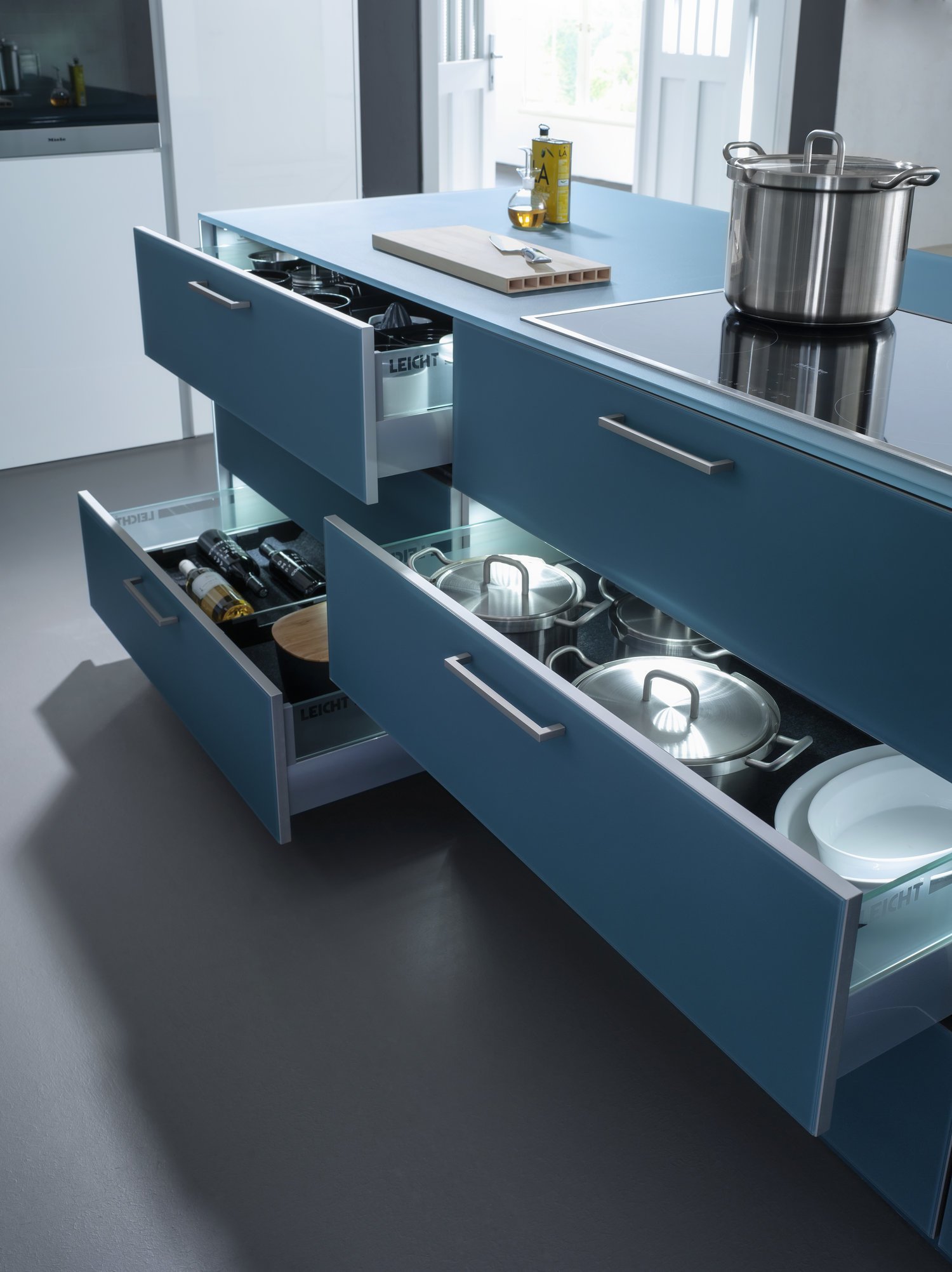
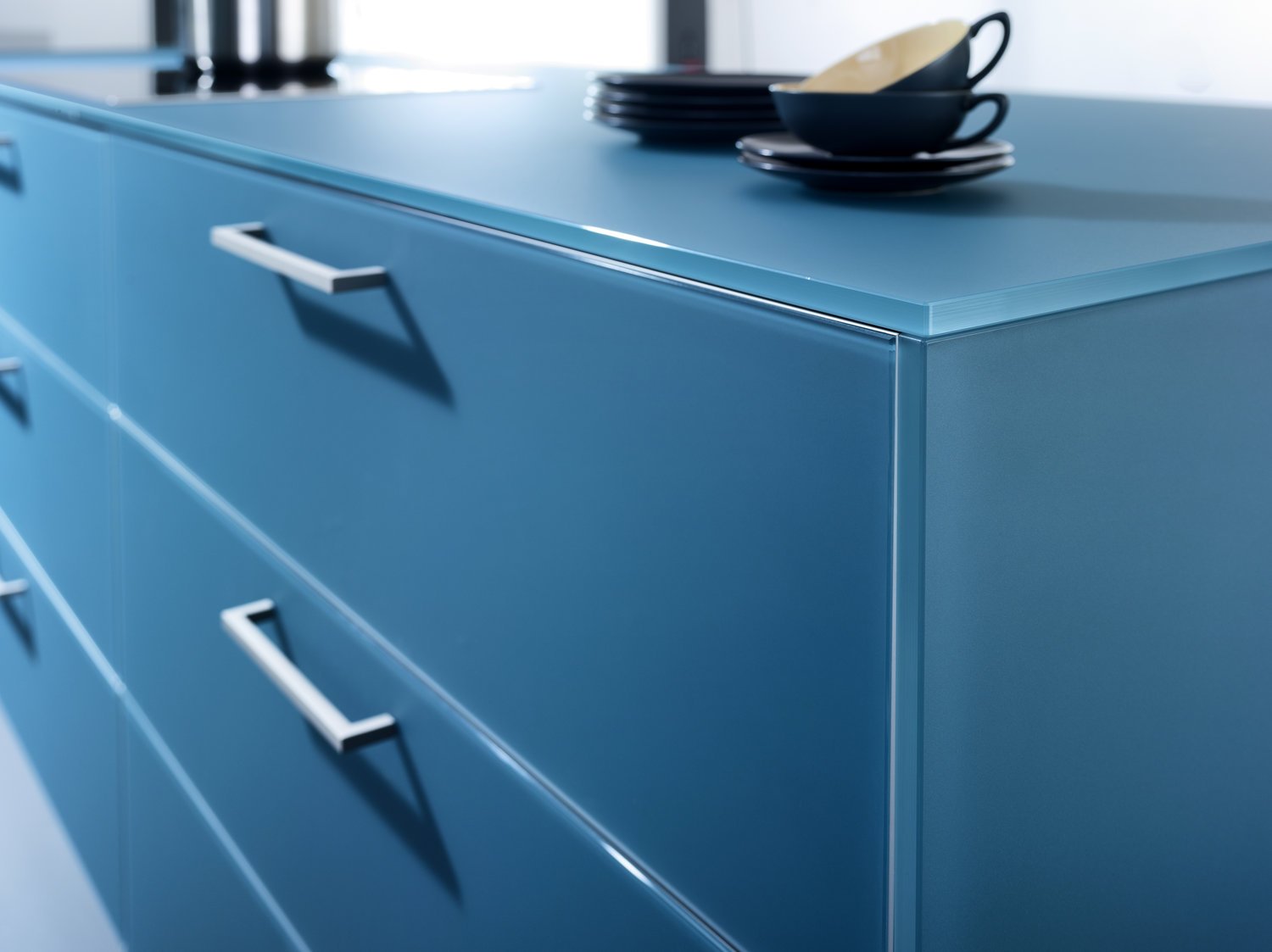
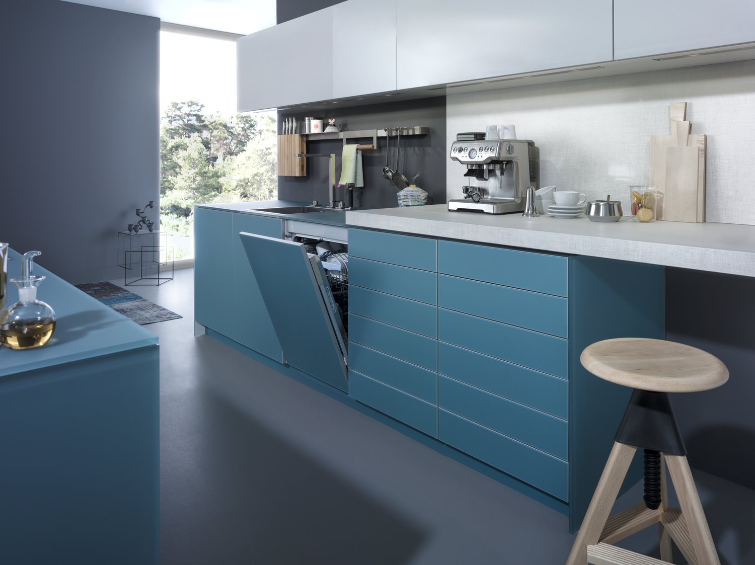
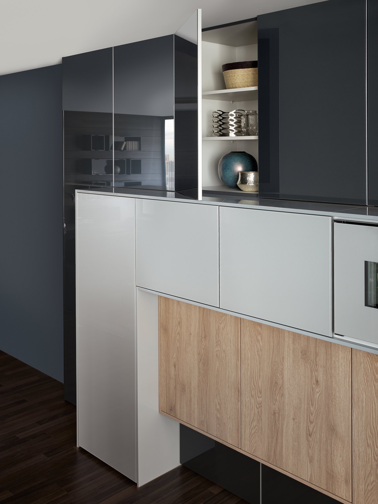
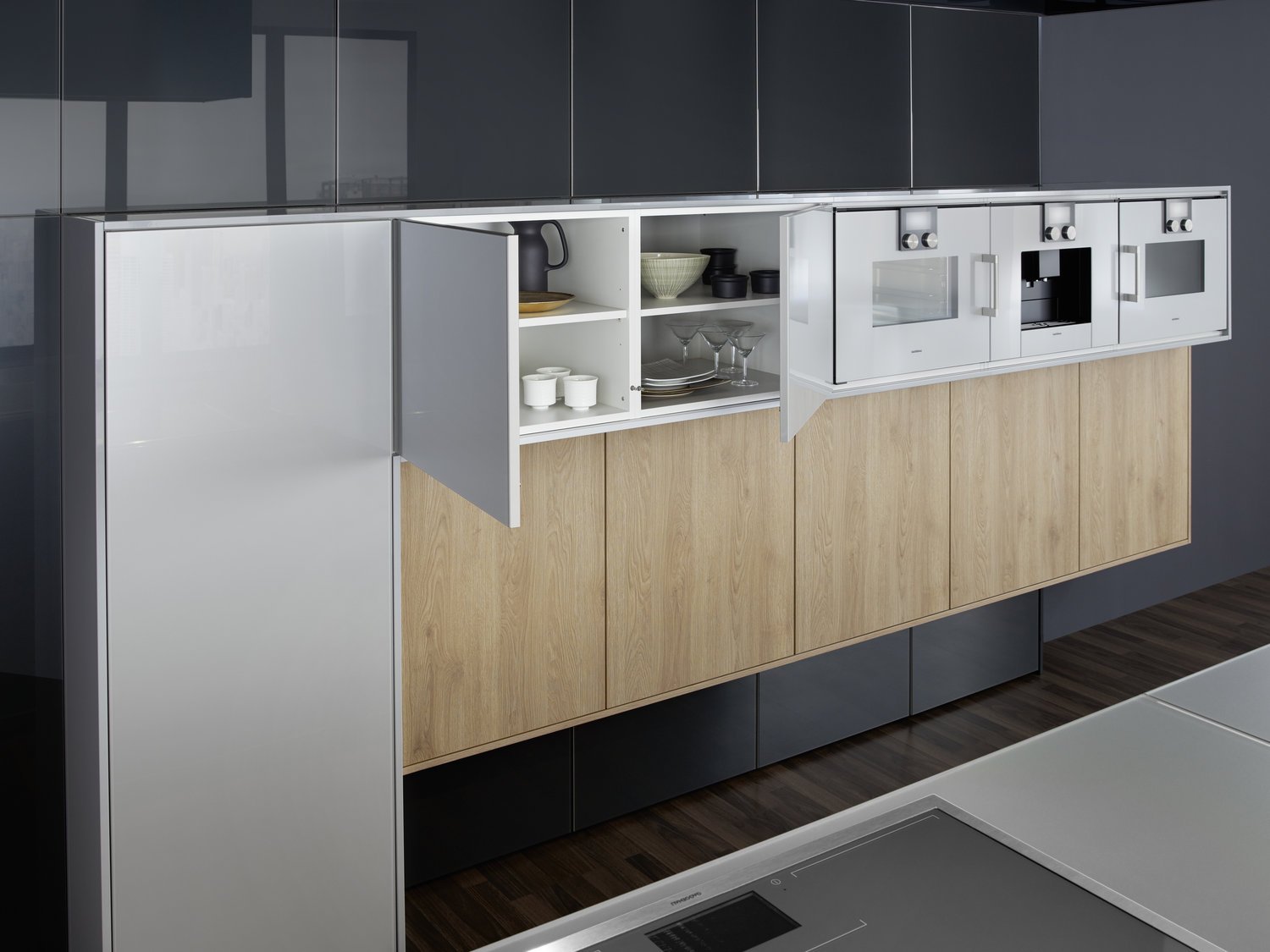
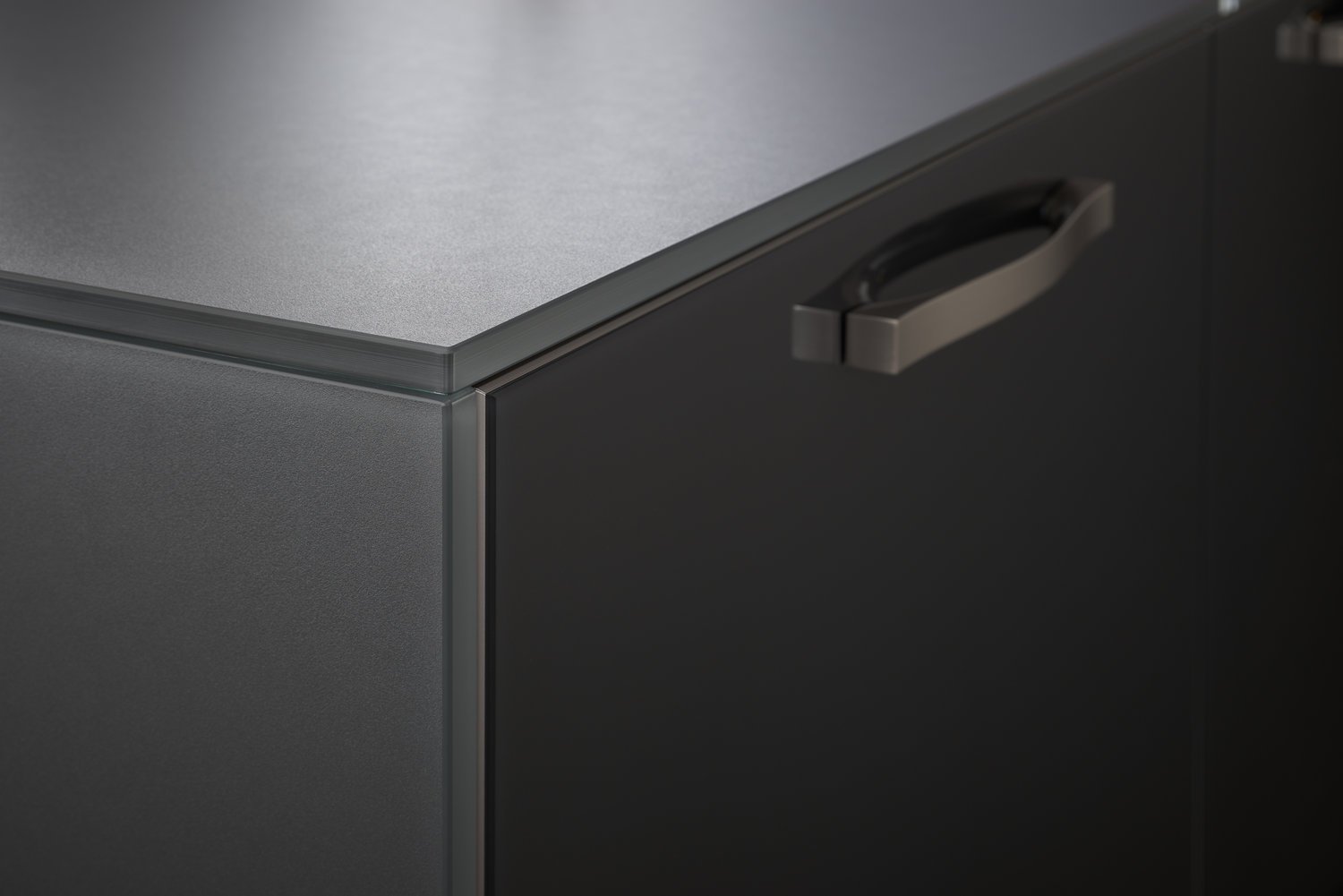
Using a spacious flat colour conveys tranquillity and serves to open up the room. Fresh and refreshing are glass fronts in petrol, a matt blue green, together with glossy, light grey cupboard element. The glass worktop, only 12m thick, blends with the flush fronts and side panels into a closed block.
Clearly divided functional areas with directly assigned, easily accessible unit space guarantee an efficient work flow. The kitchen island connects kitchen and living area. There is plenty of space in the tall units without plinths to store items and accommodate appliances.
FENIX F 45-E | CLASSIC-FS | SYNTHIA
Technically modern, industrial loft character, casual arrangement - but nevertheless warm and homey: this LEICHT kitchen reflects a spontaneous, urban lifestyle. Both the freely positioned two-door tall unit and the kitchen island that looks like it is floating stand on metal base which lend the nodules their visual lightness.
SYNTHIA | IOS | LARGO-LG
A very elegant ensemble in dark shades. The focus is on the functional run, attached to the wall, with elements of different depths and materials - a different, rhythmic kitchen architecture. The high-grade genuine wood with its characterful structure is a fine touch - and also features on the high-class inside.
SYNTHIA | IOS | LARGO-LG
The combination of a sandstone-look surface with all the signs of true craftmanship and elegant, dark genuine wood fronts, this kitchen has a unique, warm, quality aura - with a very fine, slightly “smoky” look.
The room as a whole, kitchen and living area are one: the philosophy finds expression in the planning approach that comprises the top-quality interior design through to the tailor-made shelving system.

